The gimbal one is brilliant!
Super distinctive and clear, much better than the weird corner one right now.
EDIT: Oh, my god, this new forum system is so finnicky with quotes, it’s insane. ![]()
The gimbal one is brilliant!
Super distinctive and clear, much better than the weird corner one right now.
EDIT: Oh, my god, this new forum system is so finnicky with quotes, it’s insane. ![]()
Hello everyone.
I apologize for your disturb.
As I understood, in that topic Blender users discuss about icons for Blender 2.8 UI.
I actively use Blender, so I also want to make a proposal for improving UI.
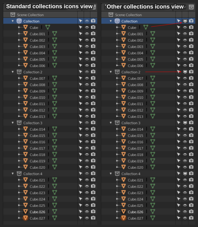
As You see on screenshot, when in Blender scene present many objects and collections, and all collections opened, then very difficult to see where is the icon of collection for turn off it for hide the collection (ctrl+h the hotkey)(left side of the screenshot).
If You want, You can create the similar collection hierarchy in Blender scene (like on the screenshot) and see the difficult perception Yourself.
I want to suggest to change the collection hide icon (icon with eye) on other, (right side of the screenshot).
This icon may be have another view, did not right like on screenshot. This may be any (thematic) noticeable icon.
I very hope that the developers read my message. That is be very cool.
P. S. English is not my native language, but I hope that You understood meaning that I wrote here. And I hope that my sentence has an meaning…
The problem is known and being discussed. Check this out:
https://developer.blender.org/T57857
https://developer.blender.org/T61578
Thank you for links, I am neglectful 
There is very little difference between the transform orientation icons (current gimbal especially) and the particles icon. Super easy to confuse them, and the particles icon doesn’t tell the story.
Hmm I personally could not tell which icon is which from these except for normal and local (but maybe it’s just a thing to get used to). I think the little globe worked well as global.
My suggestion is about the gimbal. Since the main attribute of gimbal is rotational axis affecting each other maybe it would be clearer if the icon had circles under different angles than 90deg, or arrows on both circles to imply how this option is about rotational directions.
Some of pictograms do not stop bothering me. I mean their illegibility, accumulation of details, mushiness… whatever… They’re just not as good as if they could be.
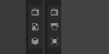
Camera icon for example - I tweaked its Object and ObData icons’ silhouettes to be clearer, sharper and more obvious (old - upper row, new - bottom one):

The other one is the icon related to the Rigged Data, which did not fit in style and thus looked a bit off and unrelated - the last one in a row (old - upper row, new - bottom one):
I can’t see a difference between the old and the new cameras, however the “rigged character” icon looks better imho. It’s definitely more in line with the others.
The lens is more triangular and has a distinct separation from the body.
With a movie camera icon, I don’t even see the lens unless I actively look at it.
The film canisters are what you see. These are the distinguishing characteristic that identifies it. The cannisters tell you what it is.
Still camera = lens and flash bulb, front view
Movie camera = film canister, side view
The rest isn’t that important. Just a box really. For a movie camera, all you need is the cannisters ( or reels, I dunno if there’s a difference), that’s it.
Continuation of cleaning details that irritate me:
Light (bulb) - it was a bit too small, with details crowded too much in the ObData icon (top - actual, bottom - proposal).

Light Probe - details too close to each other, and therefore a bit blunt and indistinct. Irradiance direction matches lights icons now (top - actual, bottom - proposal).

Both families portrayed together:
Another attempt to redesign the Light Probe icon - complex silhouette and excessive number of parts builting this pictogram still tires me terribly. There is no need to graphically describe the operation of Light Probes, but a symbol representing the essence. Simplifications are what we really need here.
![]()
![]()
I like this one much better.
![]()
I would like to propose some changes.

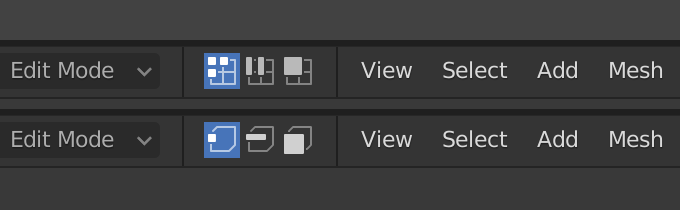
I prefer selection mode icons from UV editor, rather than the 3D View editor, and see no reason why not to use the same icons in both editors.
Really like those two suggestions by you. I tried the new icons for some time, but I don’t like the Output icon. It’s just too similar to the camera icon directly above it, I always have to look twice which one is which.
Also, with the object icon, it’s too abstract for me. Have to look closer there, too.
Really like the other icons from @jendrzych though. Good job man, much appreciated! ![]()
Yeah, exactly.
Also it (output icon) looks like ![]()
Haha, right 
It’s not even that the icons look to similar in form. I think it’s more that both represent the same concept of a camera so my mind mixes them up all the time. The picture part is drowned by the massive, filled camera body for me.
Google replaced the hamburger icon in chrome a long time ago. They now prefer a vertical ellipsis ⋮ in many places, especially for the overflow options in menus. It’s closer to a horizontal ellipsis, which is pretty much universally understood as indicator for truncation = there is more.
If you change “hamburger icon” to “vertical ellipsis” it will be even worse.
I think you completely misunderstood what I said above. I’m not against this icon, I said this pure icon doesn’t look like a button, there are no borders and background like other buttons.
I like these mind-changes
Yes please, current Object icon is so obscure without any meaning. @jenkm proposal is almost perfect.
In fact, this is not the final version of the icons, it’s just a quick mockup made from the existing ones, to show that there can be some improvements to the properties editor design.