the cube it’s ok, if it were in a different position from the global axis then it stands out from the global and starts to make sense
1 Like
@nokipaike
Global depicts standard 3 axes coordinates, Local is the same but skewed in space to emphasize its local nature. View is a unique case of Global, in which only two axes from three can be seen and this exactly is represented by the icon.
@DotBow
Global and Local are pretty descriptive, but way too complex for such small space. I tend to avoid combining different symbols in one pictogram unless it’s important for the meaning of the icon.
in fact your “local” icon makes sense
I understand you trying to unify those three icons (global, local, view), but In my opinion the main problem is that using only arrows as parts of symbol forces user to remember arrows direction rather than actual meaning which seems more nature.
Local just being like Global, but a bit different, is how “custom” could look. For “local” we really want to stress how it relates to local things, which the little box does well.
3 Likes
The difference between the “Transform Orientation” options lies in the fact,
relative to which object these transformation axes are aligned.
The only correct way to show this difference is to depict objects themselves:
world, cursor, object, viewport, etc.
There is no need to draw additional arrows, since the direction (relative to the viewport)
of the axes can be any, except for the “View” of course,
and you can not use the arrow direction to show the difference.
Besides, by default, most of the “Transform Orientation” is directed in the same way.
6 Likes
I think those icons work much better - no need for guessing, I instantly know what is what.
- get all Transform Orientation icons different from the the Object, World, Sphere, Screen Space and 3D Cursor;
@jendrzych why do they have to be different ? I hate having to ask to repeat… but this thread is long, and I must have missed this part of the discussion. ![]()
2 Likes
The icons in the blender are glyphs - carriers of certain meanings. Graphic equivalents of words. Each of the icons has a unique meaning and just like the word “World” means something other than the “Global Transformation Center”, the icons assigned to them have different shapes and symbols.
This is one of the design paradigms of this project.
plenty of words have multiple meanings depending on context. This design paradigm, like quite a few you’re using here, is restrictive and unnecessary.
That said, the combination of the two seems best, I stand by thinking the top row here is good.
Though you could replace gimbal with the one from here to further help.
You won’t know what orientations do unless you know what orientations are, at which point the axis are a terrible reminder because orientation is arbitrary. Examples of typical working conditions with a particular orientation are good reminders, and more distinctive than axis whilst not being entirely as metaphorical.
1 Like
Nothing’s settled yet - still considering some of previous proposals. I have to see icons in action first.
There are some defects at the top of the Save icon:

Strange - will inspect this.
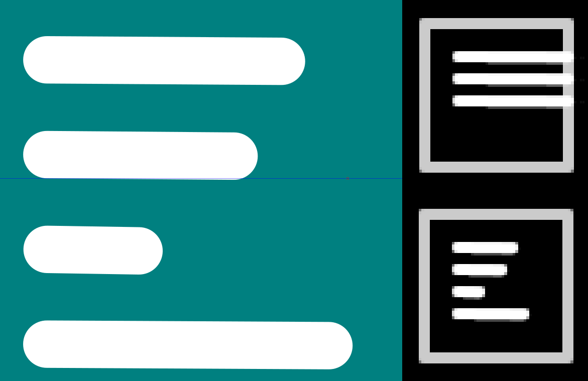
B13 & B14 both have horizontal strokes (representing text lines) that are slightly off level, which results in some blurry lines when exported. With B13 the way the lines overlap the right edge of the boundary (representing the document) looks a bit funny.
3 Likes
And hoping you don’t mind extreme pickiness…
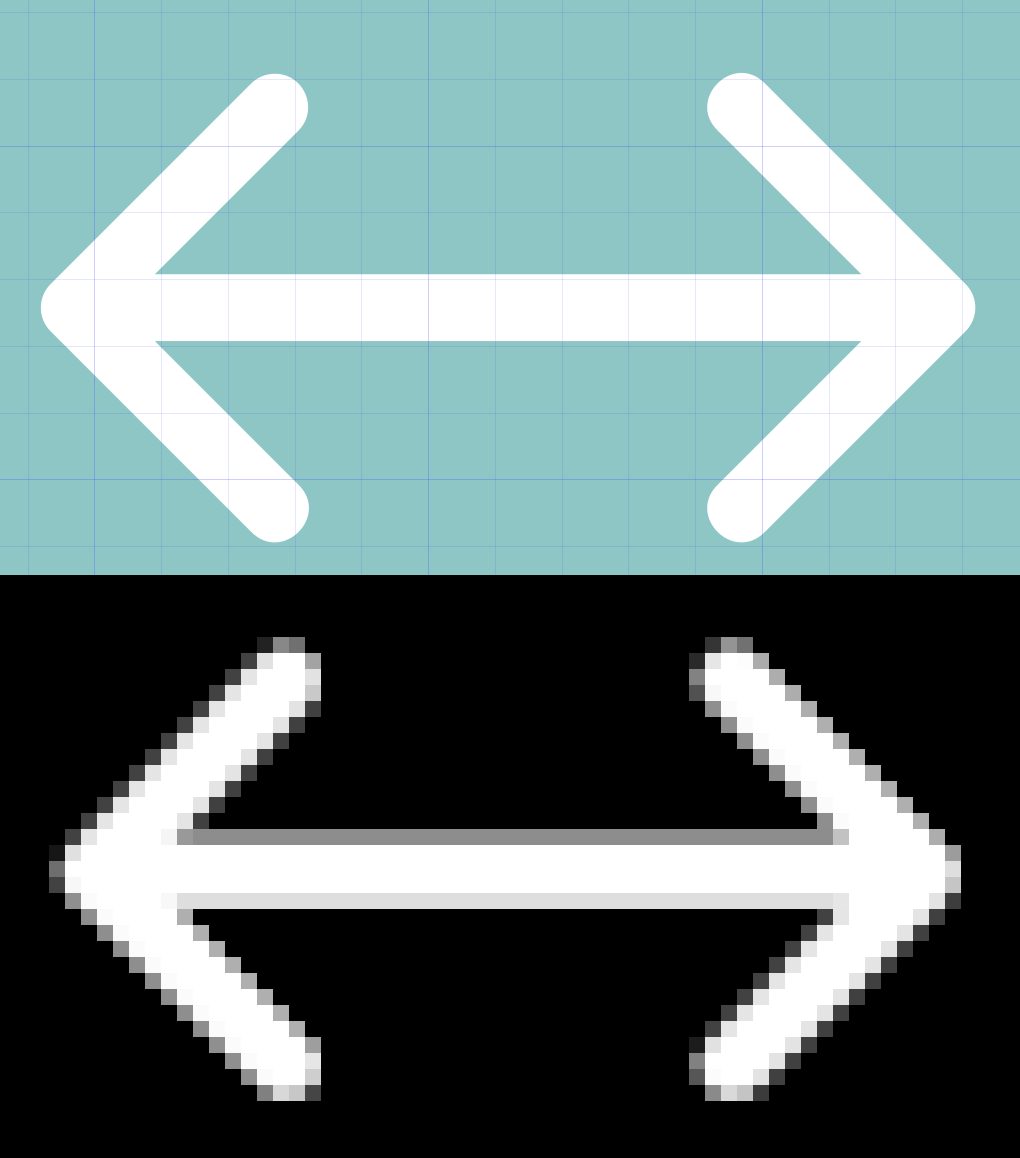
There are some icons that include strokes that are perfectly horizontal or vertical, but are slightly misaligned to the grid. This results in a blurriness at the sides of that edge when exported. So in the following example, the export was done at exactly 4X and the resulting horizontal line would have been a perfect 4 white pixels wide had it been aligned.
This affects F2, I18, R15, S2, T4, U15, X8, Y20, Y21, Z4, Z25, and DA9
2 Likes
I’ve been staring at these little devils for so long that I stop noticing minor shortcomings.
Thanks.
2 Likes
Just so I don’t scare you unnecessarily, the above are all I could find, so it is not the start of some long and horrible list.
1 Like
The F2 isn’t misaligned - internal lines are just a bit slimmer being 0,8 pix thick. Full 1pix was too heavy. I can make them 70~80% transparent to achieve similar efect if it still bothers You.
Damn, I didn’t notice that. I just didn’t realize you had any lines less than one.
But no, none of these things really bother me at all, just wanting to let you know in case any are unintended. With this check I had exported at 4X and was looking for blurry 5-pixel wide lines. And just didn’t notice that F2 was actually 4 pixels.
Too late - cleaning up the set is pending. Too many inconsistencies found.
1 Like
a useful observation
I’m starting to discover that a single icon that represents a group of similar tools at the top of each section makes the identification of the sections of the tools that are looking much easier to find
and in cases of very long menus like this …
the convenience of an easy search not only based on reading becomes evident
4 Likes