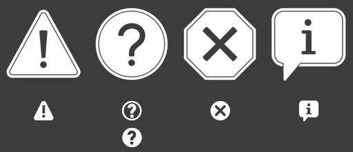
They are nothing more than a mixture of jendrzych icons in draft, but I think they conform to the comments in the thread.

My 2 cents for volume a cloud inside a wireframed cube ?
That cloud is perfect. Left and right versions work well. Although the left version of the hair looks like grass (or even the Sydney Opera House).
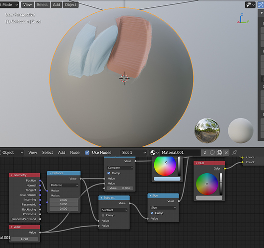
I like the idea behind the sculpt tools preview. As for the method, I would suggest you to have one ball and do the math in shader. (see linked .blend file)
https://drive.google.com/open?id=150x9D7tHXhKSEyQtO9uP7wnNPbHy9Pg1
Ooooh that’s clever. And works so much better than the flat shading in current icons.
@jendrzych - Sorry to be a make-work project, but I was hoping you could look at altering one icon…
Now that we have large versions of the warning icons, one of the matching small versions doesn’t match well enough. The “Question” one is white on transparent while the others are transparent on white. If I give the same coloring to each set that one doesn’t get as much weight as the others and takes on mostly the color of the background.

That one question mark icon was the reason I had to add the background behind the icons in the Info Editor reports. But if changed I can get rid of that. Although I might have to give a think to the use of “checkmark” in some reports as that will look a bit thin too. But one step at a time…
Done - check the first post.
Awesome! Thank you!!!
Now - tell me if I’m wrong: the new Volume Object is all about the volumetric data. Istn’t it? The way of volume object is represened with some kind of 3-dmientional grid of “points”.
If so, a cloud/fog/smoke is just a bunch of things amongst other objects that VDB data can be used to visualize.
Am I right?
That’s what I meant when designing the icon for VDB volume file (which is in the icon set for months already).

just to add my 2c here … i’m a big fan of the current icon of the VDB files, slick af!
It’s not a grid of points, it’s a grid of voxels (3D pixels). There is a concept of points stored in a grid in OpenVDB, but that would be a pointcloud, not a volume.
To me that icon is just really confusing because we will have a pointcloud object that actually is a collection of points. I would not accept an icon for the volume object that uses points, it’s misleading.
I reasoned that these big danger icons …
I dare say they reflect fear psychology of this historical period …
for me they are a little too big,
but I probably don’t perceive the danger as dangerous as it really appears: 
Ok - got it.
Will continue the research, because I find the current smoke pictogram to be way to detailed and clumsy.
![]()

Personally I liked this one more, since it looks more like smoke or clouds. It’s more organic, which makes it easier to identify as a volume:

To many small details. I made it simpler and better working in 16x16 size.
To be honest - I don’t like a smoke at all for a volumetric object.
BTW, will the Smoke Modifier stay?
The smoke modifier might generate a volume object at some point. Not 100% sure how it will work exactly.
So, the question is: should Vol. Obj. and the Smoke Mod. share the icon?
We currently have a fluid simulation modifier that is used both for gasses and liquids, no smoke modifier anymore. In the future you will be able to add that fluid modifier on volume objects.
This can then be used to generate smoke or fire, but also for applying physics simulation to an existing volume. Basically, it will be the simulation/physics modifier for volumes, and maybe the icon can just be something related to simulation/physics.
@billrey Speaking of icons, Pablo has mentioned before that the icon color for the Multi-plane Scrape tool should be red.
