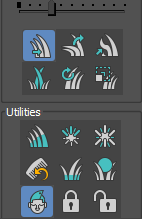
The 3d cursor tool icon can be a bit more consistent with the icon in the viewport and with the ones from transform orientation and pivot point in the header.
1 Like
New types of Objects are coming - Volume, Point Cloud and Hair.
First sketch of proposed pictograms:
![]()

19 Likes
the hair has too much rounding. How about something similar to any of these
4 Likes
Well, it follows visual style of the rest of icons - take look at all Object pictograms. I can make bottom parts less rounded, though.
It would also help a lot if the 3D cursors cross continuted completely into the center. At the moment the lines just stop somewere making it impossible to see where exactly the center of the 3D cursor is.
Basically something like this:

About the 3d cursor toolbar icon: if we are to stick with an additional accent color and if this is necessary can this be the orange that is already used by selection tools icons instead of the current red. It looks kind of jarring, and the typical blender orange color is nonetheless used too little IMO.
As the 3D Cursor now is a real 3d orientable gizmo and as that has impact on other operations, why not start thinking about unifying its look and its functionality ?
11 Likes
Thanks. I think the existing icons for volumes and point clouds communicate their purpose better though.
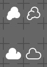
Volumes are typically used to represent objects with soft boundaries, like clouds or smoke or fire. These vertical lines don’t really match that.
For point clouds, this icon makes it seems as if the points would be in a regular grid layout, which they are not. For simulation there are volume grid based (Eulerian) and free point based (Lagrangian) methods, and I think that distinction should remain clear in the icons with points in a more random arrangement.
3 Likes
Do we really have any existing icons for Volume and Point Cloud Objects?
The point cloud is’t the best, I agree, but the Volume Object pictogram is a thickened version of Volume File icon, which was introduced some time ago and was approved.
EDIT:
I downloaded the fdc784649788 build (2020-02-27) and I see the “smoke” icon - it’s good indeed, but I find the silhouette way too similar to Metaball. That’s why I designed the C22 pictogram (Volume File), to be different from smoke symbol.
I still don’t know, how does the already existing Point Cloud icon look like - can’t find it in the experimental build.
The current “smoke” pictogram is way to detailed IMHO.
I tried to make it a bit less complex (the current icon - top rows, proposal - bottom rows):
![]()
6 Likes
![]()
7 Likes
Not a big deal, but can we have icons for the new Face Sets feature commands?
They look kinda ugly as text only in the pie menus… ![]()
1 Like
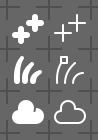
Hair and volume look fine to me this way. But it’s unclear to me why you’d use cross rather than points, it’s a point cloud after all, why not just have a few points?
2 Likes
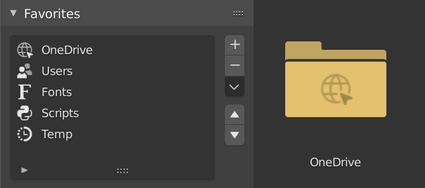
IMO the top one is better, because the common association with the bottom one is cloud computing as in for example cloud storage like onedrive.
2 Likes
I agree that the cloud icon is not fitting for volume since it makes me think of something stored on the cloud, not a literal cloud i.e. fog volume. Something more freeform like the one it was modified from is better. Or perhaps try representing a light beam (god ray) as an icon?
Yes a cloudicon is associated with cloud services. Perhaps you should go for a typical column of smoke shape and not a cloud. More like this:

4 Likes
That one bears no resemblance to its intended meaning in my opinion.
Maybe focus on the idea of fog? Maybe either of these could be a starting point:
Nice shot, but the first one reesembles the Forcefiled icon way too much.
Still searching, so don’t stop throwing ideas.
@Keavon Are we both talking of volume objects? Why do you find mist better?
Typically gaseous emissions, like explosions or columns of smoke have a central emission point and tend to expand with increasing distance from that emissionpoint. I’d choose that path for an icon as that produces the most recognizable shapes to my view.
@jendrzych Or you could display a cube half filled with water with a stylized wave on top.
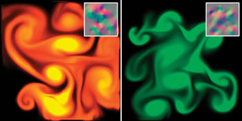
Or a simplified version of some smoke twirls like these borrowed from this gpu gems article
Hmmm… hate to waste that nice cloud icon though. I might be able to find some use for a generic icon for cloud file services like OneDrive, Dropbox, Google Drive, etc
3 Likes