In that case I would definitely suggest only having one point on a line without the points to the left and right.
They’re so much better than the current set, I agree!
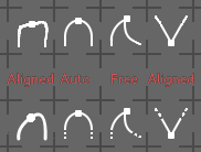
Here are some more sketches:
In that case I would definitely suggest only having one point on a line without the points to the left and right.
They’re so much better than the current set, I agree!
Here are some more sketches:

I posted these to @jendrzych but best to take part in the discussion here.
I think, for Auto and Vector, we shouldn’t show the handles since they are automatically set in those cases anyway.
For Aligned and Free, the handles are the important part.
If it’s cleaner it might even look better not to have the points on the end of the handles, the handles could just be lines.
I wonder how well that would read though, what I picture in my head would be an X with a dot in the center (in the case of Aligned)
It probably depends how much room there is to play with line weights.
Hey here’s my try:
Aligned / Auto / Free / Vector
![]()
Ha!
Auto, Aligned, Vector, Free

Looks like a dance floor ![]()
![]()
Need one more icon, “Auto Clamped”.
Pure saturday night fever.
Auto Clamped, Auto, Aligned, Vector, Free

The new icons are good, but how will it look in comparison with the dope sheet editor? After all, it is logical that they be the same.
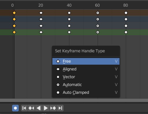
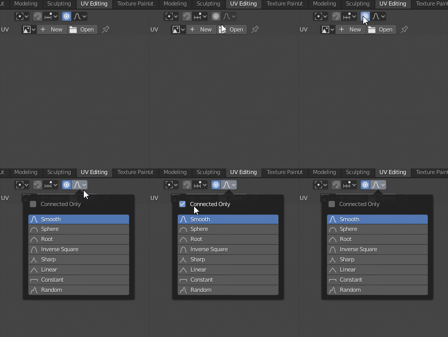
UV Editing - Proportional Editing bug icons
Proportional Editing in 3D Viewport
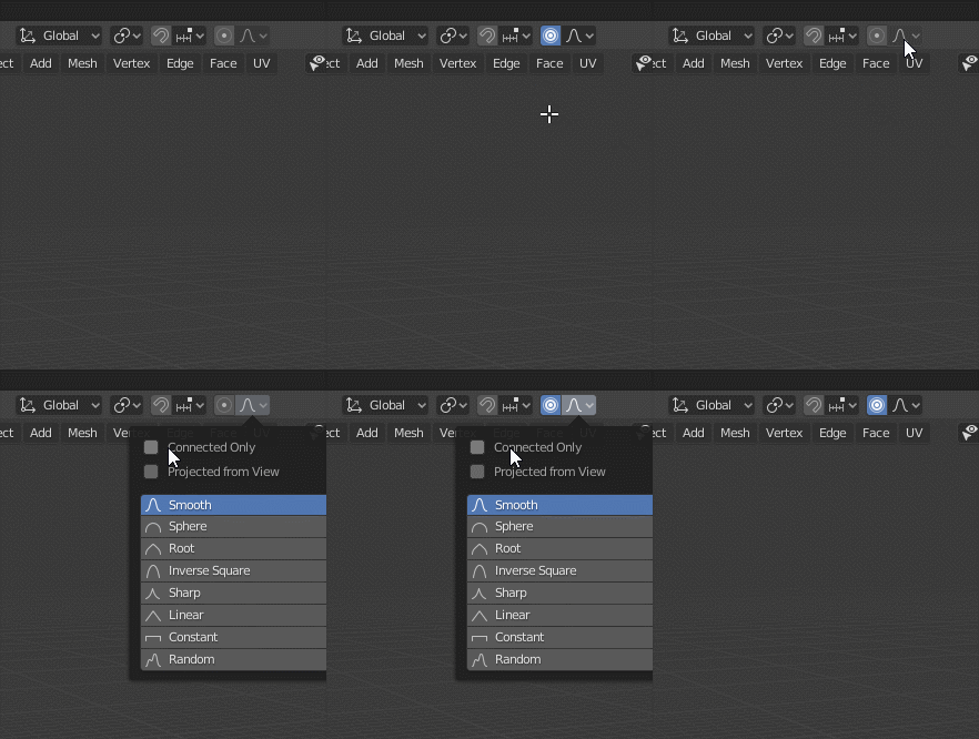
Thanks for report. Can fix.
Yeah, that’s I guess not great, but I think it’s worth it to have meaningful icons. I would just hope that these icons aren’t how the points are drawn in the dope sheet.
Those icons are drawn with OpenGL afaik, so adding these new ones should not affect those.
Or unifying them…

Kinda overloaded, isn’t it?
Maybe a little weight loss is possible.

I like it! There should be room now to push the circles back to the top of the arc now, they make more sense there.