I like the Python play button! I like that it doesn’t just look like any file, it’s clear that it’s for Python scripts.
4 Likes
it’s just an idea for the top-left corner. i prefer the proportions of @jendrzych’s design.
These two are some very good free resources for minimal icon design, in case someone will need, even only for inspiration
4 Likes
this is a very handy kind of recource
1 Like
FF and REW named icons are not icons for fast forward and rew, but for first and last frame.
Proper FF and REW icons should be added and TRIA_RIGHT/LEFT_BAR should be used for first/last frame instead.
Hi @jendrzych. Both are very well done. I’d prefer the python one slightly personally as it’s so clear to read, but I’d be careful here, not sure if it’s allowed to use an alternated official logo in this scenario, I guess that 's still prohibited by the copyright and you’d need to ask for permission explicitly before use. Not sure.
I asked for permission to use the alternated logo by the time I made icons for 2.5. Several different icons using the Python logo were created then, and the Python Software Foundation said it’s ok, as long it’s all related to Python scripting itself.
Thats great!  Then I’d vote for that icon. I find it very convincing!
Hi @jendrzych! I was talking with @billrey about the handle type icons, which currently look like this:
![]()
(Vector, Auto, Free, Aligned)
These icons are a bit cryptic. It’s hard to tell the relation between the shape and the handle type.
We also have the curve type icons:
![]()
Might it make sense for the handle type icons to take some inspiration from the curve type icons? The same curve shapes with control points and handles added could be a good start.
Could You - please - say something more about those “handle” icons? Where to look for them in the GUI? What they depict?
Indeed, I think you would need some more explaining.
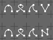
These will be used in the curve profile UI widget. Currently these are used:
These are just ‘stolen’ icons from the proportional editing falloff. Here they change the type of point between a curve or a sharp point.
A new patch adds more kinds of curve points (Vector, Auto, Free, Aligned).
Instead, I think we should create four new specific icons for this.
Vector:
Auto:
Aligned:
Free:
I was thinking we could make little icons that show this, with a curve and some handles
1 Like
Thanks! I should have been more specific. The icons are also used when you press V in the graph editor or in edit mode for a curve in the viewport, I think it makes sense to rethink those too, and they would probably be the same.
What is the difference between Auto and Aligned?
Could You point me the exact place in the GUI, where I can play with those handles?
https://docs.blender.org/manual/en/latest/modeling/curves/structure.html#handle-types
https://docs.blender.org/manual/en/latest/editors/graph_editor/fcurves/introduction.html#handle-types

I asked for the place where the “curve profile UI widget” is in the GUI, not the Bezier Curves 
Bevel Modifier - Custom Profile.
1 Like
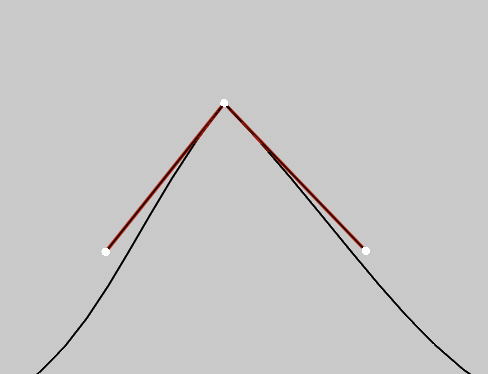
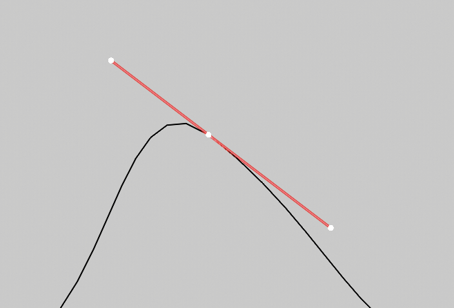
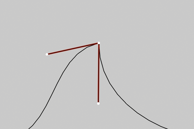
Auto makes it so the handles are automatically angled so they follow the direction of the curve. With a hill like that it will be straight.
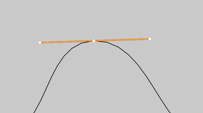
Aligned makes it so the handles are aligned opposite each other. You can’t make it sharp, if you will.
Aligned / Auto / Free / Vector
9 Likes
This is already a huge improvement! It’s going to be good to have better icons here. I have a few comments though.
Overall
I might focus more on one of the points, maybe something like this?
![]()
It also might be good to show the handles and the lines going to them in more cases (free?)
Aligned
This is probably a hard one to get different than the others, this one is “normal” enough that it looks a bit more like Free to me.
Auto
I’m not sure about the cross, as that’s generally not something people aim for.
Free
I like this one! Maybe making the left curve a bit different too would help distinguish it from the others.
Vector
I like the top one here, it lets us just think about the handles of one of the points.
Thanks!
1 Like
The icons are tiny enough to justify getting rid of anything that’s not crucial for the depiction. Handles would be nice to have, but they won’t make pictograms clearer. So that I omitted them. Aligned and Auto are so much similar at first glance, that it’s really hard to portray them without a confusion. Having this in mind, I designed those two as two different, yet smooth shapes, that are as much distinct from eachother as possible. Still a bit cryptic though, but way better than current set of icons.