If you set website theme to dark it will provide dark background, then you can zoom in on webpage with ctrl + mouse wheel:

Example at 200% zoom:
If you set website theme to dark it will provide dark background, then you can zoom in on webpage with ctrl + mouse wheel:
Example at 200% zoom:
That dark theme is not a bad solution. Thanks, you two.
To be honest, although icons are pretty and save space, the advantage of a piece of text is that it clearly communicate what the button is doing  But if we go for an icon, I would suggest a play icon, which is the most common icon for running a script.
Just to make one thing clear: Run Script is available in the View menu as text.
Not a fan of triangle + line, because it makes it look like a terminal, but it does not actually execute in Blender’s console editor. File + triangle would make more sense.
I feel the same, but also, that little underscore is not very visible.
Paul’s positioning of the play button in the lower right corner also emphasizes that it’s not the “running” that’s important for that button, but the script lines which takes up most of the icon. Otherwise it risks being confusing with a play animation button or something similar.
However, the number of likes between Paul’s and Jendrzych’s mock-ups show that we’re in the minority unfortunately. 
How about a “line striped” play button?
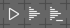
Which one of those did You have on mind?
Haha, you’re quick! I was thinking about the middle one, but I think the outlined version could work too.
Personally I tend to agree with those writing that we should stay away from the terminal/console-horizontal line, because scripts are not only for use in the consoles.
At least all of them will not say, that they’re for playing the animation, however if this also solves the idea that a script can be started, stopped and paused(which it can’t in the Blender Text Editor), I don’t know?
It doesnt really make me think of scripting. I think the play button with the dash or the play button in the brackets work the best.
personally I really like the third on the right with the cursor ![]()
The solid “>_” icon is perfect. Everything else that has been proposed is vastly inferior and less clear.
It is only in the System Console the cursor is horizontal. In the Python Console and in the Text Editor the cursors are vertical. And the System Console already got an arrow and a horizontal line as icon.
Maybe this bugreport can be solved with some more accurate icons:
https://developer.blender.org/T71082#801450
How would a normal sized and centered play button on top of the striped/lined icon work?
The normal size is very big. A bit smaller could look like 3:
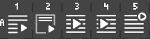
Or this: ![]()
All of those look like some sort of Playlist.
What about combining the python icon with a play arrow
I’ve asked William to pop by, so he can choose one of the many ideas here for run Script, so we can get this settled.
In the meantime do anyone have some ideas for this one? https://developer.blender.org/T71082 where the text can be positioned in 6 positions relative to a x, y point. And each one positions of those should have new and more accurate icons.

