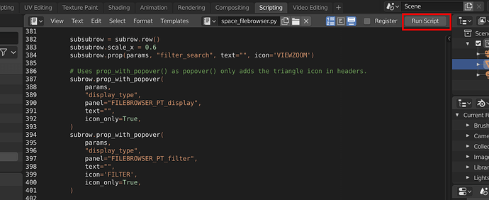
What would be a proper icon instead of the “Run Script” button?
Discussed here: https://developer.blender.org/D5686
 ?
?
It’s ambiguous, so no - a running man isn’t a good depiction for “run script”.
We already have a “Play” icon -E2. Haven’t we?
QtCreator, Pycharm, and other ides use a green play.
![]()
Play button was suggested here too: https://developer.blender.org/D5686
But apparently it can be read as something you can stop or pause too.
Maybe a kind of “start” related symbol will do?
A start button (on/off)? Yes, we use it for “Quit” the Blender, but this can be swapped with other, better suited design…
A launching rocket?
A checkered flag?
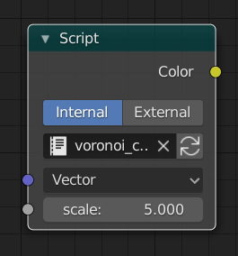
I’ve noticed that the button changes whether the script is a python script or a shader, in the latter it becomes “Script Node Update”. Should be considered I guess.
I wouldn’t tbh, the scripts runs only once when you click on the button, it doesn’t stays on.
What about the other two symbols? I mean - rocket/flag.
I wouldn’t personally mind the play icon for this actually, substituted with the update one for OSL scripts, as we already use it here:

Generally I like the idea of using the play icon. It’s probably fine to consider this the standard icon for this kind of action.
However I do see an issue. Other editors/IDEs don’t have any other playing action. For them the only thing that makes sense to carry the playing metaphor is running the application.
In Blender we do have the concept of playing animation. So there is a conflict here. Not sure how to solve it. Maybe the button with the play icon should simply say “Run”.
I don’t understand that problem, play in one editor is not the same than in other editor.
But in any case you could made a Play icon over a little gear icon
If you google ‘execute and icon’ a play button inside a gear shows up.
The only complaint I have with this symbol (a gear with play triangle) is that the gear itself is used for Preferences now. Such depiction reuse must be avoided, otherwise it will be confusing.
If we have a program that allow thousand of different behaviours some icons must be the same. So, or we use colored icons or in some moment we will have this problems.
It’s not my decision, but I like the creativity of your thinking: icons signifying launch or start.
A checkered flag signifies the end of a race, not the start.
Okay, then we’re down to one idea:
Or a “play” triangle in curly braces.
![]()

Personally I would just use a plain and ordinary “play” triangle. But that might just reflect my lack of imagination, or lack of coffee this morning.
Maybe also the console icon without the frame could work
![]()
