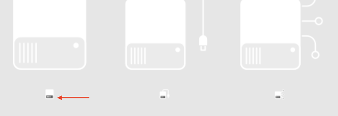
@jendrzych Do you think we could have a checkmark included in the set?
Yes, we’ll have it soon - it’s in the upcoming update.
EDIT: @tintwotin - it’s already there - CA11
Thanks! Hopefully will play soon and give you some in-place samples. My build environment is just suddenly borked though. Hopefully will get fixed soon.
These look quite good to me.
Only thing I’d change is probably make the local drive icon the same height as the network or external.
Looks slightly out of place that way, I’d probably match the body size so they line up.
BTW, is it intentional that the smaller size for drive icons has a filled grey background?
Difference in size is intentional.
“smaller size for drive icons has a filled grey background” - have no idea, what You reffer to. All thumbnail icons have parts that are 15% opaque. Small icons are plain flat with neither shades of gray nor semi transparencies. Check out first post - I just updated the set.
The smaller ones have a solid grey background in the lower part. I guess this area is supposed to be transparent?
Ooops… my mistake - I used unfinished items for this mockup. Those dark grey parts were about to be substracted from the Drive bodies. There’re empty areas there now.
The P25 icon is shifted.
Why not put the plug and network differentiation on the top of the hard drive icon instead of on the side ? And make them all same size.
- Drives are rectangle shaped, with one side longer and it’s more convinient to depict them vertically rather than on their side. Icons are square, so there’s always more negative space on sides of the Drive pictogram.
- Built in drives are more important than external ones. The size difference makes it easy to spot them at a glance.
Why does the internal drive have a fan grille, like it has the enclosure from an old external drive? They’re SSDs these days, aren’t they?
And wouldn’t an external drive be better distinguished by having a USB thumb drive shape?
The current single wire vs multiple wire network drive design is also difficult to differentiate between at a glance.
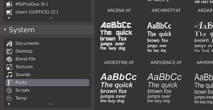
Was playing with custom icons in the File Browser quick lists. It might be nice to have something to represent a “Documents” folder and maybe something that could be used to represent “temp” too. Here I just used some existing icons to fill the gaps:
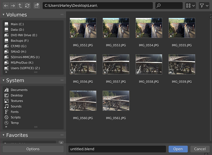
In practice I don’t think it would be that bad. The “Volumes” list is sorted, generally quite short, well-known to the user, and there are labels and details added to each item too. Here is mine for example:
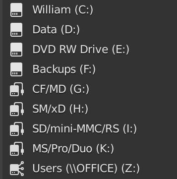
View on my machine after this patch is applied: https://developer.blender.org/D5802
Note that the patch adds the ability to have different icons per line item, but only does so for Windows for now. A Mac developer will have to do so similar for Mac for example. Ditto Linux.
Time ago somebody told that blender experimental must to have an icon. Before I think that with the actual state of blender experimental, that each day we have new tools importants for user, like remesher, could be good implement that idea and use a different icon for official release and experimental builds to differenciate in the taskbar.
Some new items are coming.
Stay tuned!

The Rolling pokeball
After designing icons for multinational companies a few decades ago, I now believe there SHOULD BE AN OPTION TO SHOW THEM AS TITLES / LABELS (maybe just a momentary-while-held-down Hotkey). The push to maximize screen-space with micro-mini cryptic icons off to all sides is entirely unnecessary, given that EEVEE requires thousand dollar graphic boards that all have muti-monitor support. It REALLY bogs down the learning process for an experienced pro (with 2.79 and before) to have to hover over each one at a time to find out what the **** it is. Thanks for consideration.


