Yep. The square with paint blotch was designed for the Image Editor itself. Both - the Outliner and the Sequencer must use proper Picture File pictogram.
@natecraddock - I updated the icon sheet with the Action modifier and two new Strips icons.
@natecraddock One more thing - Effect Strips do not have their own icons, so Outliner should use the generic Effect icon (the Magic Wand) instead of the Particle Modifier icon.
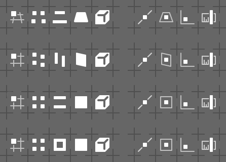
Changes in the snapping system are coming. Some of them require icons to be redesigned, since similar pictograms may be used for pop-over menu and for snapping target indication in the 3D View editor. Current design is too busy and complex for such task, so simplification is welcome.
Some sketches:
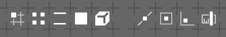
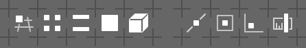
The only icon that i dislike is the volume one, that cube with the twisted Y. It might be consistent and it might speak the icon’s language, but it barely resembles a cube to my eyes. Maybe in that case havin bold edges is not necessary? since the bold thing should be the whole object (and it already is). The Y may just be a visual hint to show the 3d nature of the pictogram. Enough text: like this
I like that little tweak, agree that the negative edges on the cube were too bold. What’s the space in the middle for ? Are we keeping this for another snap option ?
Nah - the blank space is there for pure technical reasons. Nevermind it.
BTW I just realised, that the skewed grid icon is way too similar to 3D View editor’s pictogram. I’ll use the previous ortho-version then.
Regarding @Hadriscus’ and @lsscpp’s remarks, I made bold inner edges of the cube (the Volume icon), because with thin lines the shape of the very pictogram is too much similar to the Face icon - big squarish blotch.
@jendrzych
In the tracking area.
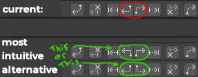
I think that these buttons should be the same but in this way as in the green proposals. Because they do exactly the same thing only the other way around. As it is now, they seem to do different things and I find it less intuitive than my proposal. What do you think? Greetings.
The one I like the most is the last one.
Also applicable to refine markers.