The bottom row of drive icons looks very good now! For the Desktop icon, can you figure out a way to make the bottom horizontal line appear thicker to imply “start menu” or “dock” rather than what pops out in my head right now, “monitor stand base”? It looks like, in attempting to give it more of a unique silhouette, it sacrificed the continuity of form that gave the start menu/dock both shape and relation to the rest of the desktop. Do these all need to be single-tone icons, or can you do two-tone with them? Either way, maybe it would be helpful to explore the idea of making the start menu/dock checkered (either every pixel, or every other pixel). Another thought I just had is that the aspect ratio is wrong to imply “desktop” because most monitors are 16:9, and that might be a reason why the detached horizontal line underneath the desktop is making me think “CRT monitor stand” because CRTs were 4:3 aspect ratio and had a stand right below the screen. Perhaps cutting off a couple pixels of height can make it seem more like a desktop because it fits the aspect ratio we have come to expect in our minds. You’ll probably have to reduce the desktop icon squares to a pixel smaller, but I think that would be fine. After doing some research on icons for desktops, I’m realizing how hard it is because desktops are quite devoid of detail and shape.
To be honest, is it really crucial to properly recreate a 16:9 monitor in order to depict the computer Desktop? My first try was to make sth that resembles the Start menu / the Dock, but than I realized that I’ve got way too few pixels thus the pictogram is kind of abstract. It may look like a monitor / laptop with some icons on the desktop. At the same time it may be the actual desktop with kind of toolbar in the bottom. But it will never be a scaled down picture of actual thing. Reducing “icons” to 1x1 pixel size will make them less important, while those icons are clue of the pictogram, defining its shape.
Anyway I agree, that thicker bottom line looks better.
![]()
But making the main rectangle one pixel lower together with thin bottom line istn’t that bad as well.
![]()
I don’t know if 16:9 is required, but it was one thing I came up with when trying to trace the design’s concepts back to their roots. I don’t know if it is crucial in recognizing it, but I do think the human visual interpretation/distillation of a “computer desktop” might imply the concept that it’s wide, not a square. I could be totally wrong about that, however.
I particularly like the empty square for one of the three icons (squares) in the desktop. I’d be curious to see other permutations to the squares being filled or empty.
I like the one in your second picture a lot! The thicker line in the first is decent, but looks too disconnected from the concept of the desktop above it. The second one stays more connected and also helps because the aspect ratio is wider and it feels more like one, conjoined concept instead of a boxy thing on top of a platform for the boxy thing.
I’d still be curious about seeing permutations of the filled and empty squares for the three desktop items (perhaps they could be a tiny, marginal improvement, for example the Recycle Bin is usually the top left icon so having that one be different could make slightly more sense than just a random one). But I think we have a winner, this one does a really good job at conveying what it means in the very limited space available.
That icon would only be used to decorate (larger) folder icons to indicate that they are directories containing operating system files. Just as we’d probably dim out files and folders normally hidden by the operating system.
Ah, then that icon looks perfect for that purpose as-is! Awesome job as always, @jendrzych.
Yes, they are awesome as always. I especially love how he made the different drive types so consistent with each other.
“Desktop” to me looks PERFECT. Mostly because it will be among only a few things so will be obvious by context. In this case it is hoped that we can show some items uniquely in the “System” list of the File Browser. All items there now look like bookmarks, but would love to show “Desktop” and “My Documents” in a special way to make them quicker to recognize. Especially if we ever combine some of those lists together, for example a single list showing Volumes and System shortcuts.
Who suggested such icons here at one time, why not add icon options for understanding on everything?
To mark the seam and remove it for the bridge and other options.
I had this picture saved, the two on the sides are so good, some are not necessary anymore with the RMB context menu, but if some things that are missed from the old T panel would come back with these icons would be great. The T panel is now so empty…
Nice! A couple suggestions to make the full-scale icons as awesome as the thumbnail versions:
- Make the arrow on the “up a directory” full-size icon white (but keep the folder dark) to emphasize the action and deemphasize the folder (because it’s not a folder in itself)
- I feel like the full-size drive icons have details on the front/face of the drive that are too small. The vertical lines and really skinny and packed together and the top right circle is also miniature, and it visually unbalances the scale and proportion of the detail in the icon. Same for the cord and plug, which would probably look more balanced in proportion with the large drive if the wire got thicker and plug end got larger.
The “Go up in hierarchy” will most certainly go and won’t get to the new File Browser. Regarding the Drive details - de gustibus non disputandum est, as they say. I like it like that and don’t find them unbalanced. Anyway, I’ll make more tests to make 100% sure.
With my outliner branch now in master, we need a unique icon for action constraints. It could be a copy.
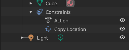
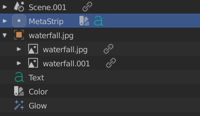
Also outliner icons for sequence types need some improvements. Certain sequence types are nested when duplicated, so the parent needs an icon (using object data icon currently). Meta strips don’t have an icon either. I’m not sure if all of these sequence icons need to be a consistent color though.
We’ll duplicate the Action icon for now.
Provide me please a *.blend file with nested sequences and Meta Strips - I don’t animate, so have no clue how those functions work. Cant propose a soution without havin’ basic knowledge about those very items.
So, what’s the Meta Strip?
What’s the sequence parent? Do other sequences have their icons?
wait, what’s this now? the new file browser won’t have a button for going up one level in the heirarchy??
I meant the very icon. Suppose the function will stay, but not the way it works now.
It’s in talk. Supposedly it’s an old concept ! God forbid it’s actually useful !
cool, so long as I have an easy way to go up I’m happy!
Meta strips are like groups. Similar to node groups if you know what those are. You can select multiple strips in the sequencer then press ctrl+g to group into a single meta strip that can then be used as if it were a single strip.
The other case, called TSE_SEQUENCE_DUP in the code, is for strips with the same name. This “duplicate strip” idea seems to be outliner-only. This happens when adding a movie clip with audio. The video and audio are loaded into separate strips and grouped. This also occurs when duplicating a movie, image, or audio strip.
As far as I can see other sequences have their icons. I will let you know if I find any other exceptions.
Here is the .blend file. The link will expire in 7 days.
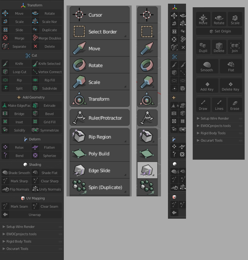
Object (Cube, Sphere, Etc.):
-
Hex: D2A172 (Clay)
Or - Hex: 7F7C7A (Gray Hawk)
Transform Arrow:
- Hex: 2DA8DA (Blue Blossom)
Merge, Delete, …:
- Hex: D02D23 (Red Maple)
Cut handle/line:
- Hex: FE6D00 (Orange Slice)
Geometry/Extrude:
- Hex: 00A93C (Green Spring)
Deform:
- Hex: 57316B (Purple Pak Choi)
UV Mapping:
- Hex: B3B3B0 (Gray Day)
![]()
Meta on the left, Dupli. on the right of each pair. The pair on the right is clearer, but the one on the left is more accurate regarding the visual language. I’d opt for clearity over accuracy though.
Besides I can see two minor problems that must be fixed before the release - Outliner uses wrong icons for Picture and Movie strips.