The question is not what is the difference between vector and raster icons. It’s OK if the Blender will use the vector icons directly. Or even better if it will support both formats, especially for user custom icons.
The question is what is the benefit of using “OpenType-SVG font file” versus for example “zip-folder with SVG files”.
You will not use the OpenType font features for icons. Inside the OpenType-SVG font is the same svg-content as inside regular SVG files.
And anyone could change the icons by replacing the single file.
No one (regular user) will be able to create this (font) file.
Any Blender user can create a custom PNG icon. Not all Blender users can work with vector graphics and have appropriate software. You also need a tool to optimize and clean up SVG code (especially if you are using Inkscape) and you need a some tool to generate a font file.
@jenkm I think @Harleya’s main point was that Blender rasterizes fonts already, and that’s functionality we could use to automatically scale icons to the desired resolution.
As to why not SVG’s directly: as far as I’m aware, vector UI is still a good bit slower than pixel icons, although I think the Active Tools use polygonal data instead?
Ah. For that second option we’d need to write a large and complex library that loads those SVG files, interprets the text encoding that comprises that standard, and then output bitmaps representations of those images at the required size.
For the first option we just have FreeType, a library we are already using, do all of that
The custom rendering of meshes for icons is not precise enough to work for the small icons. Ideally we would streamline and unify how we handle all the icons in Blender.
On Mac & iOS, you often supply vector art in PDF format, but that is more of a historical curiosity because of NeXT’s use of Display Postscript, which became Display PDF/Quartz.
Yes, very true but that is a known issue with vector fonts that we deal with via caching. So whenever Blender needs a particular character glyph in a particular font size it first looks in a cache for it, if not FreeType rasterizes it for us and we stick it in the cache for next time. So icons would benefit by this system that is already in place.
And we could have more icons available than just the Blender-specific ones we are currently talking about. We could also ship with a generic icon font as well, like Typicons, Entypo, or FontAwesome. The Material Design Icon font contains more than 1000 icons and is only 550K.
About icon constrains can we have some sort of color grouping of those? like if constrains are from similar family can we make it same color for example.
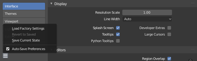
I wanted to point out that Blender is misusing the hamburger menu icon.
This is not a hamburger menu:
Neither is this:
Both of those are overflow menus, so a hamburger icon is incorrect and confusing. In the user preferences window, for example, a user might expect clicking the hamburger icon would open/close the left sidebar.
A proper icon design would feature a meatball or kebab symbol (horizontal or vertical ellipses, respectively). A kebab menu icon (vertical ellipses) tends to be more common and idiomatic for this case because the menu entries extend vertically.
For the user preferences window specifically, it might be worth considering an alternate icon such as a gear, however a kebab would be appropriate also. A hamburger, however, is definitely not.
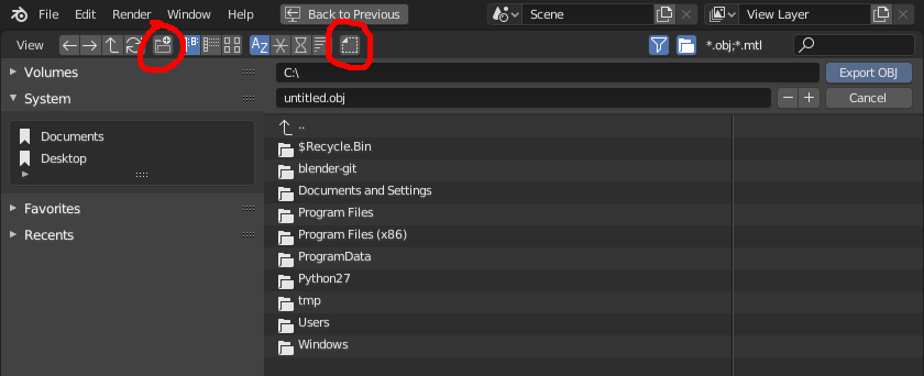
Could the design of the dot files icon be changed to make it look less like it implies “new folder”?
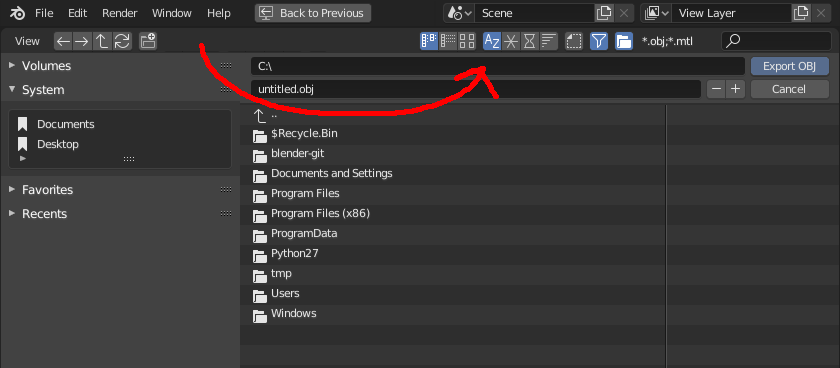
I think another large factor in my constant confusion with that icon is due to placement. The right of the icon group is just a sensible place for a “new folder” icon, so that’s where I assume it should be. When there’s a sensible-looking icon for that task, I frequently click it. If we can instead move that whole group of icons to the right, leaving the actual “new folder” icon exposed intuitively at the end, that would solve the problem.
(Perhaps the “View” label could be removed, since it may be less relevant then.)
Considering there is already a “filter” and “show folders” icon on the right, that seems to be the logical place for that whole group of icons related to the file system view options. At the very least, the “show dot files” icon could be moved to the right and put beside the “show folders” icon, because those are both the only two icons dealing with showing/hiding entire categories from the list.
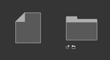
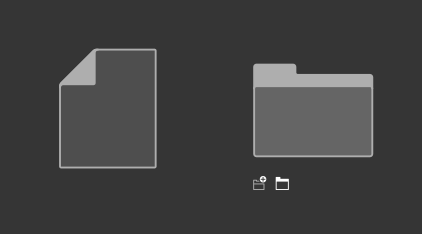
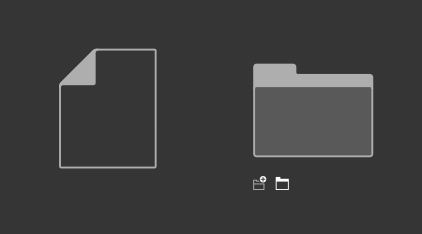
The fill really helps to solidify the file, otherwise it looks very much like a white box. I would keep the fill I think. The silhouettes are different already.
I agree with billrey. No need to remove the fill when they both have distinct silhouettes already. Plus, it adds some extra contrast so the icon doesn’t blend into the background.
Any way to vertically align the drive in External Drive and Network Drive?
I don’t think Desktop is very clear. It makes sense when you look at it and think about it, but it doesn’t have a very immediately obvious silhouette or shape.
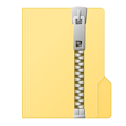
See if you can improve the Zip File silhouette by making it like a manilla folder (taller than wide, sharp left corners, rounded right corners, tab on the right). The current sharp-edged square is not very unique or easy to interpret without thinking about it.
What does System mean? That icon does look like a system but I am unfamiliar with what that is used for in Blender.

 . I was just using your comment as an excuse to elaborate a bit more for anyone else interested.