14x14 pixels is too limited to convey such complex depiction.
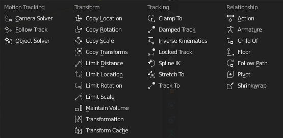
○┄● This is Damped Track (and Track to Constraint, since both of them work very similar; the latter one will get the icon with both circles empty). This one: ○┄| ● is the Limited Track, on the other hand.
Regarding the beak, I’ve got one filled with liquid, but found it too strong with solid fill.
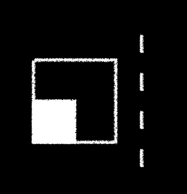
I managed to make this clamp in a 14x14 pixel canvas, it isn’t vector so there is no anti-aliasing but it would look much better that way.
You’re right there is definitely no room for the lines/dots through the clamp. But maybe the dots or lines can appear above and/or below the clamp in some small form.
Maybe the distance one could use bigger indicators though, something like this?
As I already said, I’m definitely contrary to the use of the clamp… even if the common path symbol I did is out of the way, maybe we could still try to make it similar to the spine ik (and possibly also follow path), with a design similar to the ones you did before, like this:
I also tried to revisit “Floor” in the style you used for the tracking ones:
I’m not a fan of the clamp as well. Things are pending, though.
Talking 'bout the Floor - I’d get rid of the filled sphere. Will make some tweaks this evening. Now have to earn some money
In the meantime, the actual panel with some of the new designs, plus my tries for clamp, follow path, floor and transform cache (I did the latter last week but I forgot about it ):
Mind that Your concept doesn’t fit well the Copy an Item paradigm - it will be tad to noisy. Two hours aago I proposed slightly different Limit Distance pictogram, based on the Distance Driver icon. The Limit Distance and the Distance Driver should be further refined to make them look more consistent, though.
@a.monti - two remarks:
(1) all transform related icons use different symbols. They must be unified. The (x) in my proposal is the shared element that says: this item is about the transform. It’s consistent with Transform Driver as well.
(2) all spline / curve related icons You’ve made look too similar to Rotation. So, IK Spline, Clamp to and Follow Curve could share the same curve. I’ve some sketches ready - will post them after work.
Even if this one’s very good and descriptive, it breaks visual consistency of the Limit subset. I’m especially bothered by the way it will look as Copy Scale Constr. icon.
They’re not that related though, especially the cache one, they do quite different things and so having them differentiated would be ok IMO;
also as I said the (x) is really difficult to understand for me, and the way I read it is different than yours. I think we need some more feedback from other people for these ones.
Tool’s icon could get smaller circle and diagonal cursor axes, similar to the small 3D Cursor glyph. The 14x14 pix version optimally uses the available space, which makes its silhouette visually different from the large icon in the Toolbar.
great, also myabe you plan on updating other inconsistent icons that I dont know like the Metaball in the outliner and Properties editor, The force field in the add menu and in the outliner and Properties editor