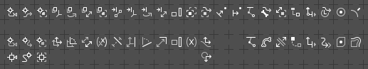
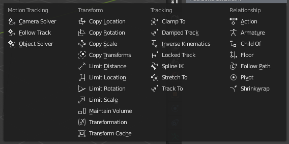
can we make these icons more consistent by sharing same style ! By either borrowing the others transform tools grey and white colour scheme or this can be a chance to give more personality to Blender by using accents of Blender orange colour where there should be grey. Selection tools already have this style.
Partially related to my 3d cursor icon consistency suggestion
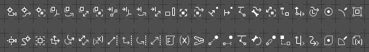
More Constraints doodlin’.
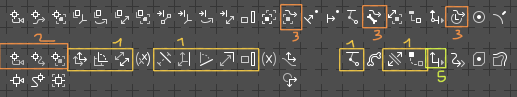
Upper row - @a.monti’s oroginal design; my proposals underneeth with alternatives at the very bottom (some newly designed, some just revamped and retouched):
The Damped and Locked Track are still a mistery to me…
Limit distance: I would remove the part to the right of the limit line, even though it makes it a little less clear, because it currently is confusing how the limit line doesn’t consistently portray a “chopping-off point”.
Limit rotation: This seems to be entirely missing the limit line, all the parts of gray from what I can tell. It currently just looks like an angle between two lines. Maybe, to show that the limit line is “chopping off” part of it, try adding something that can make it clear that the angle being shown is not complete. Perhaps a little right angle square that’s cut off by the limit line.
Limit scale: This one is really unclear to me, it breaks the consistency of using a limit line and turns it into a weird L shape, I have no idea what that’s supposed to indicate. I can suggest this: turn the “scale” concept from a straight line with arrows on each end into an X-shaped cross of arrows, with the new one shorter (to convey the sense that it’s being scaled more along one axis than the other). Then you can use the straight limit line, just as with the “limit distance” design, to crop off or “limit” the scale. If you make scale into perpendicular arrows, do the same for the “copy scale” design.
For all the “limit” designs: I like @a.monti’s idea of using an arrow pointing into the limit line, it makes it seem more like a limit. See if that looks good to have an arrow pointing into your white limit lines. But if that adds too much complexity (especially with yet another arrow amongst all the arrows in the “limit distance” design) then just focus on making sure each icon clearly crops part of the gizmo being indicated, like the “limit location” icon does so well.
Maintain volume: Looks decent but maybe consider something like a beaker with water instead? I don’t have my heart set on it, but I thought I would mention it as an idea, since water in a beaker will maintain its volume regardless of what container it is poured into.
Damped track: Maybe show a noisy and smoothed signal overlapping? I don’t actually know what this “track” category actually does though.
Locked track: I’d definitely add a padlock if you can to make it indeed clear, or some other visual indication that two things are locked together in place like an unbroken chain.
According to the docs it “clamps an object to a curve” so I would draw a clamp (probably the “A” shaped style) clamped to a curved path. It’s not really a pun, a clamp performs the same adjective that is being used here.
Hey! I’ll go through them, hopefully without writing a wall of text
Nothing to say here, these ones look amazing (only ocd thing: I’d mirror vertically “copy scale” to make it face the same direction as the others).
These ones looks clearer to me.
I’m still convinced that, when possible, we should use common symbols for similar behaviours, for this makes it easier to find an icon within such a long list. So I’d personally go with my design here, but yours looks really good.
As I said in a previous post, I’d do this for “Copy transforms” and “Transformation”:
I modified this one the other day, to try to represent that it is another object that limits the location, maybe it can be tweaked a bit more:
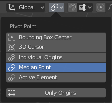
Pivot, my design was aiming to keep it as simple as possible, and also to reference this panel here:
Shrinkwrap, your design implies a deformation that the constraint doesn’t provide, it only puts the object/bone on the surface of the target (it would be perfect for the modifier though, it would be in line with warp)
plz no, it wouldn’t mean anything at all, a curve or path reference is needed here imho.
Same for this: a padlock wouldn’t suggest well the behaviour. What the constraint does is to lock one local axis of rotation in order to make the object look at the target; since only one axis is constrained though, the result is that the object, unless perfectly aligned, will look at the general direction of the target, instead of directly at it.
I made some tweaks in the time @a.monti wrote the above post, so some of his points are still valid. Anyway, here’s it (the transform cache is the last one in the row):
The principle is to design compact silhouettes, that are unique and do not contain composition of several symbols (if it’s possible), due to limited space and for sake of clarity and readeability.
Using established visual language is a must, so:
the Pivot Constraint has to get a bold dot, but the silhouette should be distinct. That’s why it got a simple cuboid instead of a circle. BTW - take look at all pictograms in the Pivot Point menu and look for shared element. It’s a bold dot, not the circle with bold dot.
Transformation vs. Copy Transforms - we double an item to depict the fact that it’s copied. The Transformation icon reads a symbol of a mathematical function - (x) - quite abstract, but good enough and effective. So, copying all transforms should contain more complicated notation (x, y, z, alpha) for instance. Unfortunately, the space’s limited. Since we design a minimalistic symbol of a copy of all transforms [with figurative (x) amongst them], a double Transform icon fits the paradigm and works well in my eyes.
Anyway - the Shrinkwrap, the Floor aren’t perfect, I agree.
I’m really not sure about the transformation thing… That (x) to my eyes represent a single property, so having two of them like this following the same paradigm as for copy loc,rot and scale to me it means that we are copying that single property, instead of all of them.
I’m way more fond of @a.monti’s approach to constraints, where the broad category is combined with a finer category icon.
It’s much easier to follow than having distinct icons for everything.
With the common track, copy and limit especially, it’s much easier to logically follow the dual icons than using discrete icons for each. You can easily pick up the difference between track, copy, and limit. And then again easily pick up the difference between location, rotation, scale. Whereas with the discrete icons you first have to seperate the icon into it’s component parts in order to identify what it’s working on (location/rotation/scale), then analyze how it’s been modified from there to understand which operation it’s talking about (copy/limit/etc).
At a glance, you’re just parsing much more information much easier, you can see immediately which constraints deal with copying, because they all have a common element, and which ones deal with rotations, for the same reason.
This is the last build I did a couple of days ago, in which I recreated the previous Jendrzych’s designs for copy and limit, I don’t have the new vectors though.
they look much better in the actual program. I still like your style a bit more and the icons look more consistent. These and the folllowing modification can also work though.
The limits were clearer in your previous iteration, I think. It was a long white line that “cut off” or “cropped” or “limited” a direction of the different icons. I can’t even parse any meaning out of these ones, they just have a mini line at the end of an arrow (except the rotation one, which is just a rotation down from an angle or something, even more confusing). I think I agree that I like @a.monti’s way of putting the ->| limit icon in the corner, it makes them clearer as a group and gets the idea of “limit” across way better. I like your approach to the “copy” category better though.
yeah thats my impression as well plus a-monti set has more variation in terms of shape and dynamism, there is a nce balance between curvy, dynamic shapes and more squarish static ones. This is only stylistical aspect not that it makes much difference for UX
I might be the only one who has posted a comment about it directly, but my concerns aren’t a personal preference, this icon is actually causing confusion with my students, both in my classroom and in online learning, and it would be such a simple fix.
Keep in mind that there are 11 hearts for my post in this tread (one new from today even), as well as 8 hearts for my post about it on the Blender Artists forum, I’m not the only one who thinks this change would help.
Although I prefer the version with a hammer, I don’t see how it can be confused. There are many much more similar icons. Apparently the problem is how you teach your students, sorry.
Everyone thinks that this is the icon for modifiers when I describe that they are looking for the wrench.
Just show how it looks and where it is located, no need to try to describe the icon.
Fragmentation of the detail should be avoided. The design of icons with the minimum number of components will be much better. I agree, however, that families of pictograms should be recognizable among other icons on the menu. The trick is to find the right visual language and a compromise between the amount of detail and the complex depiction symbolism.
Things starts looking posh:
I help many students online as well (on reddit.com/r/blenderhelp and other sites), so it’s not always possible to show them what the icon looks like, which means a description is necessary. Also as a community we have a whole internet backlog of tutorials describing the modifiers icon as “the wrench” so it’s not just a matter of me trying to change my language rolling forward.
During these formative lessons, learning Blender needs to be as frustration free as possible for new users.
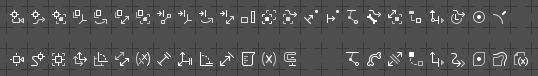
I am really liking this set much better now! The “limit” group is looking great now.
A little feedback about the beaker and clamp icons I suggested (keep in mind I’m not totally attached to those concepts, it is possible they are not the best ways to represent them, so no hurt feelings if you decide to scrap either of them in the end):
The beaker currently looks a bit too much like a paper scroll or a code file. In order to convey the metaphor about water having constant volume, it definitely needs a water line (possibly even filled solid white, or the air above it filled solid white, to clearly contrast them). The graduation is important to hint that it’s a beaker (and to convey the idea of “measuring” the constant volume of the “water”) but it is less important than actually showing the water, so it should probably be slightly de-emphasized. Maybe remove the top graduation mark because it would interfere with the water line, maybe make the graduation lines less wide if that helps also. Additionally, the little bump on the top right isn’t quite clear enough to describe the flask shape, so I would make the beaker lip smaller and give the whole top a slight curve (so it’s not a totally straight-on view, it’s perhaps viewed from 10° above the horizon) to make it look like it’s a cylindrical shape.
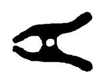
The clamp looks like some fancy “>” (greater than sign), but it’s really hard to tell from its shape what it represents. Could you try making it look more like this simplified icon form?
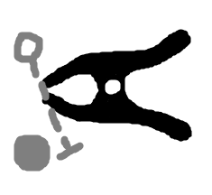
But I’m wondering if we can keep the other part of the metaphor context in, like putting those ○┄| ● style of shapes “in” the clamp, so the pointy end clamps through those symbols? I don’t actually know what the feature does or what those symbols represent but here’s an example of the idea I mean (even though it’s just a random use of those symbols).