Indeed, the Metaball ObData icon in the Properties Editor panel is wrong. It must be fixed to fit the Outliner. There’re more quirks like this one - Text ObData for instance.
I can’t agree with You in regard to the Force Field. The pictogram is just fine, since it’s an Empty with Physics enabled. The Force Field is not an Object itself.
the x is really terrible, anyone who has done any basic algebra is going to think that’s just a variable, in other words, it could be literally anything.
You’re right! It’s a bit confusing, to me at least. No consistency here.
@Antaioz - transformations are really abstract matter which can’t be depicted in one uniform way. Variable fits here perfectly. X, Y, Z, alpha and so on… Don’t see a problem here.
And for this very reason (real 3D nature of the 3D Cursor) its depiction can be angled with no harm for the symbol itself. Consistent silhouette of icons in both sizes is main benefit here.
@billrey I have a patch for adding the force field icon in the outliner for empties if you want, it would be overriden both by the image and the collection icons when in conflict.
This needs a DNA file to be included in outliner_draw though, would that be ok?
I agree that (x) implies “variable” to me, perhaps something related to drivers or custom properties or Python script input. “Transform” is the absolute last guess I would make for what that icon means. It’s not an easy thing to come up with but it really needs to be something other than (x).
I personally like it - it is kind of generic in the sense that X can refer to any variable, and in practice the constraint allows you to linearly connect any transform value to any other. At least I can easily associate it with “transformation”.
To be entirely consistent, maybe it should be an X and a Y, because you’re affecting a different value.
Latest incarnation of Constraints plus an individual icon of Armature Modifier (the first one from the rignt).
Armature icons for Constraint and Modifier must be different from the Armature icon itself, otherwise we’ll get several pictograms of the same shape, which can be potentially confusing if one decided to not use colour coding. While the Armature Modifier succesfully mixes the wrench with armature symbol, the Constraint one is far from perfection at the moment…
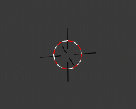
The tracking ones are perfect now, it was really important to get those right, similar yet recognisable.
Maintain volume: I don’t really get this last iteration, the two shapes shouldn’t intersect and the difference should be more visible, like in my original design… I wasn’t a fan of the volume flask, but I’d personally prefer it compared to this one.
Other small thing: in my opinion if we use the filled circle to indicate a target then it should be consistent, I think that that way of differentiate damped track from track to could create more misunderstandings than benefits. Having the same icon would be acceptable imho if we couldn’t find another way.
Possible alternative for the scale ones:
It feels to me that it would be a bit more in line with the set.
After a while, I too find latest version of the Maintain Volume not good. Will stick to Your design.
Regarding the Damped Track and Track to - I came to similar conclusion. They could use the same icon, with a twist - one of them rotated 180 deg.
Scale proposed by @billrey refers to Toolbar icon. They’re identical now, which is good for UX.
If you want I can send you a diff with most of the code done, at least the tedious part; I wasn’t able to solve a couple of problems in the outliner, but the add menu and the boxes in the properties editor should work.