It could be better, but it this could easily become a developer sinkhole. Personally I would not prioritize spending lots of resources on this topic. We should make sure icons are always legible and that there is by default enough contrast so they are always clearly readable. Our current icon system is already way more flexible than almost any other app - you can completely theme the colors, and add variable generated outline opacity. There are also patches floating around that lets users load their own icon sheets.
We should continue to develop a top quality, world-class icon sheet and good default, readable themes.
Probably, my reserve against the current solution comes from incorrectly chosen icon / background contrasts. The quality of the automatically generated backdrop is certainly partly to blame. As I have already noted, making a backdrop in a vector form and converting it into a bitmap leads to much better results. To get the vector base, all is needed is to simply assign the contour line with a thickness of 2 pix to all of icons. It may be made in no time by hand (a backdrop on separate layer) and it shouldn’t be hard to make it by a script. This way all transparencies will be taken into account, leading to more subtle and detailed output.
honestly I think you are wrapping up a problem that mostly does not exist, given that in reality there are only few icons that are outlined, and sincerely the current status on clear themes (the reason why the outline was added) seems to work very well …
Some of this stuff doesn’t work too well on bitmap filters, but trying to implement a vector solution isn’t really a possibility. I think the devs managed well with bitmaps.
Regardless, you can tweak outlines to nicer than drop shadows, with the added benefit that outlines don’t leave ambiguous gaps where the original icon covers the backdrop.
The current outlines already look pretty good. I’m not sure entirely what method you used to generate the outline example, the one you label as ‘crude’, but it has less definition and thinner white lines than the method I believe is being used, here https://developer.blender.org/T64083.
My only gripe with the outlines is that they only apply to a select few icons, so users are still stuck having a disjointed light theme that has to include either remnants of the dark theme so the white icons are visible, or black icons.
Personally I like the idea of jendrzych hand-crafting perfect one-pixel wide outlines in the SVG as a separate layer that is exported as a separate file so we’d end up with two PNGs.
If they were exported together then we lose the ability of coloring the mono icons by category as we are doing now. If they are separate we can combine the two as we wish at the same place we are now doing it now where the blur is created before icon creation. The outline layer would just have to be made quite dark so that we have maximum latitude with an opacity slider.
Having the icons as two files would also not break anyone’s plans for replacement icons as they could also use outlines that can be similarly adjusted by users and theme creators.
As I said before, there should just be a separate set of ready-made icons for each theme, with the predefined colors, with a outline if necessary, etc. It is much easier to make good icons in a graphical editor than all these coding stuff. The current approach is very limited.
I would prefer not to add so much complexity for now, with multiple layers and so on. I think it creates too much technical and maintenance overhead, and I don’t think it is necessary.
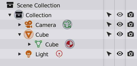
I am still confused as to why the world icon is red. It always breaks any understanding I think I have of the color coding, and I am already a Blender user. Now imagine how confused newbies will be.
With Cycles enabled, it isn’t a material— it simply allows you to set a material, among other things. It also looks really funky being the only discontiguous icon color and the only colored icon in the top group of icons. The colored icons would look significantly better if we made the world grey like its upward neighbors.
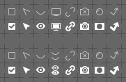
Regarding to eye icon(now screen). I understand this, like Sebastian said at stream: screen icon used because its not only hiding modifier but exclude it from computation. But do we really need this complication? Eye icon is simpler, more understandable and looks better.
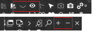
@billrey I was noticing that these four icons are exact copies of the ones below:
The eye icons (VISIBLE_IPO_OFF and VISIBLE_IPO_ON) in my opinion could be removed, since they seems to be only used in the Graph editor’s channels and they were identical to the outliner ones also in 2.7.
The add and remove icons though are causing a problem in the outliner, where the two sets are used next to each other.
I’m affraid that this needs UI revamp and some love from @billrey, instead of icon cosmetics.
Meanwhile, I find the Eye and the Monitor icons really confusing. The latter one doesn’t imply the fact that it affects global viewport visibility. So maybe single eye for local visibility and double eye for global visibility (or multi viewport, in other words)?
Chain link is reserved for linked data. Using it the way You’ve proposed will be confusing, since the very icon doesn’t refer to data, and we already have a Chain icon for linked ID.
While I agree that the difference between Global Viewport and View layer show/hide is not super clear atm, I also don’t think two eyes is any clearer.
At least the screen icon mirrors the render icon, both of which are ‘global’ in that respect.
The issue is just deeper - the difference between Global Viewport and View layer show/hide are just somewhat subtle, and I don’t know how much a small icon can help
@jendrzych how do you feel about adding back the Keyframe Add/Remove icons? We don’t use this so much but I guess it would be nicer for the case pointed out above. We already have the regular add/remove icons elsewhere anyway.
Also, many users have commented that the Collections icon the the Outliner header is not clear enough. Is there anything you could do to make it clearer that is adds a collection?