I think that this should be resolved with the interface, it’s quite strange to have an icon-only button that performs an action like that, usually they are toggles.
Maybe it should be like this:
I think that this should be resolved with the interface, it’s quite strange to have an icon-only button that performs an action like that, usually they are toggles.
Maybe it should be like this:
It takes up too much space. Already there is just about space for everything at normal sizes:
We could replace it with a plus icon, and then make it spawn an add menu with both Collections and objects.
To make space we could reduce the search bar, like how it was in the old Dope sheet header:
So if one doesn’t need it, as in most simple scenes, he could keep it closed.
“Add new” is a part of contextual menu (W / R-click), so I don’t see a reason for a special button on the header. It could be more functional-rich, allowing to add objects as well.
Yes, I think that makes sense. I might try and see if I can implement this easily - hopefully without duplicating the Add menu code.
The Add Selected Item to Active Keying set and the Remove […] actions in API Data view (Outliner) should populate the W / R-click menu as well. Besides the Keying Set dropdown differs from other dropdowns - it lacks the dropdown arrow!
Moreover, keyed data has no indication of the fact that it’s keyed already.
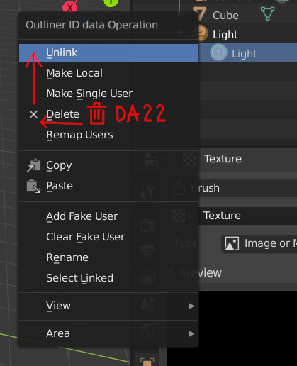
Unlink ObData icon in W/R-click menu is wrong. Unlink should get the “x” pictogram and Delete the Trash Bin. Unless it’s just a mess with naming…
Yes, those add/remove options are quite strange, a part from not giving you any indication about what is assigned or not, I noticed a couple of other things:
Regarding this I’m not completely convinced, it makes sense to have it, but at the same time what if you don’t have a 3d view opened and you add an object?
You wouldn’t have any idea of where it would end up since you can’t see the 3d cursor, it would also not show you the tweak options unless you press F9. I think that for new users this would not be a great idea.
i like your style so far. Chain symbol is kinda universal so I dont see too much confusion with linked data one.Maybe you can try with a clip symbol ! but i like the chain too much. Can you try your luck with custom icons for the Constraints menu options ?
You guys are kinda autoimposing too many constraints. The same way you felt necessary to linked the colors from the outliner with the ones from the tab icons and now you are messing around this.
In the meantime…
![]()
Hey, I dig that - it’s much clearer than just a plus/minus alone, which are kind of cryptic. Why give the plus a background and not the cross though ? Does that make them indistinguishable ?
I also second the ‘new collection’ icon.
The “+” with backdrop circle is used for icons noting “add / create new item” since the begining of this project. It makes the “+” pop out and turns it distinguishable from “x” at a glance. You don’t have to focus on them to know which one is which.
Maybe the eye of providence for global visibility? ¯\_(ツ)_/¯
I like the idea, although I’m afraid that the symbol has too strong religious background and using it in such context may be found offensive by some users.
I haven’t read the article but in American culture I know it as two things, “that creepy symbol on the $1 bill” and “the sign of the Illuminati”. I am not aware of any religious or offensive connotations but I agree it might be weird to include a symbol people associate with the Illuminati.
Originally it was (and it still is) a Christian symbol of God.
It might be possible to eliminate the triangle but keep the emanating rays.
Alternatively, I wonder if something like a simplified version of the Eye of Horus could work. However I’m not sure it gets across the “global” idea as well.
The symbol is really good for global visibility controll, for the meanings it carries. On the other hand, its symbolism can disqualify it… Can’t say neither of that about the Eyey of Horus.
Can you try a version without the triangle, but with rays coming out from the eye? That might be sufficiently removed from the concept of the eye of providence but it could get the idea across that the eye is “affecting” (with its rays) “everything” (globally).
I honestly think that the less religious we can go, the better.
Anyway I don’t get why you’re keeping the chain icon in this sheet, that was one of the alternatives for the “global” visibility, not something in addition (if I’m not missing something here).