I noticed that there are cases in which the new opacity of the edges of the icons needs to be different from color to color …
I know that it actually starts and is too much as a claim,
but it would be useful to have the possibility of adding the density of the border linked to the colors
this is an example where dark icons work well without borders, but you need to add borders only to clear icons …
Well that’s a bad icon color-set anyway!
Whoever wants to put icons on such a light background should go for light colors and a rim, or just dim colors.
You’re proposing too many sliders. Unless, somehow, we can take advantage of the unused alpha channel in the color picker
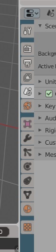
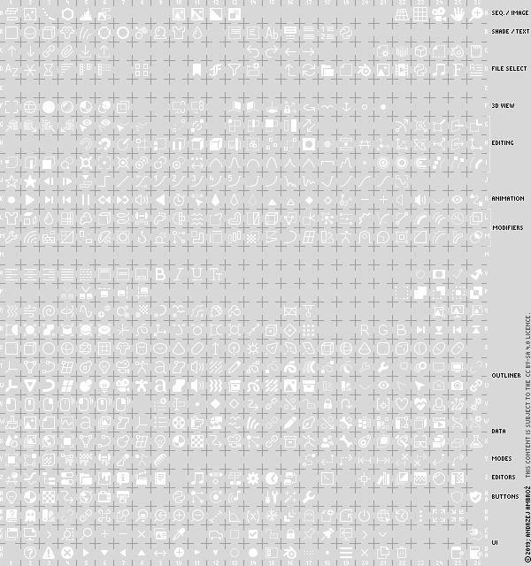
The modifier icon in the tab is not consistent with the one in the outliner. The first has a fill style while the later is outline style. Thats why it looks a bit different than the rest in the tab with the new both fill and (gray) outline style. Pls use the outliner icon.
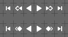
I still do not like the Previous / Next Keyframe icons. Keyframe diamonds are not as legible, as they ought to. So, here’s another attempt to make them fit the style better. Top row - current design; bottom one - latest proposal:
If it’s worth having six theme preferences, couldn’t we just make it 13 or whatever so we can have one for each tab? The run of four identically colored “modifier” icons is giving me brain cancer.
Also, since these preferences are intimately tied to the properties tabs, wouldn’t it make sense to have them as part of the Properties theme settings rather than as global User Interface things? I think I’d rather see the icon colors for each region together with the other colors for that region rather than having all icon colors together. I don’t think icons are so special that they need to all be edited together rather than with the area they’re used in.
But themes also desperately need the ability to define a palette of colors at the top and then refer to the colors in this palette of colors throughout the theme, so you could change say the hue of the entire theme by editing one base color rather than changing what now seems like 1,000 individual theme items.
The current design is way clearer. The one you’re proposing is visually cluttered, blends in, and has an ambiguous function. The current design is clear and stands out visibly.
I would recommend, however, moving the left/right icons into a separate group right of the playback buttons.
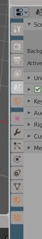
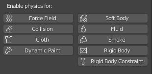
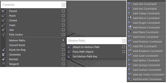
I noticed that we still don’t have a specific icon for rigid body and rigid body constraints , I don’t remember whether there was a discussion about it or not, but I tried to figure out some possibilities for those.
Rigid body:
Constraints:
I think that these two may work well, what do you think @jendrzych@billrey
as for the constraints I can post similar icons from other softwares. Here is Maya and Cinema 4d but I think Max has the best design for them (couldnt found a picture)
I was messing around with the code earlier so, if you like them, I actually have a patch that implements those two specifically.
Should I load it for you to review it @billrey ?
Outlined icons…
To me, visually, the current solution does not look good. Besides, originally the icons are made as polygons. Instead envolving bitmap operations, all you need to do is assign a contour line to each vector polygon and you get an outline effect with much higher quality and precision. It can be made by hand or automagically.
So, anyway, ordinary contour makes the details blurred and the icons begin to look blocky. Curved lines and diagonal lines are overwhelmed by the outline and lose their readability.
A much, much better visually and more legible solution will be simply displaying black coloured icons (or other colour, controlled via preferences) as a backdrop and moving them 1 pix down and possibly to the right (the shift should be controlled by the user and associated with the shadow under the text). Offseting edges of the backdrop can help, but ain’t that much necesarry.
Judge for yourself:
icons with edges offseted by 1pix, 75% opacity, no shift (Icons crude, illegible, no detail)
icons with edges offseted by 0,5pix, 75% opacity, shifted 1 pix down (way better than above, but overall space consumed by icon with its backdrop may be bigger than 16x16 pix)
icons with no edge offset, 75% opacity, shifted 1 pix down and 1 pix right (Icon with its backdrop fits within 16x16 pix space. Pictograms are clean, legible, detailed and readible against the light background - local contrast can be raised up with higher opacity of the backdrop)
I really don’t understand why you are trying to use white icons on a light background. It’s like white text on a white background. Use the dark colors of the icons when the background is light. It’s obvious.
Unfortunately @billrey is of the opinion that the present solution is sufficient. I agree that it increases the local contrast in the case of a dark background, however, when the difference in background and outline brightness exceeds 50%, things start to look unacceptable. Dirty, blocky and clunky shapes it becomes.