i like your color palette on this one! Good job.
2 Likes
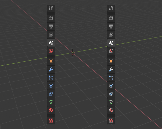
Is anybody else bothered by the shape of this icon?
What’s wrong with it? It looks perfect.
2 Likes
My only problem with that is that we have two similar icons one over other. But the shape? nop.
3 Likes
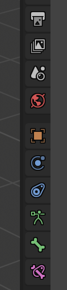
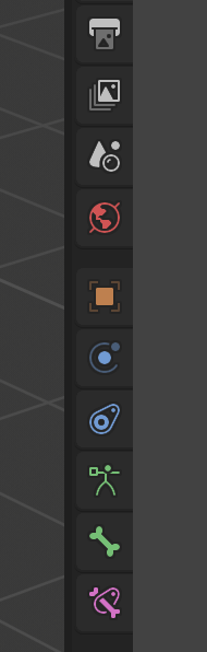
Just the partial coloring version
7 Likes
I really don’t like the two-color versions. However I definitely dig the pastel tones given by some of the people posting above. Especially important is removing that horrible red for materials (and also making World not be colored, since World isn’t just a material and it looks out of place, color-wise).
2 Likes
That’s just because of Windows’ window decorations.
8 posts were split to a new topic: Merging window title bar with tab region
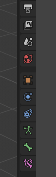
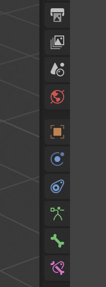
Can color the first five icons now and add borders.


9 Likes
Awesomesauce. Hats off to Jeroen Bakker…
3 Likes
Is its opacity and width controlable?
I’m anxiously waiting for buildbot download…
20% looks gorgeous against dark background! Adds tiny bit of depth and rises up local contrast.
3 Likes
That’s looking pretty good right there. Shapes up nicely as predicted. For me at least 
There you go again, trying to take away the little color we get by even desaturating those. 
Shame on, despicable me!
1 Like
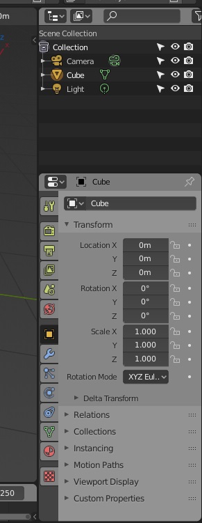
A bit too light that light theme!
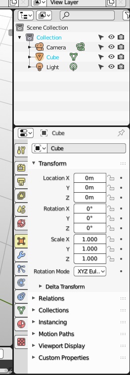
But I like the highlighted properties in the dark one.
Icons are shaping up really good, nice job everyone!

I just took a strongly white theme from the thread of the themes to prove how the new icon silhouettes worked in extreme cases