The way I see this multicolored/ non colored thing in regards to any UI, not only to Blender one ,depends on two main concepts that might be very well my own creation :UI forefront Elements and UI Content or Items. By UI content or UI items I understand things like Icons in the Outliner, icons in the drop down menus like the ones from Add Object > . Here the keyword is user selection, visual clasification and richness of content so color diversity here is more tolerable and advisable than anywhere else. By UI forefront elements I understand pretty much all of the rest elements that are there from the very moment user start the program with an empty file/scene and which should stay neutral (content wise and color wise) to any content user creates inside the program. This last part is what gives the UI a general character, an identity and style. Tab icons in Property editor are in my books part of these elements and adding multicolored icons in the forefront of the UI while the rest is so elegant and restrained makes blender lose its consistency and style.
If the coloured Tab icons is here to stay I concure to the previous user idea of bicolor style for the tab icons which is pretty much the same as my accented coloured icons idea and would be a more decent solution. Best example is the Sculpt toolbar icons. Neutral gray with accent colours, so elegant, userfriendly and confortable to the eye. In fact the colour shade there for blue, orange, yellow is pretty much ideal if the current tab icons shades looks to eyesoaring. Just noticing now, doing a side by side comparison between Sculpt toolbar icons and Modeling toolbar icons I see there is again some inconsistency. The sculpt ones have a Fill style while the modeling ones have a line style. Pls make them consistent. I would prefer the sculpt fill style because it gives less constrast to accent colours.
Aside from the Tab Icons disccusion, if we are really on about adding more color to the forefront of the UI, why we dont think about a color that should be a part of Blender identity like…orange ?, that should be carefully added in small doses to the forefront ui. Im thinking about accent orange colours to icons meaning main icon color should stay neutral gray/white while bits of it should embrace the orange. The selection icons in the toolbar are a prime example. The arrow is white while the dotted line is accented with orange. Move, Scale rotate, measure etc could also follow this style and in a thoughtfull and restrained manner this style could be extended more to Blender UI. Other softwares did the same (not that Blender should follow the pack) , Cinema 4d has its own accented orange, Max has his teal colour etc
Maybe Include Channels for Objects that are Invisible could look more like an invisible item? It’s related to when an object or bone is hidden in the 3d view. Maybe it could be a dashed box icon?
F-Curve Snapshots icon seems ok - can’t think of anything better
@billrey - the dashed Object seem to be enough, since Bones (Armatures) are ObData blocks atached to Objects, if I’m correct.
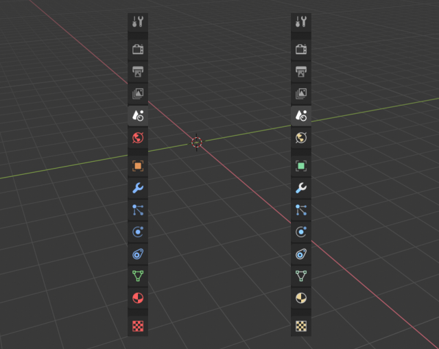
Regarding colours - I made another mockup with icons coded with the palette that’s mix of Active Tools colours and Viewport random colours. With slight saturation and lightness tweaks.
That looks a lot better. I might swap the green/purples, since green tends to be more dominant with active tools, but I’m probably just being nitpicky.
Hi! I would personally keep the orange for the objects, while for modifiers-constrains I don’t know, keeping the blue would be coherent with the old icons, but that purple looks really good.
@billrey As for the Holdout, wouldn’t the mask icon be enough for that?
Maybe, although that would be a pun icon. I prefer icons that try, if at all possible, to actually communicate what they do. Something like Holdout is a little abstract but basically something with a hole in it I think could work?
Gosh! You do not make my life easy. Do You?
Do those icons have to be two-state pictograms? If so, what states are to be depicted?
By the way, use proper chain restriction icon, please - T26, V26
Hi guys,
I’ve noticed the upper icons of properties tabs icons are greyish/dimmed when inactive, and only full white when active. But the colored ones doesn’t follow this behavior and always are displayed with the same brightness no matter if its active or not.
Maybe would be nice to have the same inactive fade effect for all.
Personally I like the bright saturated icons because I think their main use is to serve as quick visual locators when you need to quickly find the section you want. The partially colored ones are pretty, but don’t really help me stab at the one I want.
I would suggest maybe changing the particle and physics icons to purple so they’re distinguished from the modifier and constraints. This would make those icons stand out more and avoids the run of four icons all the same color.
Having multiple icons with the same color really doesn’t help that much. If I want the constraints tab I can think, “oh, that’s blue, and it’s kinda roundish” and then I have to stop and think about which of the two adjacent icons that match those criteria is the one I want.
(what I really want is to be able to drag the width of the tabs until they turn into words
 :UI forefront Elements and UI Content or Items. By UI content or UI items I understand things like Icons in the Outliner, icons in the drop down menus like the ones from Add Object > . Here the keyword is user selection, visual clasification and richness of content so color diversity here is more tolerable and advisable than anywhere else. By UI forefront elements I understand pretty much all of the rest elements that are there from the very moment user start the program with an empty file/scene and which should stay neutral (content wise and color wise) to any content user creates inside the program. This last part is what gives the UI a general character, an identity and style. Tab icons in Property editor are in my books part of these elements and adding multicolored icons in the forefront of the UI while the rest is so elegant and restrained makes blender lose its consistency and style.