The safety pin is good as depiction of F-user type of securing data, but its shape is quite ambiguous, to be honest. The general goal is to get possibly the simplest and compact, yet most descriptive, silhouettes.
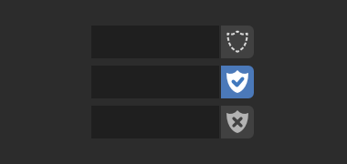
It seems perfect when it is enabled. It clearly shows that the thing is being protected from unwanted deletion.
My issue is with the unselected state as it implies that the thing will be deleted. It is not protected, but not necessarily deleted. So it looks a bit off when shown beside something that has multiple users.
It might be nice to have THREE versions of the icon. The checkmark one used when fake user is selected. But show the shield with the “x” only if the block currently has no users. Show an empty shield without the “x” if the block has users but fake user not enabled.
I’m not sure if there’s real need for such a complication, since there are plans to change the way the data is managed, so that F-users will dissapear.
I agree, that the “x” could be removed from the shield as it implies that the data will be deleted. Which is not true in most cases.
The skull is too alarmist IMO, it’s just going to signal excessive danger, when 90% of the time you actually don’t need to worry about it because the data block is in use.
Best of those options is the peeling paper, but even then it only makes sense when you see both icons.
I think I just didn’t think it through very well. LOL. I liked the thought of getting an extra warning when it was in a more perilous state, but we don’t normally see things without an owner. Oh well, I’m never short of dumb ideas.
The shield is hands down the best (and frankly, quite close to perfect) way to represent that, whilst all other attempts have been tacky (skull) or entirely ambiguous (safety pin, taped paper thing).
But for tuning the shield, I just want to remind about the original image that was shown to propose this plan:
I think the designed icon for the shield with the check mark looks awesome. But the one with the X is still somehow lacking, even though the higher-res proposed image above is not lacking and looks fantastic. So I would suggest trying another few versions that take on the original concept better: knowing that the icon will have its background highlighted in blue to indicate it’s active, perhaps having both the check and X icons filled solid, with the inner icon cut out of negative space, is fine. Consider also the dashed shield outline. I might also suggest making the X thicker to match the thickness of the check mark, and to move it up a pixel. Compare:
I like a lot your last Show Gizmos icon.
Regarding the F-user, though I voted for shields, personally I think I prefer the pair Shield (filled with check mark) + Skull (filled)