Please, please not another shield. Microsoft antivirus’ shield is enough. The tape looks great.
As a user who has never ventured into the deeper parts of Blender enough to grasp the whole data-block system, I have a pretty vague understanding of how that works. I’ve sort of managed to pick up on the idea that “F” is a button you click to make things not disappear after restarting Blender, but I don’t get how it works internally or how it necessarily relates to data-blocks or how those are related to the way Blender works with things. But from that limited understanding, I can say that all the proposed icons with tape and glue and peeling note icons are very confusing to me and don’t elicit any sort of clue as to what it does or why a random paper (leave a note? make a new item? peel off the item and discard it? shred it?) make zero sense, and the entire paper and tape analogy is completely on the wrong track. The protective shield, however, makes a lot of sense. Especially with the “X” for unsaved and check for saved data-blocks, because that means your work is going to disappear (it’s unsafe, it’s dangerous, hence the X and the inactive protective shield) whilst the shield means you are safe and protected from that item being lost. That is the right analogy, not the paper or pinning analogy. You can pin UI elements (like the previous discussion about the push pin vs. safety pin for pinning UI panels), and things related to actual files (not data-blocks) use the paper symbolism and also a floppy disk or CD. But data-blocks have nothing to do with paper, or files, or safety pins, they have to do with danger and safety. Use the “X” and check shields if you want it to be obvious to all users, even those like me who barely or entirely don’t understand what the system does. Make the tooltip clear also to people with no preexisting knowledge. And don’t worry about it looking like Windows Defender, that is just one of many icons taking on the shield analogy. Nobody is going to think clicking that button opens Windows Defender.
Are you worried users would mistake that icon for something related to Windows Defender? That clicking it would open Windows Defender or do something like quarantine the file or make it scan your computer for viruses? I think not, and so this is not a valid concern. A shield has existed for millennia longer than Microsoft, and it has meant protection and saving important things for longer than paper or tape has even existed. Icons are about analogies that call attention to the relevant thoughts and associations. Paper brings to mind the wrong associations and confuses the user, shields bring to mind the right associations and provide intuition.
And I have no idea if anyone ever used tape to protect paper. Maybe push pin icon is viable alternative, but not a tape patch.

Hey is there plan to implement icons in outliner that show… is collection, holdout etc or indirect light only etc… i am talking about view layers/render layers. stuff…
@jendrzych
What if you put a skull when the fake user is not activated? And a smiling face when it is?
You’re biased toward skulls… 
The Skulls are cool… 
With special dedication to @zebus3d:
![]()
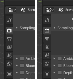
Output tab icon - not really high priority, but it’s tad too similar to Render tab pictogram IMHO. Left one - current design, tweaked one on the right.

I think the cube for the object icon was more descriptive.
Well, it’s still a cube, but in a rectangular viewport. 
(Default) Cube would be so nice!  I always have a hard time picking the object tab out at the moment.
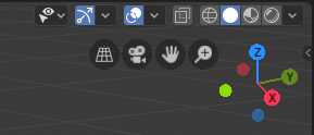
After several trials and fails I think I’ve found a compromise between the form and content of the Show Gizmos of All Types icon (the mockup contains redesighed Show Whole Scene Transparent pictogram as well):

@billrey - by the way, I think that the Set Whole Scene Transparent button should be moved left - between the Show Gizmos and Overlays buttons. The Overlays and Display Methods belong to the same family and have similar icons…
@MichaelHermann
3D cube won’t be brought back to my set. Current icon, in its ascethic form, perfectly depicts idea of the generic Object Mode and creates a great pair with the Edit Mode icon - both are stylistically consistent.
I like the new output icon.  Puts more focus on the image that is coming out instead of on the printer body. I’d argue you could even leave the body of the printer transparent, so it’s just the outline and the image (the output) is even more emphasized focus.
It would be nice to have the same “image” depiction with the mountain and sun for the Image Editor icon. Someone said this somewhere already, but right now it looks like slime running down a wall 
The new Show Whole Scene Transparent icon looks also clearer to me. The current one was a bit overloaded. Good job there, too!
Regarding the Object icon, maybe you can help me: What are these 4 lines surrounding the square supposed to represent? I think the symbol might be easier to spot if it was just the square, bigger? Like the Texture and Material Icons are just one big object. They are easier to make out because of that.
Speaking of consistency, the Object icon is a square and the Object Data icon is a triangle. I think the correlation would be more obvious if both shared the same geometrical shape.
Object icon is a triangle only for Mesh Object. Other types of data have their own Object icons. The square is a generall depiction of an object without indicating a specific object type. The “handles” in the square’s corners were conceived as elements emphasizing the fact that the mode applies to the whole object in contrast to the Edit Mode.
That new gizmo is looking great. I’ll add my voice however to the people who don’t like the object icon much. It doesn’t convey “object” very well, with its square frame around it makes me think of ‘target’.
I think the safety pin is brilliant for the fake user, when I first saw it I immediately got it, and it evokes the word ‘safety’ and ‘pin’, both being relevant concepts. Maybe the shapes could be refined a little - the open pin clasp part in particular.
I’m sorry to barge in here so late, and give discouragement to jendrzych, but I really think these new icons are a very significant downgrade from blender 2.7x. I appreciate that icons are added to things that didn’t have them, but I am very opposed to these new ones replacing the old icons. The older ones make the UI easier to navigate, given their brighter style.
I’m sorry, but I really think it was a bad idea to make all these new icons to replace what we had before. But what was it about the old icons that needed replacing?
This issue has been quite intensely discussed in recent months. In order not to repeat, I will send you to the original thread on blenderartists.org: https://blenderartists.org/t/new-icons-for-blender-2-8/1112701
I am not referring to a specific post - you join the party quite late, so you should read most of the above thread to catch up …