I like the original, first one. To me it works because it’s the corner you’re taping down so the icons feel cohesive. But the second works.
The last three feel like jabs at the F-user system, not particularly cohesive either.
I like the original, first one. To me it works because it’s the corner you’re taping down so the icons feel cohesive. But the second works.
The last three feel like jabs at the F-user system, not particularly cohesive either.
Yes, good old eye is much better
Maybe a “protection” sign for the fake-user?
There was such a proposal months ago, but it was rejected by devs/community for some reason. I’ll make another sketch, just to see, what it’d look like. Thx for dusting it off.
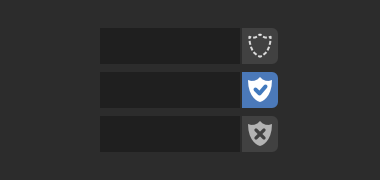
Link to the original “shield” concept: https://blenderartists.org/t/new-icons-for-blender-2-8/1112701/1554
wouldn’t it be possible to have color coded icons as a one week test… just to see the community’s reaction?!? 
What do You mean by colour coded icons? Coloured design? I do not provide such solution. Not yet, not in my free time.
That’s fine, I was just wondering, but yes, to have icons be more consistent throughout all of blender… Red for material, green for mesh, etc.
As far as I know, devs are working on more colour coded icons in the GUI.
EDIT: https://developer.blender.org/T63521
Ah! Nice! Thanks for the info. 
Updated set of sketches.
What do You think? The “shield” is really appealing to me, if my opinion really counts in ![]()
I really like the shield! To me it reads much more clearly than the tape. Though I was also a fan of the safety pin 
Agreed… it’s so much clearer!
Liking the shield a lot. Looks familiar in a good way (context).
i like the protection sign idea
I too like the shield. I like the other visual metaphors, but out of those, the shield is the one I’d feel most safe clicking. It’s the least ambiguous in that it clearly illustrates that this datablock is protected somehow.
To be perfectly honest, I’ve always had issues with the whole fake user system, and paired with this visual metaphor, the silliness of it is highlighted: you must manually “protect” each datablock that isn’t being used so that it isn’t automatically deleted; It must be “shielded” from the effects of this destructive force that will sweep across your project.
It’s as though the old “F”, being so unclear itself, was “unaware” of how user-unfriendly the system it took part in was, and in a sense, that made the whole thing a bit more forgivable.
But this, by virtue of being so clear, shows more awareness of user experience and design, and thus highlights how weird the fake user system is.
REally a good idea to understand the feature
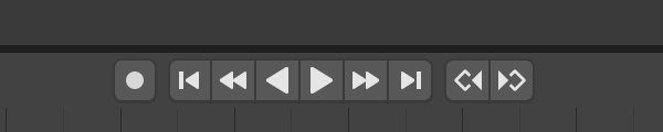
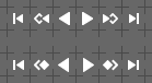
More style inconsistencies, that annoys me - playback controll buttons. Current desingn on top, proposal on the bottom:
I always forget which one is keyframe and which one is framestep. Probably look hokey but I am going to make something with a doorkey and arrow for myself. Actually don’t even need to make a key I’ll just copy the one from keyingset
I like the shield. Everything else looks like slapping beef jerky on paper.
This “style inconsistencies” helps to distinguish between Frame and Keyframe actions, current version looks more clear.
Moreover, I already suggested to separate Frame and Keyframe into separate blocks.