The icons are there, but for some reason they show only in the modifier list.
And it looks that the icons’ “space” is indeed used since the buttons’ labels are supposed to be centered but have a slight shift on the right side:
But there are no icons displayed.
Right now for some reason in script all those button have “BLANK” icon.
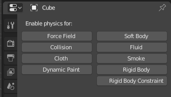
By the way, those two icons (particles and physics) is not very descriptive, maybe we can do them better?

For particles I really like this one proposed by @Skumball:
![]()
For physics maybe something similar to Houdini (ball thrown to a wall):

5 Likes
Those icons are descriptive enough IMHO. Please keep in mind that “descriptiveness” is just one of the factors that determine the appearance of these icons. Scalability is another important feature. The symbol must be simple enough to scale down and work without impairing readability in other pictograms (see Particle Instance, for example).
Please believe - the appearance of individual elements of the set is not taken out of the blue.
1 Like
@DotBow luckily, Blender now supports custom icons, so I don’t care what @jendrzych says now, since I can just pick and choose from the best examples in this thread and make my own theme, and so can you! 
Custom icons… Without building blender?  Did I miss something?
And @jendrzych is a very smart man who made 2.8 look amazingly great! So it is good to listen to him and others too.
Well, I have to admit that on the spot I cannot say which one is for particles and which one for physics. My first instinct was to start Blender to hover the icons. I guess the one that looks like coordinate axes is particles? No offense meant, but I never understood what that is supposed to represent. The physics icon looks like it could be a planet with something orbiting it meaning gravity, meaning physics? 
So I have to agree that at least particles is not very descriptive to me.
1 Like
I made my living as an icon & UI designer around 2004-2012, so I have pretty strong opinions myself.
But yes, I think you missed this: 2.8 Outlined/Coloured Icon Adaptation - #77 by gsrb3d - Blender Development Discussion - Blender Artists Community
1 Like
Just as a note Brecht has required a few changes to it, so I presume it’s not in the releases yet.
hehehe the beauty of open source
Admittedly a very small request, but wondering if you could have a look at our “menu” icon (DA19)? We see this icon on a button if we “Collapse Menus” on a header.
Our current one looks a little lopsided and thin compared to the current preferred look of this kind of thing. One can also be seen on this site, at the top-right.
2 Likes
yes, now it’s a crêpes menu instead of hamburger
2 Likes
this is way better !!!
6 Likes
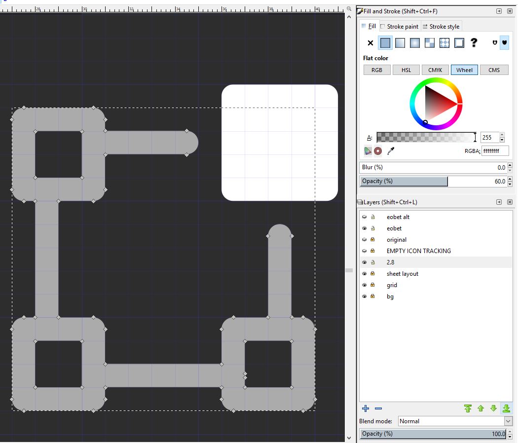
@jendrzych I’m unfamiliar with Inkscape. Could you please tell me what makes the symbol have a darker color, because I can’t see it.
I think the current particles icon is amazing, it is both Hair and Particles, and particles path also here. The proposed replacement (sparks) is more like the effect or magic, and is already used for Grease Pencil effects.
The proposed physics icon (ball thrown to a wall) has absolutely nothing to do with Smoke, Cloth, Dynamic Paint…
Opacity (%) 60.0 
Great! First time seen the ‘Safety Pin’ icon:grinning:
I agree on points 2 and 3, but I think a basic cube shape for the 3D viewport is way too ambiguous. I have no trouble seeing a grid (instead of an octothorpe) but perhaps the ball could be slightly larger. However it does need to convey the idea of a scene, not just a single primitive object.
The push pin icon is extremely important, a safety pin icon won’t cut it. You save or “pin” things to a bulletin board with a push pin, not with a safety pin, so the latter makes no sense. It is also a very confusing shape that doesn’t clearly convey “safety pin”, especially in its open state.
4 Likes
The safety pin as an F-user indicator is a nice symbol, but its shape doesn’t work for this particular purpose. So, I made more F-user icons doodles, since I’m goin’ to bring back the Taped Data icon:
Second pair from the top - my favourite.
1 Like