Yes, I pushed them together to make it all easier to notice.
The only different ones I’d keep is the UV editor ones, because they swap from UV edit selection to a linked-to-3d-view selection. In that instance, the change of the 2d-to-3d icon set for selections is the best demonstrator of what’s going on.
2 Likes
It reminds me of Mach Bands illusion. One item having sharp transition from one color to other (because the vertical and horizontal lines allow it), and the others having some mixed greys in the transition (for AA) and thus not triggering the brightness illusion.
1 Like
Hhhhhmmmmm not seeing that at all ? I perceive those icons as being pretty much equally bright.
1 Like
Different brains and eyes see things differently. Also monitor, local light conditions…
1 Like
+1 for having the same icons in component selection and snapping and having a separate set of icons for the uv components.
the thing is a uv vertex is really not the same component as vertex - a vertex can have many corresponding uv vertices. Also the uv island is not really a meaningful component on a mesh level, but its super handy for uving. So in theory you could ‘mix’ it with a uv vertex icon, edge icon, face icon and a uv island icon… but i think just having a unique set for these would be better. 
2 Likes
Absolutely agree.
Selection and Snap should use the same icons. UVs a different set.
IMHO, these are PERFECT:

8 Likes
Here’s something I’ve come across. The mute icon seems to be mis-assgned.
The left is unmuted, the right is muted. This is an audio strip in the VSE.
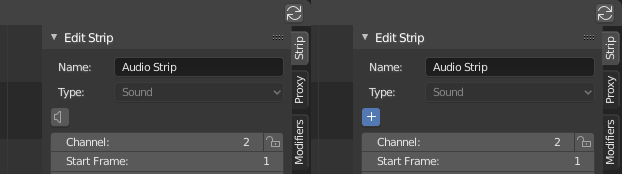
2 Likes
Yes this please! Although I also liked the UV component icons where they looked a little more like an unwrapped cube.
1 Like
New icons for Tool Selection modes (New selection / add to existing selection / substract from / intersection / difference):
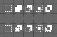
Upper row I find cleaner and descriptive enough. Bottom one seems to be a tad too busy for my eyes, yet consistent in style.
6 Likes
When dealing with such small icons, I always prefer clarity over complexity, especially when the style inconsistency is insignificant. So my vote goes to the upper row.
3 Likes
“Show gizmos” icon variations:
![]()
My choice - the middle one. What do You think?
3 Likes
Not very sure yet. It might work. But I’m also wondering what other metaphor we could use to imply more that is about displaying something and not performing an action on an object … From this pov, I would go with the first one despite that the second one is slicker. Just my perception though …
this is what people imagine in their mind when they think of a gizmo
your icons looks really good but personally when i see them i dont think of a gizmo ![]()
2 Likes
More “show gizmos” doodles:
![]()
The left one looks OK and is different enough from current “Transform Orientation” and “Empty” icons.
12 Likes
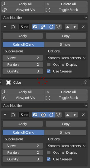
This will be sorted out soon by devs. I mean chain/eye icon confuson. Regarding the rest of icons there - Modifiers GUI is one giant mess and icons are just small part of it.
1 Like
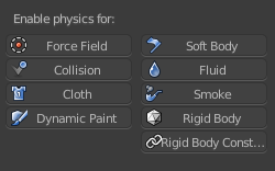
oh, ok. also will Physics tab get new icons?
Could You be more precise,please? A screenie would be helpful.
i mean this