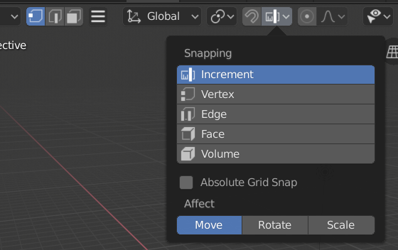
there is a reason for the component selection icons and for component snap icons still not being consistent ?
Also I propose:
the Modifier “wrench” icon to have a consistent style in both tab icon and in the outliner. The one fron the tab has only a fill while the one from outliner only an outline. I propose the use of the outliner style for the tab as well since it makes the design more interesting.
2.Object “Framed suare” to be replaced with a cube or other 3d symbol or something to suggest depth. For now its kinda dull and for components selection icons we already have a similar depth suggesting design
We should use more of blender trademark orange colour as bits of accents for icons that dont share a color relation , for : move, 3d cursor, rotate, scale etc. Selection tool icon already has this style Im hintering at. It has a white arrow and an orange doted box or circle around.
What do You mean by no consistency of component selection icons and component snap icons?
The wrench on the tab is filled, because hollow one was visually not strong enough against the other icons.
Regarding Object icon - a lot of time spent on symbols analysis and their visual compatibility, many projects of whole sets of pictograms corresponding to the Object icon and referring to it, a sea of words and a very valuable contribution of active Blender users, preceded the current design. The modest form of this icon is perfectly coordinated with the other pictograms. Adding the third dimension (making it a 3D cube) will not bring quality. It’s already here.
there are other outline style icons in the tab bar so I dont see why the modifier wouldnt cut it but anyway
I dont see how the modest form is so perfectly coordinated with other icons. There are a lot of icons suggesting depth. A great idea and a more coordinated design would be to make the cube in the style of lookdev or rendered icon like your avatar lol. Having some hatching to the sides to suggest depth.
Different functions with slightly modded pictograms. Yet still the same devices and similar forms. There’s no confusion here.
Depiction of idea of an Object doesn’t have to incorporate spatial depth.
Speaking of the changes You don’t like - they are not accidental.
There’s one thing that still bothers me - design of Previous / Next Keyframe… I’m simply not happy with the appearance of these icons, but tried several solutions and neither of them wasn’t worth an update so far.
The keframe diamond isn’t obvious enough and distracting overlap of parts of icons doesn’t fit the set’s style.
Therefore we will go for something more flat and 2D:
Been there, done this. All blends too much.
Pause - two sticks? Record - a circle? “Fishy diamond” ain’t any more abstract than any other playback icon.
Mind that (1) Prev. / Next Keyframe is a concept without established symbolism; (2) we’ve got extra small space for a pictogram that has to be super recognizable. I won’t please everyone, but I’m not ashamed of this design
Even if it looks a bit like a fish, it’s decent. However, the current ones are still better in my opinion. I’d like to reiterate, however, that the pair of keyframe icons really should be moved into a separate group to the right of the playback controls.
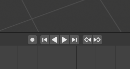
Separated, with the current icons:
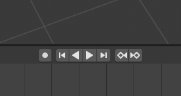
Separated, with the proposed “fish” icons:
Except Pause is supposed to look like two sticks, and it looks like two sticks. Record is a circle and looks like a circle.
This is supposed to look like an arrow pointing at a diamond, but it looks like a fish.
Your previous design worked better because at least there was a clear distinction between the two shapes.
I also think the outlined diamond is stylistically inconsistent with the rest of the set which is all solid. If we’re insisting on the fish why not something like this instead?
The diamonds read sharper/pointier and there’s still a clear separation of shapes.
I can only post one image because I’m new…
Part 2:
I still think the original one does a much better job of filling that requirement:
It’s a pretty universally recognized symbol for skipping ahead. I think given lack of a better alternative this is still the clearer icon.
Just look at how stylistically consistent they are together. It’s just so bold and clean. I’m not really sure why we wanted to change this in the first place? Especially since these icons have such a prominent place on the screen. Why clutter them up?
Before the UI freeze can we please address the issue I mentioned as the very first post in this thread?
The tool settings REALLY shouldn’t have a wrench in the icon, since it’s confusing for new users (I teach new users and this comes up all the time). Everyone thinks that this is the icon for modifiers when I describe that they are looking for the wrench.
I don’t go to complain because no time, but I never understand that icon. Is like a pencil in a diana. I don’t have problem because I know since years ago, and position is easy to see the tooltip and discover the tool.
@Alberto - think of a pencil and some kind of visual representation of effects of its pressure against the paper.
@andyvandalsem & @Hadriscus - the Next / Prev Key are tad too big and the pseudo 3D effect it does not go hand in hand with the rest of this micro-set. All this makes N. / P. Key pop out too much. The hollow diamond of my proposal isn’t best as well, so:
@Xury46 & @Isscp - funny, but I already made such pictogram during the search for the best form for Tools icon.
This one is ok, but look kinda squeezed. I might be tired as well and the icon is ok.
@jendrzych I’ll let you decide, but I do see the issue of the two shapes of the ‘fish’ melding together. It’s a bit hard to see where the arrow ends and the keyframe begins, making the overall meaning a bit harder to read. Rather than looking like an arrow pointing at a diamond, it becomes simply a fish
Seems like either of @Andyvandalsem’s alternatives solve this issue well: