8 posts were split to a new topic: Merging window title bar with tab region
Can color the first five icons now and add borders.


9 Likes
Awesomesauce. Hats off to Jeroen Bakker…
3 Likes
Is its opacity and width controlable?
I’m anxiously waiting for buildbot download…
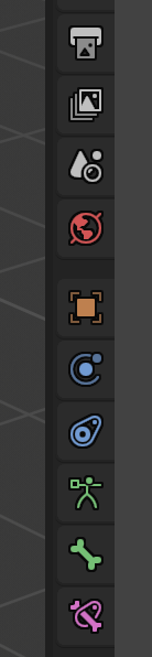
20% looks gorgeous against dark background! Adds tiny bit of depth and rises up local contrast.
3 Likes
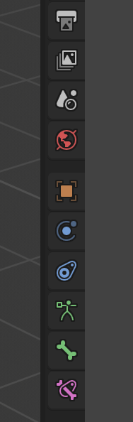
That’s looking pretty good right there. Shapes up nicely as predicted. For me at least 
There you go again, trying to take away the little color we get by even desaturating those. 
Shame on, despicable me!
1 Like
A bit too light that light theme!
But I like the highlighted properties in the dark one.
Icons are shaping up really good, nice job everyone!

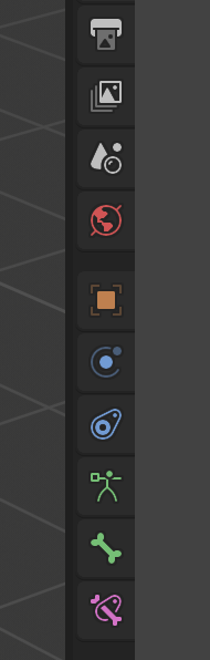
I just took a strongly white theme from the thread of the themes to prove how the new icon silhouettes worked in extreme cases
I noticed that there are cases in which the new opacity of the edges of the icons needs to be different from color to color …
I know that it actually starts and is too much as a claim,
but it would be useful to have the possibility of adding the density of the border linked to the colors
this is an example where dark icons work well without borders, but you need to add borders only to clear icons …
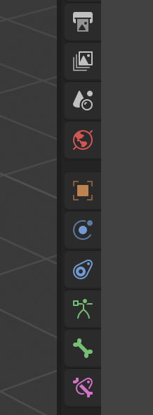
The border makes it look kind of aliased…
Well that’s a bad icon color-set anyway! 
Whoever wants to put icons on such a light background should go for light colors and a rim, or just dim colors.
You’re proposing too many sliders. Unless, somehow, we can take advantage of the unused alpha channel in the color picker
came on, give me a break
of course are borderline and bad cases but are taken on purpose to be able to demonstrate current limits that can be exceeded
The modifier icon in the tab is not consistent with the one in the outliner. The first has a fill style while the later is outline style. Thats why it looks a bit different than the rest in the tab with the new both fill and (gray) outline style. Pls use the outliner icon.
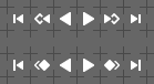
I still do not like the Previous / Next Keyframe icons. Keyframe diamonds are not as legible, as they ought to. So, here’s another attempt to make them fit the style better. Top row - current design; bottom one - latest proposal:
6 Likes
If it’s worth having six theme preferences, couldn’t we just make it 13 or whatever so we can have one for each tab? The run of four identically colored “modifier” icons is giving me brain cancer.
Also, since these preferences are intimately tied to the properties tabs, wouldn’t it make sense to have them as part of the Properties theme settings rather than as global User Interface things? I think I’d rather see the icon colors for each region together with the other colors for that region rather than having all icon colors together. I don’t think icons are so special that they need to all be edited together rather than with the area they’re used in.
But themes also desperately need the ability to define a palette of colors at the top and then refer to the colors in this palette of colors throughout the theme, so you could change say the hue of the entire theme by editing one base color rather than changing what now seems like 1,000 individual theme items.
1 Like