Haha, right 
It’s not even that the icons look to similar in form. I think it’s more that both represent the same concept of a camera so my mind mixes them up all the time. The picture part is drowned by the massive, filled camera body for me.
Haha, right
It’s not even that the icons look to similar in form. I think it’s more that both represent the same concept of a camera so my mind mixes them up all the time. The picture part is drowned by the massive, filled camera body for me.
Google replaced the hamburger icon in chrome a long time ago. They now prefer a vertical ellipsis ⋮ in many places, especially for the overflow options in menus. It’s closer to a horizontal ellipsis, which is pretty much universally understood as indicator for truncation = there is more.
If you change “hamburger icon” to “vertical ellipsis” it will be even worse.
I think you completely misunderstood what I said above. I’m not against this icon, I said this pure icon doesn’t look like a button, there are no borders and background like other buttons.
I like these mind-changes
Yes please, current Object icon is so obscure without any meaning. @jenkm proposal is almost perfect.
In fact, this is not the final version of the icons, it’s just a quick mockup made from the existing ones, to show that there can be some improvements to the properties editor design.
Search would be a great addition, but there is some technical work required still to make it work.
I think it’s something that should be added, but it might be more of a 2.81 feature.
@jendrzych Great job on recent icons update! Really like how Pivot Point and Transform Orientation popovers look right now 
But, one icon is very out of scope…
![]()
This Face Select icon looks like was accidentally placed here and don’t have any relation with two others.
And this choice obviously relates to changing icons style from 3d to 2d.
So, as an example, that’s how 3ds max 2d icons looks like:
![]()
They are a bit ugly, but pretty simple and descriptive in relation to each over.
The simplest solution to current icon set would be something like this:
![]()
But I’m still not sure that 2d shape is a good choice.
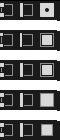
Can anyone explain to me why there are three different sets of icons that represent Vertex/Edge/Face Selection Mode, where is the case where the functions they represent can be confused?
Hey @jendrzych,
I see that some updated icons landed in the latest version of Blender 2.80 but a couple of them don’t make any sense yet …
The new icon for viewport visibility is now a link icon, which will make sense if the planned changes of the Outliner Visibility Update will get added but for now the icon is totally out of place. I think it makes sense to wait adding them until the changes to the visibility system are actually done.
This is feature I don’t use and I’m not familiar with - I changed the design, based on the discuss You’ve linked. Perhaps a bit I rushed
Yes! Much more clear and concise. I dig!
Actually we don’t need three different sets, but two are a must - one for Vert./Edge/Face selection and one for Snap Target.
My original intention was to use the selection icons from UV Editor. Ultimately, both 3D View Editor and UV Editor use the same Vertices / Edges / Faces selection concept. But first I wanted to try a set of visually distinctive icons for: [1] 3D View Editor Sel./Disp. modes; [2] UV Selection modes; [3] 3D View Editor Snap Target. That’s because it was suggested to me that No. 1 and No. 2 should be distinguishable due to the option of synchronization of selection between UV Editor and 3D View Editor. In my opinion, it does not matter much and I think that numbers [1] and [2] can share icon sets without a confusion. So my goal is to: [a] design better set of I1, I2, I3 pictograms or [b] just replace I1, I2, I3 icons with G13, G14, G15. Personally I opt for the latter.
Thanks, I missed the Snap Target option. And I agree with your opinion.
It may not directly cause confusion, but having those icons change, and be the same as the 3d view when using that selection link aids in recognising and understanding that selection mode in a useful, unobtrusive and intuitive way - it represents the mode far better than any icon can, that double arrow doesn’t mean much. It also increases the chance you’ll notice you’re in that mode if you don’t want to be or vice versa.
Why remove it?, it’s helpful and there’s no benefit to doing so.
Odd, I didn’t change it in the code. Are you sure it isn’t you who switched them? 
Gosh… looks like I screwed it up.
What about something like this?
I think the 3rd row might be good.