Hi, this is a proposal to change the way the 3D snapping popover is laid out. It is meant as a “UI papercut” as per this definition : Blender UI paper cuts
PROBLEM
The new snapping options are presented in a perfectible way. I see three issues :
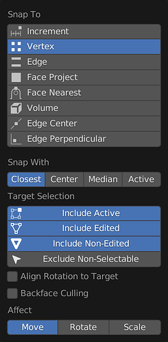
First issue : the first three targets are opt-in, and the last one is opt-out (exclude non-selectable). Operator properties and other preferences in Blender are usually opt-in, ie they turn a feature on when activated. Having to toggle something on to turn some feature off goes against logic, especially when it’s just the one property. This was one of many principles during the 2.8 redesign effort if I recall correctly, one that does a lot to clarify the application behaviour.
Second issue : text is centered instead of being aligned like in every other part of the interface.
Third issue : unrelated icons are being reused in a non-fitting way. The only one that seems fitting to me is the last one, because it’s related to selection. Generally, I think they add distraction instead of clarification.
- This is the current design
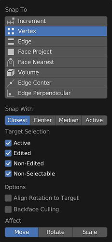
- This is what I propose as a redesign
The text has been left-aligned, the icons have been removed altogether, and every property is presented as opt-in.
Cheers,
Hadrien

