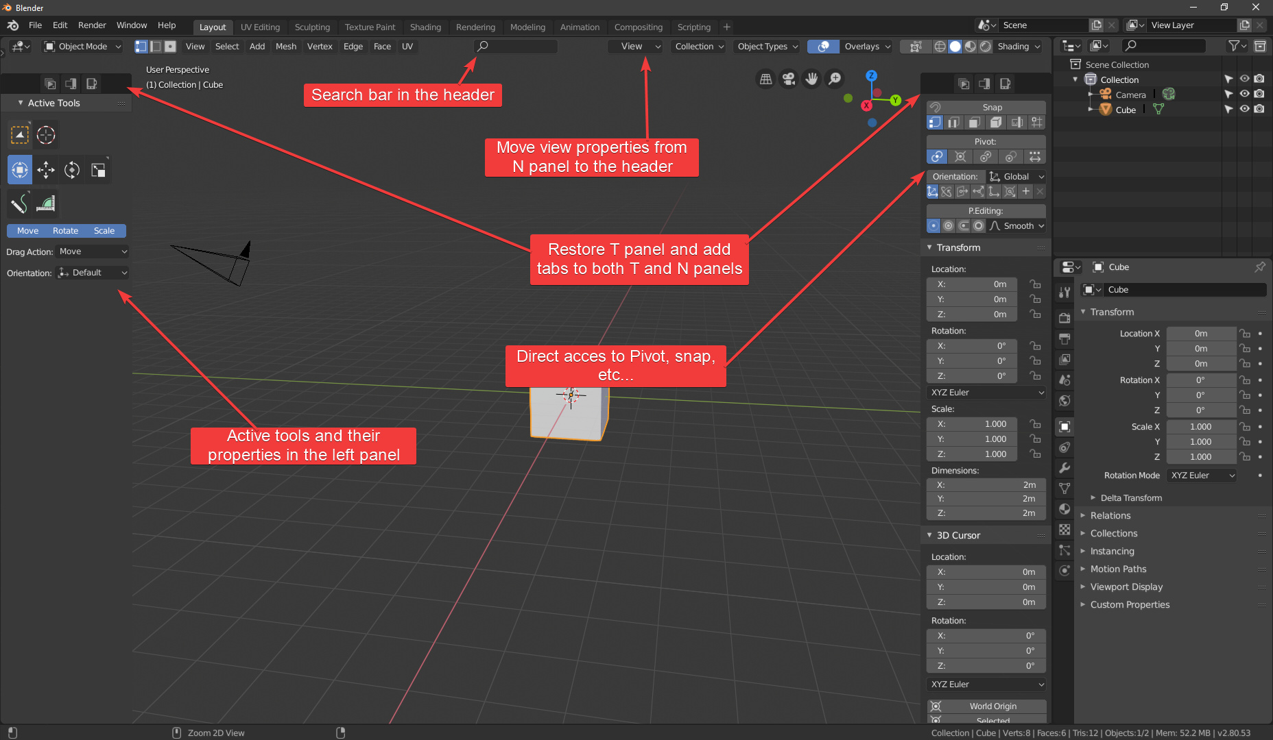
Now that the address of the blender interface is clear I wanted to make a proposal to polish the operation of the N-Shelf and solve the main problem that actually has.
The idea is basically how to fix the current behavior of the panel when it moves from right to left. Now cut the viewer completely from top to bottom with the tab column. There are several solutions and I wouldn’t know which is the best, both have their pros and cons. So I prefer to do a survey and see what people think.
The clearest and most immediate solution to the problem is to move the N-shelf to the left of the T-shelf (Or vice versa if we move the T-shelf to the right). This solves the problem completely. But by removing the opacity from the bottom of the tabs and turning them into buttons you get a solution that gives the possibility to put the N-Shelf to the right of T-shelf. And it works quite well as long as there aren’t too many eyelashes. As I say I don’t know which is better or worse.
(They are examples, the N-panel would still come by default in the same place like actually, and you can hide it completely if you want, hide the T-shelf… It’s to see the problematic if we move the N-shelf)
Pros of the N-shelf to the left
Nothing interrupts the mouse’s path to the T-shelf.
More at hand the T-shelf
Better tidy
Works with any number of plugins
N-shelf pros to the right
The T-Shelf doesn’t move from position every time you want to see the N-shelf.
Visually it looks better
It appear more logic
More handy controls, like the Tool.
Given also this evolution could be good to update the behavior of the tabs, as I proposed a few weeks ago, so that the user could see all the tabs and select or deselect the one you want to show. This way I could avoid showing and hiding the N-shelf constantly.
Putting it on the left seems like a weird choice, but I suppose it should be supported. However, if it is never completely optimal because it clashes with the tool shelf, that is up to the user for putting them both in the same place. I think the transparent version clinging to the right of the tool shelf is best. But it also comes to another proposal I thought about after seeing the recent switch to the current implementation of the tabbed N-panel:
I hate the ugly double bar that the N-panel adds, especially when it goes back-to-back with the bar on the Properties panel.
These tabs should always just live on top of the viewport, without a background bar. Furthermore, each tab really should close when you click on the tab again, since this is expected behavior in many applications involving showable/collapsible tabs. And also, the tabs should never go away because that adds unnecessary complexity making the user learn and think about “Where did my tabs go? Why aren’t they where I usually see them?”. They take up such minimal screen real estate (each tab is only 18 pixels wide, and they are usually only near the top of the screen) so it cannot possibly be harmful to keep them visible all of the time. Then that means the confusing icon can go away, which is being stuck in a very awkward place right now behind the viewport transform gizmo where it is hard to see or understand what it does or why it’s there:
That also helps reduce Blender’s reliance on hotkeys, because the entire functionality of the N-panel can work without ever learning the N hotkey. Tabs can be opened and closed by clicking on the tab names to the top right of the viewport. The N key can then be used to open the most recently closed tab, or to close the currently open tab.
Nice Proposal - the current design with the tiny < Symbol really doesn’t add a lot to discoverability. Since this is a problem in other editors too, I’d make it consistent with the other sidebars in Blender. You probably already addressed this in your tabs proposal, but I didn’t find it.
From the three proposals you did, I think " Transparent N-Shelf at the right" is the best one, because it doesn’t mess with the Toolbars position when opened.
I think this wouldn’t a problem with the Panel at the right, if the toolshelf would be completely at the screen edge and therefore even easier to click (since you don’t have to stop the mouse ahead of the edge). You probably already know the principle of “infinite width”.
The thing I don’t completely aggree with is the switch to the left in general. Maybe it shortens mouse distances, but it also gets a little cluttered. When we have the option to move it back, I’d like to have it though (like the Headers option “Flip to right”).
It’s possible when you really want it! maybe by adding rows instead of extend horizontally. The same problem happens with the unreadable and ugly vertical tabs it will be quickly full!
Ooh and for Alberto’s proposal I’d prefer with background for better looking. Also with these bunch of settings I think it’s better to keep two panels
I would like the side panels, now that they are becoming important containers, to have some evolution in terms of “expanding drawers” and show their best tools that are contained …
I’m talking about something like it happens in physical reality …
I’m thinking of the mechanic’s drawer which has a compact part, with all the basic tools, and which then opens the two doors and there are all the other more in-depth tools …
imagine
every door “full of tools” and the central part also full of tools …
mentally transforming this figure to what I mean in terms of each sidebar panel … and you will understand what I mean …
we would have compact panels for each addon and native blender function, but that can be expanded when we need them, in horizontal terms, to use less frequently used parts of tools …
Addons can go anywhere in 2.80 in Active Tools Panel, in the topbar, even in their own editor…etc, i don’t like the N panel to be flooded or spilted like it’s right now, this will result into too many clicks or losing the horizontal 3d space…also there is no time left before the stable Release to redesign it, so it’s best to polish it and make it useable instead of trying to test every possible combination that users throw.
The tabs in Properties can be in the other side, it’s configurable, use the Flip Region command over them (not the panels, just the tabs zone). The tabs in the N-key are not, they seem to always be left side for left panels and right side for right panels (Flip Region flips everything, or I have not found where to apply it). Default for properties seems to be the inverse logic used for N-key, they are in the way instead of placed near the edge (area for N-key case, window for Props).
There wouldn’t be any problem if we could just have the T-panel back. The N-panel alone is just going to get absolutely cluttered with addons and rigging buttons (it’s common to put IK switches and such there). We’re going to end up with an insanely long scrolling list, for absolutely no benefit to the design what so ever.
The N-shelf was deserted at 2.79 and the T-shelf was full. Now that the T-shelf has been removed, or become the active tools bar, the N-shelf will be populated in the same way.
Actually if it were not because we know that one was the T-shelf or the N-shelf we might think that only the T-shelf has moved from place to place.
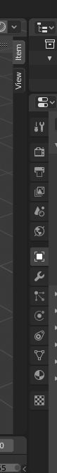
Improvements to the N-shelf are needed to allow it to work with many more elements. Icons seem the most obvious option.


 maybe by adding rows instead of extend horizontally. The same problem happens with the unreadable and ugly vertical tabs it will be quickly full!