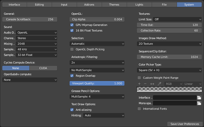
The User Preferences > System page is for allowing the user to modify settings related to hardware and rendering quality/performance at a technical, low level.
Except two settings are in there which definitely don’t belong, can you find out which ones?
Color Picker Type and Custom Weight Paint Range are both UX-related settings, not hardware or system related. This is a very hidden and inaccessible location for these settings, and they should be moved to relevant locations (hint: not inside the User Preferences at all).
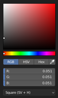
Moving Color Picker Type into the color picker would be a very important UX improvement. Until a few weeks ago, I had no idea that Blender had other color picker types, and this bothered me for years since I began using Blender. Because the default color picker type is so useless for picking colors, I always used Photoshop’s color picker and copied the hex code into Blender. I could also see how different workflows, or different users of the same source file, may wish to frequently swap between types. Opening the User Preferences is cumbersome and separates related tool functionality into wildly separate contexts, which is a bad UX. Here is a suggested adaption of the color picker UI which has a more consistent/aligned layout and includes the color picker type setting:

By moving the eye dropper up to the RGB/HSV/Hex button bar, it allows the eye dropper to be considered another manner of adjusting the active color value— either by toying with the RGB values, the HSV values, the hex values, or the color value at the chosen pixel. It also makes the input sliders below align nicely. Finally, it fixes the current long-standing issue where the eye dropper icon is misaligned in its own standalone button:
![]()
As far as defaults go, I would argue that the Square (SV + H) style picker is the most useful, intuitive, and standard style of color picker in major digital art applications. Ergo, I believe it should be made the Blender default so new users start out with something expected and existing users can effectively choose the color most intuitively compared to the current default. Also, usually it is more useful to make small adjustments to the HSL value than the RGB value of an existing color, since humans understand the idea of making things lighter/darker, more/less saturated, and a different color/hue. Whereas humans do not understand the task of adjusting a color to alter it via its red, green, and blue components, so needing to adjust the RGB values is less common for artists. Thus, I believe the RGB/HSL/Hex buttons should be rearranged as HSL/RGB/Hex so that the default can be HSL.
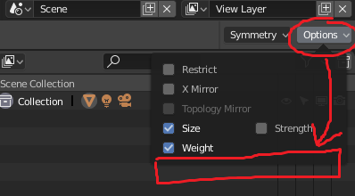
For Custom Weight Paint Range, one suggestion is moving it into the Options dropdown that appears at the right of the Blender header while in Weight Paint mode. However, I have never used this feature, so others may be able to find a more relevant location to move it.

