More Evaluation Required for Screen Area Docking

I’m hoping for (yet) another round of testing on my PR for screen area docking. This time considering this specific implementation for possible inclusion in a near-term Blender release. So not just evaluating the idea of docking, or of having something like this, but of getting this in particular. Can you live with this?

If you have tested earlier in development, this version does everything from the corner action zones without modifiers, so no need to hold down shift or control - just drag from the corners. This also implements area splitting in a way that is as close as possible to how it works today. So hopefully this is minimally disruptive.
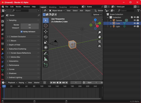
Builds:

Patch:

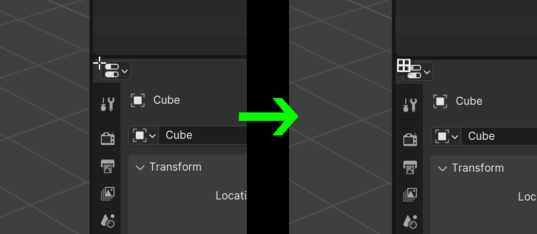
To recap, this extends the “Join Areas” operator. You just drag out from a corner zone and you will be presented with multiple docking locations along with possible joins. Split Area operation works as today, except that it only does so on mouse release, which allows for seamless transitioning between docking, splitting, joining, and floating new windows.

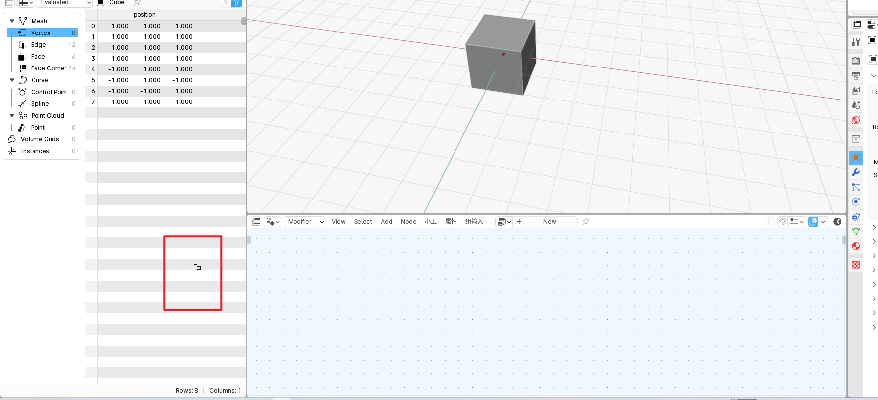
The following shows seamless transitioning between area joins and vertical and horizontal splitting:

DockSplit

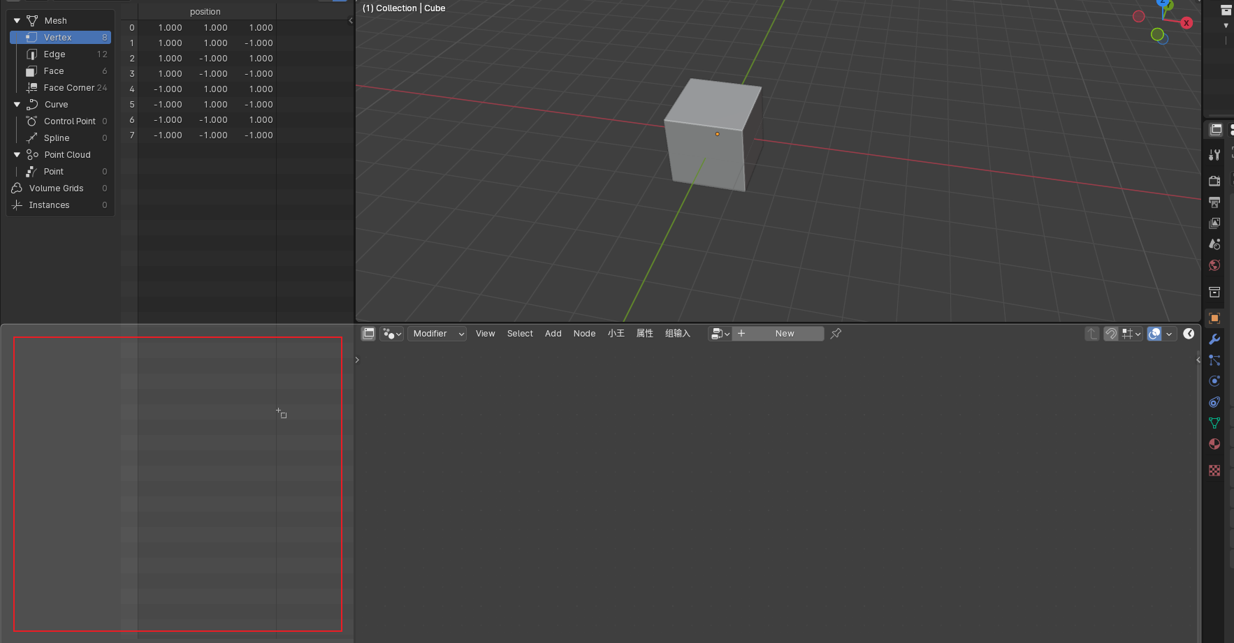
The following shows how dragging with your mouse gives you options for joining and docking in multiple locations:

Docking2

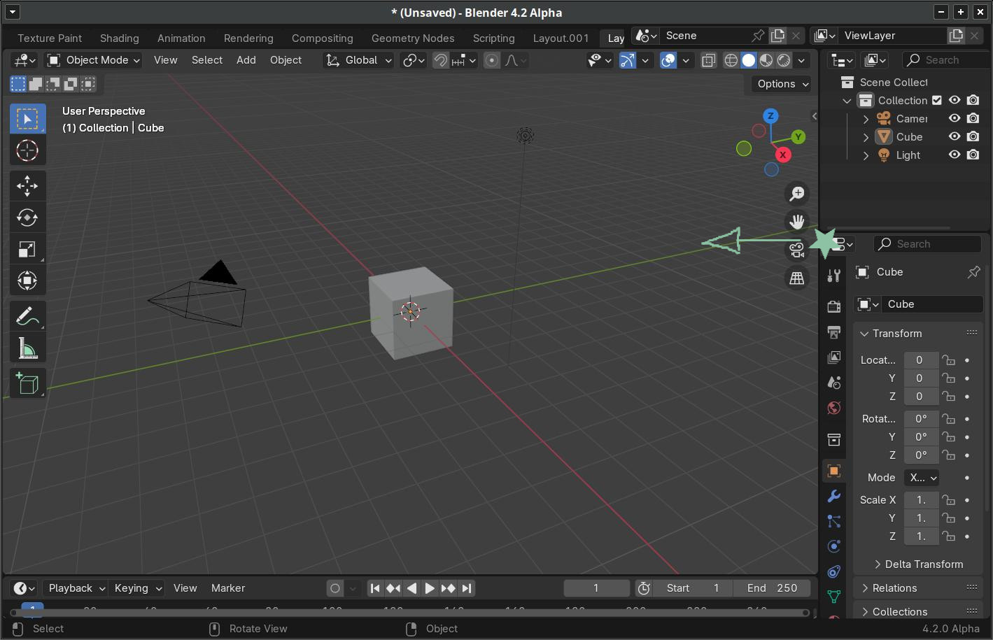
The following shows creating a new window by dragging outside the window:

Docking3

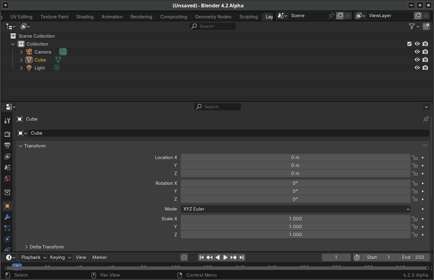
The following shows moving areas between separate windows:

DockWindows

Right-clicking on the gap between editors, there is currently a “Join Areas” that starts an interactive join. Because this patch removes the ability to reverse join direction mid-operation, this item becomes two which execute immediately:

Docking4

All comments are welcome, as long as you actually test this.

33 Likes

Thanks for working on this! I just did a quick test and I really like this implementation, it feels quick and intuitive (for me at least). I specially like the ability to create new windows by dragging outside the main window :ok_hand:

1 Like

This is cool and convenient.I really like this feature. The operation prompts are also quite clear. Unfortunately, the operating experience is not good in the white theme.

I tried to break it but couldn’t find anything wrong. It’s absolutely fantastic. I set goal of recreating every workspace configuration we have, and switching between different ones, like from sculpting workspace arrangement to scripting, and its incredibly fast. Just a second or two to completely rearrange your screen. Great great job Harley.

2 Likes

i just wish i could start the dragging from a more obvious place like the button.
the corner stuff is always a pita.
other than that, great feature ofc

2 Likes

I just tried it and it is awesome. It worked fluently and flawlessly.
I somewhat agree with @ThinkingPolygons that it would be even better if you could start it from somewhere else than the corner.

Perhaps use a modifier Key to start it from a border? For example if you hold alt and drag from the border or even from anywhere inside an area? But that that is just a tiny issue that would not warrant putting a lot of work into it imo.

Some of you really hate easy life huh.

5 Likes

I really like it, no weird or unexpected behaviors. I love how easy it is to dock and move areas around.

1 Like

Took some getting used to in terms of which movements trigger splitting, which trigger swapping etc, but once I got passed that I really enjoyed it!
I do think a cursor change or even a small text overlay could help people figure out what exactly’s going to happen, even if the visual feedback does a fairly good job of that already.

2 Likes

Thank you for your efforts!
I love this!

Only problem I found …

Before. I enter ‘docking’ on the properties editor and drag left.


After I dragged left, the whole right column is removed.

I think it’s working well. It’s far easier to use than whatever the pre-existing was, which honestly I could never quite understand the workflow and logic of.

  • I like that no modifier is required.
  • It’s easy to see when you’re dragging from a corner, or not.
  • Final placement seems predictable.
  • I’m glad it IS the corner, at not some other arbitrary place - especially not on the main borders, as I regularly resize by dragging those around.
4 Likes

Love the feature.
Maybe, talking about making it more explicit for new users, this could also be the opportunity for having a dedicated icon, instead of the cross from edit mode.

Only problem with this is that for corners that have the editor drop-down close, it occludes it a bit, making it less readable.

Go upvote it… :wink:

1 Like

With this docking in, I’d be inclined to make that cursor look like a “move” while at the corner action zones. That might mean the four-pointed arrow we have in a few places, or maybe the OS-supplied move cursor, and maybe the “open hand” when on Mac (only).

But…

The mouse cursor could be changed without this PR, and this PR can go in without a mouse cursor change, which means that these things are separate. I’d rather not bikeshed about that here as that literally pushes this PR further into the future for no reason.

I’d rather stay on topic and compare how things are now with how they could be with this PR. If you think it would work better with a different cursor then just imagine you have that cursor while trying this.

12 Likes

That is actually the normal behavior today. As in you’d get the exact behavior in 4.0, 3.6, 3.3.

From the default layout, as you started dragging left from the Properties area, different areas were dimmed to indicate which areas would go away. You let go of your mouse button when you it looked like this:

image

The above is trying to indicate that Properties will subsume the 3DViewport. Afterward Outliner and Timeline will fill in the voids and you end up with this:

image

However, with this PR you have new options that you don’t have in older versions:

Drag Properties to the middle of the 3DView and you get this

image

Or drag to the left side of 3DView and get this:

image

Or you can drag it to the top or bottom of the 3DView to get even more combinations.

10 Likes

Sorry for detour, this PR indeed isnt changed by these comosmetics. Feature feels really good!

Apparently I did already months ago :laughing:

1 Like

Yepp, very well done. :upside_down_face: :slightly_smiling_face:
Just tested on latest macOS 14.4 M2

Only thing missing for me would be an updated solution for:
Dragging the borders between two windows to resize OR collaps more conveniently.

It would be very helpful when on ‘mouse over’ over the border, a bigger trigger/action area for the mouse click & drag would be possible. Because with screen resolutions like 3840 x 2160 +, it’s not funny to drag the border to resize. Most of the time it’s hard to trigger this behaviour, because the trigger / action area is so tiny, with higher resolutions, even with big ‘Line width’ enabled.

That change to a bigger trigger/action area under the border and the ability to collaps a window when dragging the border up/down/left/right to the end of the window, would make this nice screen area docking solution an absolut burner. :crazy_face: :wink:

Hope & Thanks in advance

1 Like

@Nurb2Kea

to collapse a window when dragging the border up/down/left/right to the end of the window

So you want the area to be removed by just dragging it to nothing? That should be possible, although we’d need to also keep the current behavior of treating the minimum-sized area as a minimized state. So dragging toward nothing it stops at minimize size, but then go much past that and the area is removed.

with screen resolutions like 3840 x 2160 +, it’s not funny to drag the border to resize

I didn’t know that was still a complaint. I have multiple monitors, but none that are 4K. We currently do allow dragging window borders to resize from positions that are (slightly) wider than the visible black border. With defaults and resolution scale set to 1, I am seeing a visible border that is only 3 pixel wide, but I can drag that edge from two pixels away from either side, so there a 7 pixel-wide action area. But each of my pixels are potentially much larger than yours.

Probably the best way to approach this is for you to screen capture the entire monitor with blender set to a resolution that is usable to you. Then send the capture to me in a DM that also describes how large your monitor is and how far away it is from you. And then try to describe how hard it is to hit that edge. Maybe blow up an inset and mark it up to help illustrate the problem.

1 Like

Personally I feel like the current command of close area in the menu bar is quite sufficient.

Perhaps I’m an edge case, but honestly I don’t spend all day dragging areas around. For complete floor plan changes I just use another workspace. I think the new feature set makes it much easier to quickly create a new one for a special use, but I really don’t need it to go much further than that.

1 Like