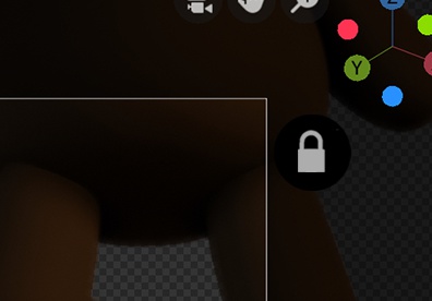
Currently the way you enable Lock Camera to View has a few flaws:
- Most importantly, lack of discoverability for new users ! Since the camera doesn’t move by default, new users will click on the camera icon and then not know how to move it. This is not good ! It will give newbies the impression that Blender is harder to use than it is.
- Requires 3 or 4 clicks (hit N to open the side panel, click to select “View”, click the “Lock Camera to View”, hit N again to close it) instead of 1.
- The N panel takes up a lot of space, so it’s annoying to have to keep opening it.
- Easy to forget you’ve enabled it. Every time I use Blender I find myself making unwanted camera movements and having to undo them!
- It’s a little bit poorly named, because it does move when it’s locked and it doesn’t move when it’s not locked! For me, this leads to a lot of accidentally checking the box when I want it to be unchecked, or vice versa.
The obvious solution is to get rid of the hidden Lock Camera to View checkbox and replace it with a little padlock icon somewhere outside of the camera frame in Camera View, which prevents the camera from moving.

This would be more intuitive, less clicky, and easier to see at a glance whether or not you’ve left it on.