Left click Default?

see now that’s something we can agree,input editor need some attention, u see they can have Right and Left keymap but i bet people once they pass the basic steps of learning, they’ll be like me having their own custom keymap because no one works with default as it is and add on top of that that, addons who some actually confilcts with it or with other ones, luckly now we can filter them by workspace…we need more intuitive and communicative editor.

1 Like

I have plans to implement a node based input editor, If I be lucky, I expect it to be as easy as creating a shader for cycles, I just have to learn the node and the keymap api.

That will be nice. So many times I’ve thought: Finally! A new version and I just KNOW they documented it this time because they said they would. It’s great to know they’re finally doing it.

I disagree with almost all your points, especially regarding tutorials, but I do agree the shortcut editor is just a mess and almost unusable (I manually edit my shortcuts externally in a text editor if at all possible). I also think it’s the one thing if fixed that could actually stop everyone bickering about the keymaps once and for all.

I have considered for a while trying to tinker with the source code or making an addon to make the list at least sortable, easier to search, etc, but I suspect it would be quite a lot of work and I don’t really have the time for now. Still I’m always thinking of ways it could be done, especially given how Blender commands work.

I’m curious how you would make the shortcut editor node based? Like how would that work UI wise?

I dont have concrete plans for how yet but I suppose I can create a key_press and a operator_call node, then each editor would have its own output node as well, they would have to be connected backwards but anyway, I guess its possible, I will just require a lot of work.

I guess nodes are elegant because a single operator for example Transform.translate that repeats itself in the keymap a lot can be collapsed into a single node for a bunch of modes and editors.

How About this?
consistency

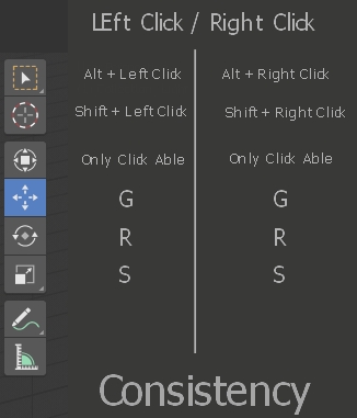
Right click should reflect Left click more. This could work for edit mode as well.

W - should be the same for both

2 Likes

I agree with you, it should be as symmetric as possible, for sake of simplicity.

1 Like

Why would you move the 3d cursor off left click in the RCS keymap?
What would you replace it with? A menu like LCS has would likely be frustrating.

Also pressing a modifier key and then clicking and dragging is basically the embodiment of redundancy compared to the ‘B’ hotkey. At least click+drag without a hotkey had a point removing a key press and matching the ‘expected’ behaviour, the modifier key makes that so you mayaswell use the ‘B’ key.

RCS isn’t just a flipped version of LCS, that defeats the entire point.

2 Likes

Good point. ALT + RC wouldn’t work either in edit mode.

as @anon18120698 said

Right now, LCS is too distant from RCS.

It’s meant to be, they work different, they’re intended to function differently, those differences are what gives RCS it’s strengths. To make them similar would be to eliminate the need for the distinction at all.

3 Likes

It wouldn’t. For many non-blender users is RCS frustration. Goal is to make LCS as powerful as possible.

I don’t think most people understand the significance of switching to left click select. It doesn’t swap the function of the left and right mouse buttons, but just stacks everything on one instead. This leads to mis-selection, accidental movement of objects, and removes the ability to deselect a tool.
When this becomes standard, Blender will become slower by default and future versions and addons will be built around this. It’s a mistake.

If left click MUST be standard to cater to Autodesk users, then at least swap the keys - Don’t just kill one and destroy the workflow.

Same with pie menus. They just slow down work, and having them as an option is fine, but forcing you to use them is just bad design.

Removing the T-menu and stacking everything in the already jam-packed N-menu is also a completely incomprehenisble design choice. The N-menu is already a huge and disorderly scroll-list, and rigging settings also end up there. The new buttons are pretty, but ultimately useless for anyone who knows how to use Blender properly - But I don’t see why we can’t have both. Buttons for new (/Maya) users and a T-menu you can open if you want to.

Blender 2.8 has some amazing new features, and it’s incredible that we all get access to this for free, but the new UI choices are very misguided and a detriment to the software.

1 Like

then make mock up, proposals, because we all can say this is bad and this is good… but if you really want to get the devs attention from all the sea of feedback they get on a daily basis then something good and well presented is the way to go…i hate when users complain about stuff but never provide a solution…i am talking in a general way not par person.

This fear is unwarranted, since for that to happen we would have to have a huge regression and lose key remapping/configuration. Which I just don’t see happening. At all. Heck, if it were to happen the outcry from user community would be a hundred times worse than what is currently happening over the change in layout/defaults.

I doubt it would stop the bickering completely however I do agree that the input editor is bare-bones and could use improvement. I disagree with calling it almost unusable, rather the appropriate word here is overwhelming. But that’s just semantics.

I don’t see the purpose in making a mockup to show that some things SHOULDN’T be changed.
I think what I wrote is pretty self-explanatory, and I get the impression that I’m not alone in having these opinions.
Making Blender more inviting to Autodesk users is a good thing, but set it up so that

  1. It’s completely optional (don’t remove the T-menu if you don’t have any alternative for it, don’t force slow pie menus)
  2. It doesn’t disrupt the great workflow (don’t remove functionality when switching to left click select - instead just swap left and right). Left click in its current form is just objectively slower and less precise. It’s a step back in terms of design, and it doesn’t have to be.

u say it shouldn’t be changed when actually most people asked for these changes, and they can’t please everybody and just give u every single option for every little change here and there that’s counter productive ,i said make a mock up for T panel or whatever to how they could work using both old and new design.

1 Like

I doubt it would stop the bickering completely however I do agree that the input editor is bare-bones and could use improvement. I disagree with calling it almost unusable, rather the appropriate word here is overwhelming. But that’s just semantics.

I don’t know, I’ve never seen this much bickering about shortcuts with any other program, or even people fearing that shortcuts will be changed! Always the complaints are about areas where customization is not allowed. This can even be extended to other problems, not just shortcuts.

In Blender’s case, you can technically customize your shortcuts, but it’s so inaccesible, it’s almost like they weren’t customizable. Also I did qualify “unusable” with “almost”. It is also “overwhelming”, but that’s not why I would call it unusable. I made a detailed list of problems in this proposal. I’m sure most people can manage changing a few shortcuts just fine, especially from the menus (though there are huge problems with this as well). BUT try making major changes IN the editor.

And this has become worse now. I just noticed but ACTION and SELECT mouse are gone? I had thought the asymmetry was optional…sigh. There’s probably going to be even angry LCS people now. Before you could just swap ACTION and SELECT for those that wanted symmetrical LCS functionality, now, there’s only the new “select with” which is completely deceiving because it has side effects! It’s more like a second keymap than the option it’s described as. It should at the very least make this clear with a warning or a checkbox for performing those additional side effects. Preferably though these options should be decoupled and independent from each other as much as possible.

Also it seems changing Right/Left can change/remove shortcuts you might have changed! And it doesn’t change new shortcuts that you set to Right/Left. Someone please tell me this is a bug and not intentional because I don’t even know what is going on anymore…

2 Likes

That’s just silly.
“Most people asked for these changes” - That’s simply not true. A lot of people used to Autodesk asked for Left click to be the selection key, because they were confused by the default Right click selection. Swapping those keys would have been absolutely fine, but THAT IS NOT WHAT HAS HAPPENED. The new paradigm is NEW, and the Left click now just does multiple things, which leads to misclicking, unnecessary movement and TIME WASTED.
As for the T-menu: You demand that I make a mockup of how I want it? Why? I thought it was acceptable as it was. There could undoubtedly have been made improvements to the layout, but I’m just not happy that it has been REMOVED, because it causes more stuff to clutter up the N-menu for no reason.
I still don’t get what you fail to understand here.
The pie menus are OBJECTIVELY SLOWER, and require MORE CLICKING. That would be all right, IF YOU COULD TURN THEM OFF. But you can’t.

1 Like

well suit yourself ,the truth is the truth otherwise they wouldn’t change it, i tried to help u but it seem u like the rest…stuck with their opinions and you’ll have to choose, aceept it or leave it…cheers.

I’d love to “suit myself”. Problem is I can’t. Have you even tried modeling in 2.8?
There’s a difference between opinion and fact, and the fact is that Blender 2.8 is slower, less precise and much less efficient for modeling than 2.7.

“the truth is the truth otherwise they wouldn’t change it”
The devs are human beings. All individuals with different ideas and opinions. It’s not like a change is automatically better, just because it’s new. What kind of infantile reasoning is this?

“i tried to help u”
No, you didn’t. You wrote a lazy dismissal about things you clearly don’t understand, because you don’t bother trying to understand it.