I like that one. Where did you learn Logo-Design? But of course, the others are right: It is looking too much like a corporate logo (slogan and ®-Sign). Besides that, it really can compete with the other proposals
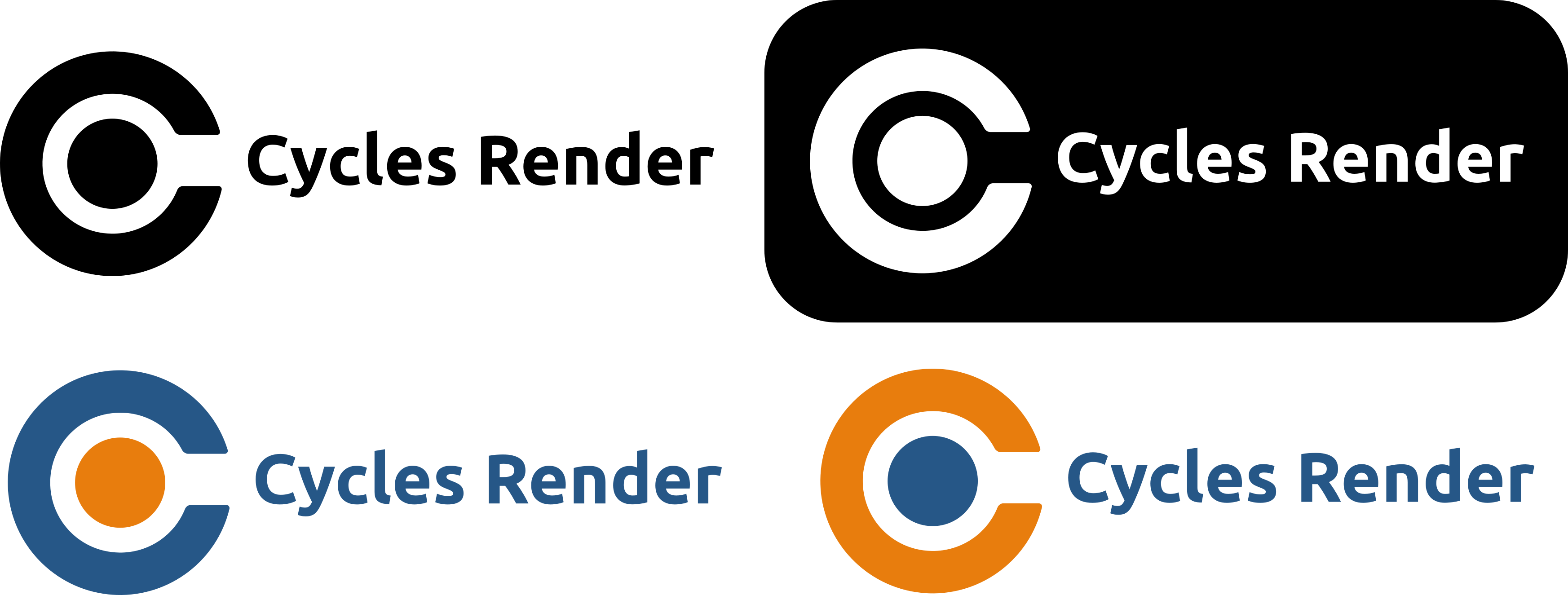
I really liked the idea of the C with a dot inside so I tried to make it look closer to the other standalone cycles logo
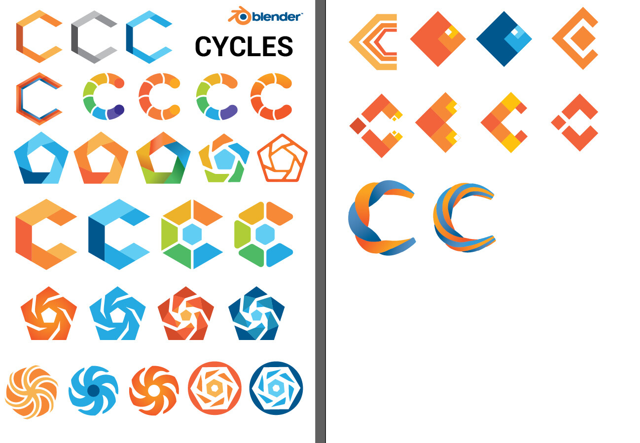
7 Likes
I like the simplicity of this one, it’s obviously very similar to the Blender logo without being too noisy.
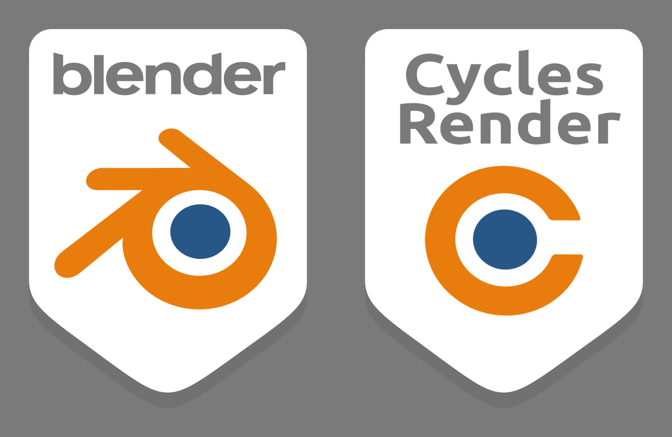
Now that we have an official Blender community badge, I think an official Cycles logo would have to look good next to the Blender badge. I made a slight adjustment to your design and did a quick mock-up to see what it would look like in the badge format:
6 Likes
Personally that looks incredibly generic.
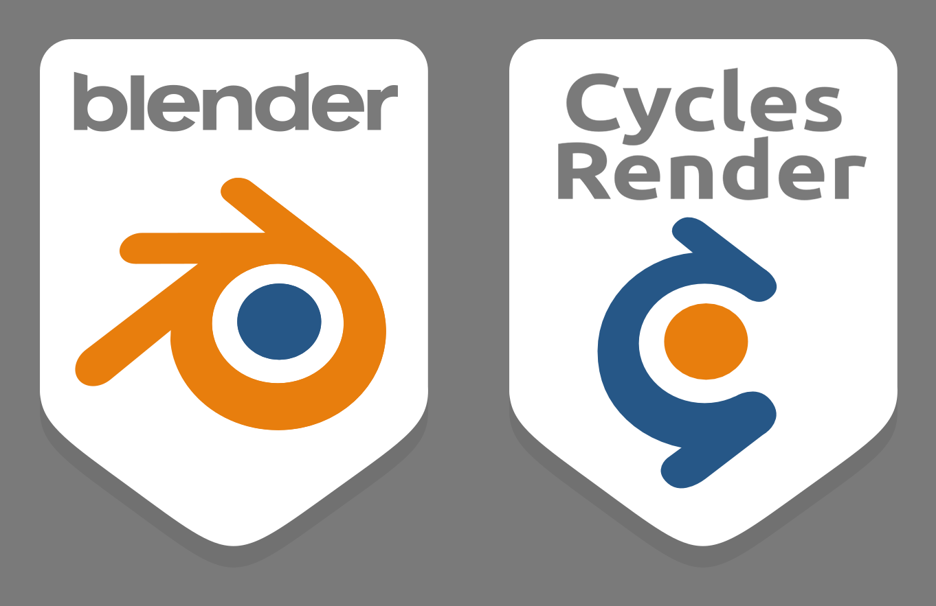
I wanted to see what making the smallest possible change to the Blender logo would look like, but I didn’t like that at all either… tried inverting the colors, but it didn’t really improve things…
Leaving it here just so people can see it’s already been tried.
3 Likes
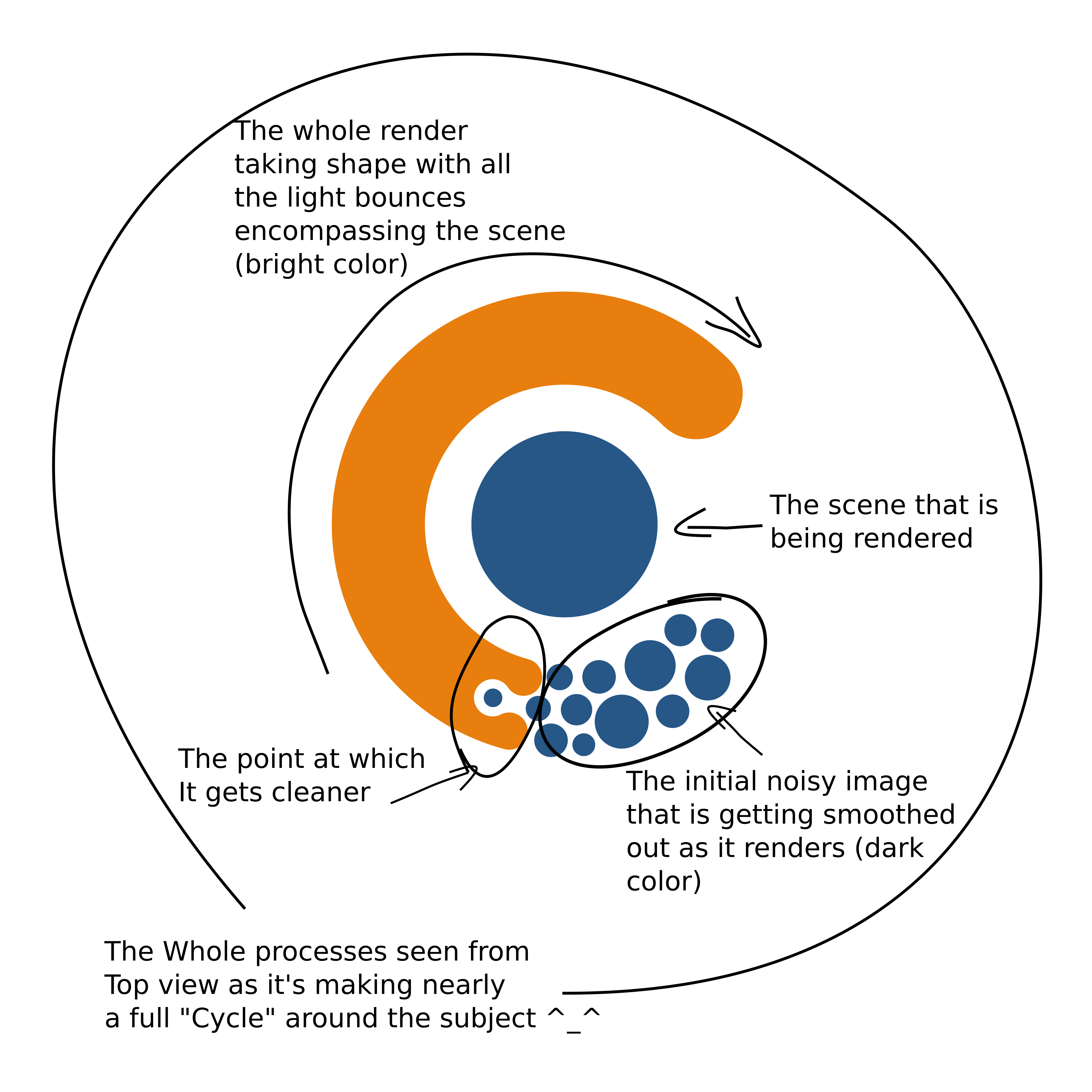
UUUH that’s a great idea … I really like it. Altough I’d really love to include some references to sycles-specific things such as the render tiles or something …
Why do people think a cycles logo has to be a mixup of the blender logo?
In my opinion this logo design from phocomelus is stylish, elegant, simple, and has its own identity.
17 Likes
I am very impressed by all those suggestions! Would be awesome if one of those was picked.
1 Like


That honestly makes it look like an icon of a tool related to fluid dynamics/sims to me. But I like that you tried to actually design some symbolism into it.
Personally I’ve been thinking of how to bring the cyclic nature of a photon as a light waveform into it and merge it with a 3/4 view of a sinewave cycle(looking from the side it would be a wave or a bell curve if you will, while along the axis of progression it would be a circular cycle).
It could make sense in motion as an animation but I can’t see it working in a still… so I haven’t really managed to come up with a viable iconography based on it.
3 Likes
Love this, maybe the C a little bigger to be more readable (personal opinion). I prefer to differenziate from “competitors”, so no circular saws or similar.
Attention to hexagons (Magento e-commerce platform).
I’ll give a try to Josefin sans font https://fonts.google.com/specimen/Josefin+Sans?preview.text_type=custom&preview.text=cycles%20Cycles
I understand that this is not an important thing, but with Cycles getting integrated more outside of Blender (soon probably in Houdini an other Hydra hosts thanks to HdCycles project) It would be nice to have some logo. Happy with whatever Cycles team decides on. Personally I though that these were the best looking and professional here:
By @WoollyBear


By @JulianPerez
8 Likes
Im personally in love with the first one!
It fit the general mood really well and have its own identity.
Simple, yet very powerful design!
6 Likes
Cycles X is coming, anyone else wanting to revive this thread for such interest (logo creation)?
Whats about this Cycles X logo idea?

a variation,the main idea is to give the logo a 3d and round look (like cycles xd)

3 Likes
I really like this one. ![]()
13 Likes
I think I guess its better without logo  Because it really has a cool name. I agree with Brecht. Maybe it should be a text logo when Cycles X Arrives it can emphasize on ‘‘X’’ with Cycles text
cycles x is the codename for refreshing the architecture and such. Cycles will always be cycles. Personally I like phocomelus’s logo as its elegant and being a flat logo its much more versatile. Especially now that we’re seeing the render engine being implemented in other software


 ![v5new|345x140]

I also made some designs being inspired from Cycles X where X also looks like light bounces and refraction because of lines that are broken to create C like shape as well showing the power of new cycles and fragmented C also symbolizing like eye / camera where rays hit during rendering. Moreover X also looks like cycling /shuriken. The one inside a sphere also inspired from material icon in blender to emphasize on materials of renderers . My favourite one is with X and without sphere. But I put the other trials as well for variation. Proportions or lines can change later. I just did these in short period of time for having a new idea after looking at other ones already posted:D.
Honestly, i don’t think that having both the C and the X of Cycles X in the Logo is going to work - even more so if the Logo is supposed to represent the qualities of Cycles as a raytracing engine.
Most of the logos collected in @Kubo.V’s post all have two big advantages
- They are simple
- They would be easily recognizable
With both letters and a rayracing reference it’s hard to reach these two qualities.
I think using one of the original designs and changing the name next to it to “Cycles-X” (with the Logo remaining unchanged) is the best option here, especially since these Designs are not officially associated with the original “old” Cycles yet.
I think render engines might change logo or have a new logo symbolizing its new reputation when they improved their reputation with new game changer improvements
Plus, the X I did was not just X but also light rays that are coming and refracting / reflecting from surface. So it had many meanings. It depended on how you look at it.
I liked the logos that Kubo.V mentioned too. However ,As for the recognizability of those logos in Kuba V post. I am not sure. In internet there are many logos for areas (like company logos or apps) that look like the logos you mentioned in Kubo.V post. So the recognazibality is due to those logos already have similar/same designs in internet like C inside hexagons or even c inside hexagon with openings from C to Hexagons edges. or fragmanted C. So it doesnt make cycles unique or recognizable as renderer. So in my post. I just tried to find a new idea (even though it has space for improvement in terms of proportions or corners etc) from my mind to create inspirations for giving a variation . Blender logo is quite unique if we look at logos in internet.
Most logos look really like Keyshot or where interior hexagon turn into C or the V sign inside spheree turned into C
So I think the logo should be
- Have similar design elements/ corners roundness and style like blender (so we can differentiate shape and look original compared to other renderers)
- Should be able to get colored version like blender colors so it can differentiate blender cycles from cycles used in other engines (I know cycles is not fully blender thing like evee but still it should be cabable of giving little connection or credibility or diffferentiation of blender cycles when needed)
- So, it Might be more similar to blender logo because the other designs make them less original because internet full of hexagon C or pixelated C or Chrome-like C designs.
- While having similar elements to blender, with little changes of proportions from blender logo, it can look unique and diferent compared to other renderers
If it should be similar to designs in internet, it should be too simple, so its cant be said’‘it looks like other logos’’
So for me , I think AnityEx’s logo is good especially it simple and recalls blender and dont have any fancy thing and it looks cool when it has no color like standalone renderer
Also, I like Adam preislers idea. I think Adam preislers idea to make it similar to blender but changing proportions to make diferent is good idea. It has the round corners of blender and circle turned into c and more rays around C. It both looks like blender for people who know blender and also not like blender for people who dont know it. Its better than the fragmanted C and sharp rays in other logos because other renderer like keyshot has fragmentation hexagons and octane hassharp end edges. But Adam preislers is more unique because its like blenders design methodology while being a standalone symbol for people who dont know blender.