I preffer the first one since it also resembles a camera aperture.
3 Likes
just another concept.
8 Likes
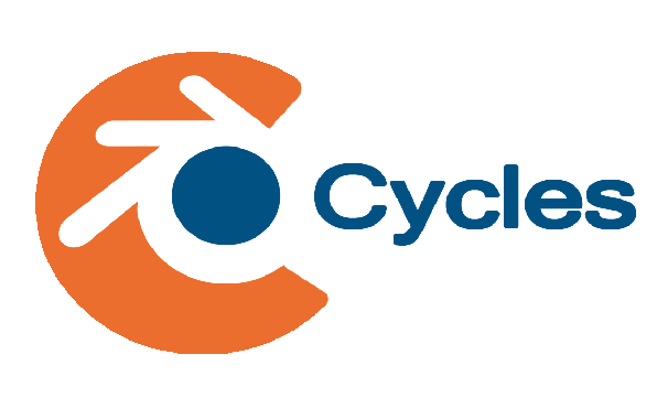
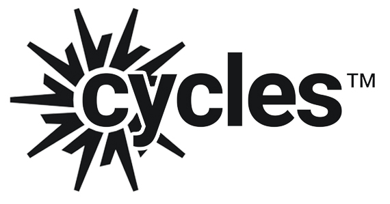
Quickly mocked up in Blender (and rendered with Cycles ![]() )…
)…
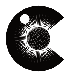
A C that is composed of lines that symbolise both light bounces off a sphere and light rays from a light source. The font is the default BFont with reduced kerning - I quite liked how clean it is.
Maybe it’ll inspire something better…
27 Likes
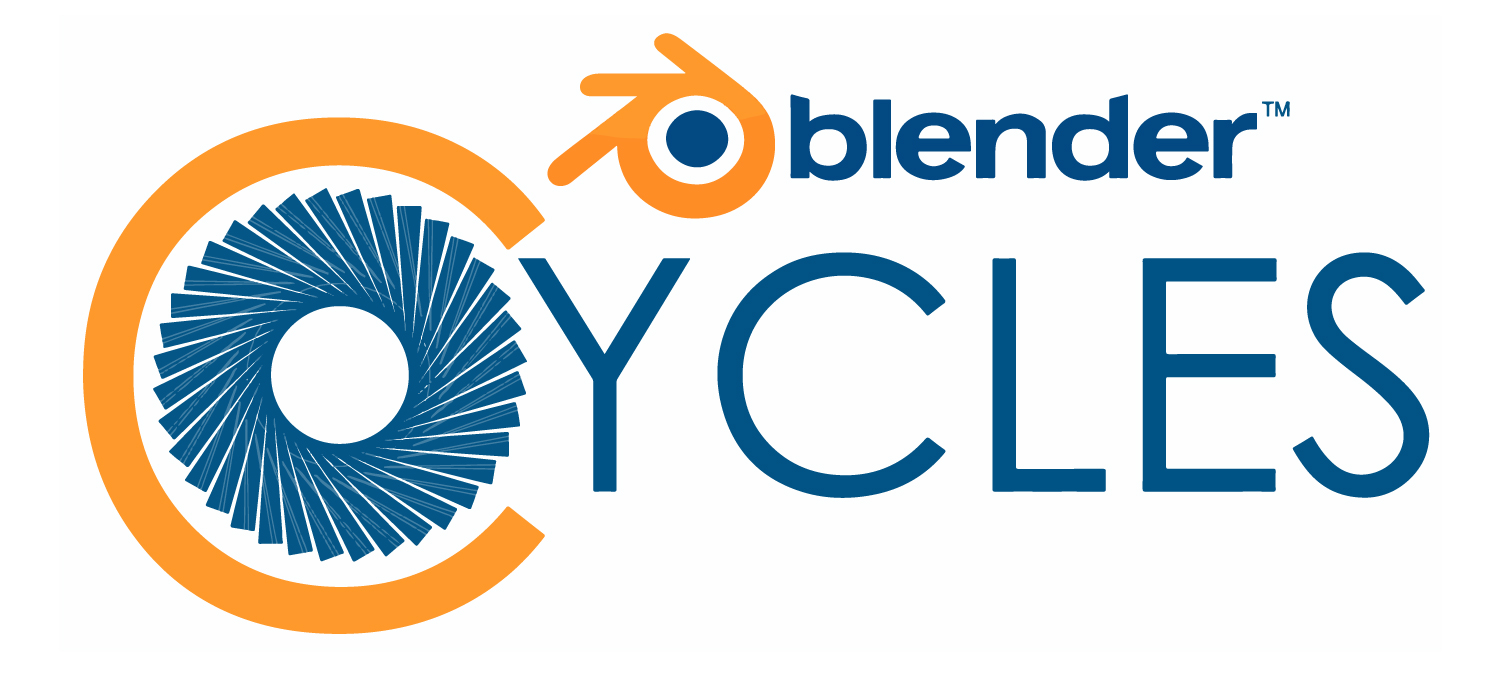
i think since blender now has two powerful engines both should have similar design that follows blender’s brand and logo, they should be distinguishable but not too different …here is my quick attempt
t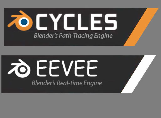
1 Like
4 Likes
@WoollyBear, I quite like that logo! Best one I’ve seen so far.
The default Blender font not so much.
7 Likes

some variation :

1 Like
An eye with rainbow iris, oh no, wait, it’s a planet with its moon, spreading light all around, but… where is Cycles render engine??

That’s not a logo: it’s a logo (blender’s), typografy (cycles), a tagline all in a graphic frame
this might be a nice start for a logo design
1 Like
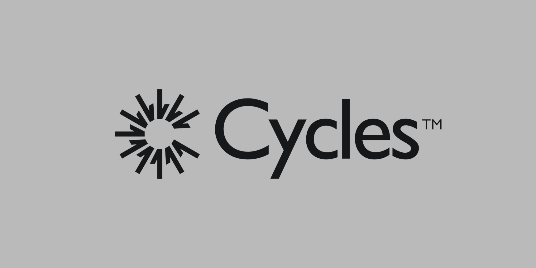
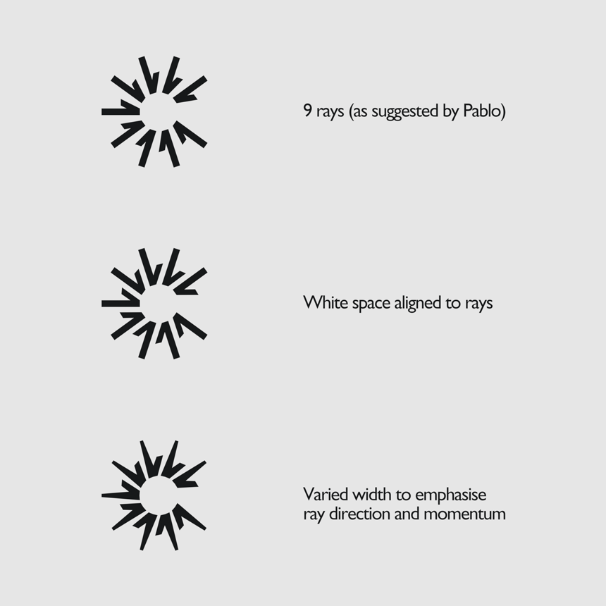
NICE! The typography could be different. But the logotype is great. Have you tried a version with less “rays”? Like 9 rays instead of 11. So it’s still readable in a smaller size.
5 Likes
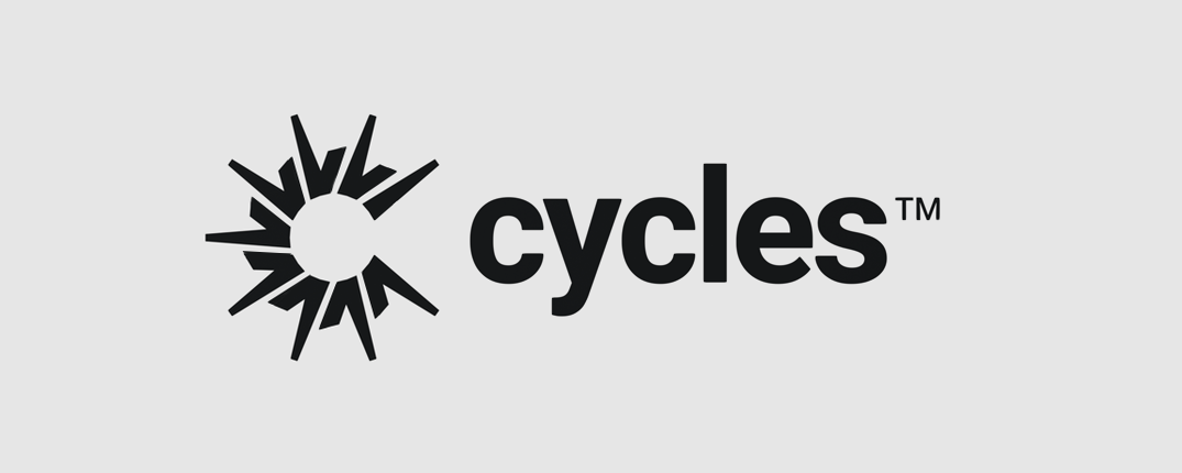
Based on the idea from @kaeru

Another draft with a couple of variations for you guys…
Are these more in the right direction?
The font is A Google Font called Heebo (bold). I’ve got a few more options if you don’t like that one…
28 Likes
I like this logo graphic you did (version 3) what if you did something like this?
This way it can be used as a stand alone like so

10 Likes
I had some time to do some sketching for the logo, I was mostly playing with different forms and shapes, and tried to stick to the Blender color scheme in general.

I already have some favorites but I’d like to know your opinion before doing more iterations.
12 Likes
Thanks! All right, time for me to get working. This is so encouraging that someone really pays attention and read these threads. I´ll upload mine when ready.
Woh00!
Question: Are you also looking for an eevee logo? If so, who approves it?
What happens if we have 2 rendering modes´logos on public presentations? Will there be confusion?
1 Like
My fav so far. I would suggest a few changes to streamline it.
- decrease icon size by a few points
- eliminate the shorter leg on the first ray (@ the 2 o’clock position)
- combine varied width and white space alignment
Here’s a quick edit:
I’m sure yours would look much better with everything aligned properly.
7 Likes
@WoollyBear, thanks for the variations! The “White space aligned to rays” one I like the best so far. Somehow the varied width doesn’t look as much as light bounces to me, though I like that less white space makes it feel like a more of a coherent whole.
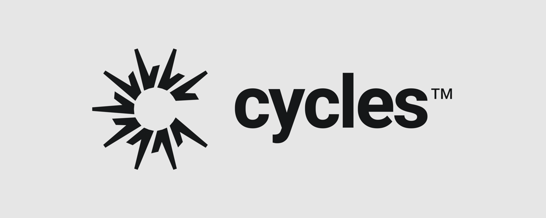
It would be interesting to see some font variations. The Heebo one is ok, nothing that stands out too much but I’m not sure if it needs to.
@PixelUrge, text inside or integrated with a logo doesn’t work so well I think.
@JulianPerez, I’m missing some kind of clear rendering or physics concept to make it more than a C or swirly cycling shape. The swirly black holes have a link to light physics, but we don’t do relativistic rendering so it might not be the best thing to hint at.
@DavidRivera, you’d have to ask Clément if he wants one, he’d be the one to approve it. Cycles runs independent from Blender so the need is a bit more clear, Eevee is still Blender only.
6 Likes