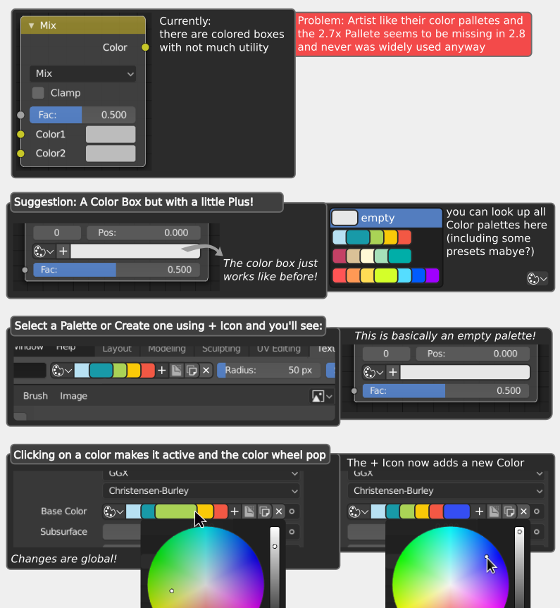
Okay I am currently thinking about suggestions to improove blender for astists and color palettes are actually something really important for a lot of non-3D-artists and that’s why I have this Suggestion.
Feel free to add your own Ideas or point out problems with my design!
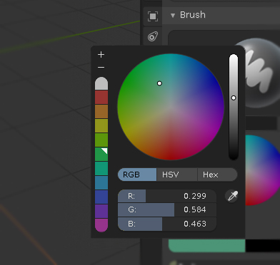
I kind of like it, it is indeed more direct, but it feels a bit “cluttered” and dense for an area that small. Having all those colors there could also get confusing… I think I would have to squint my eyes more often than not to clearly see what color is currently selected.
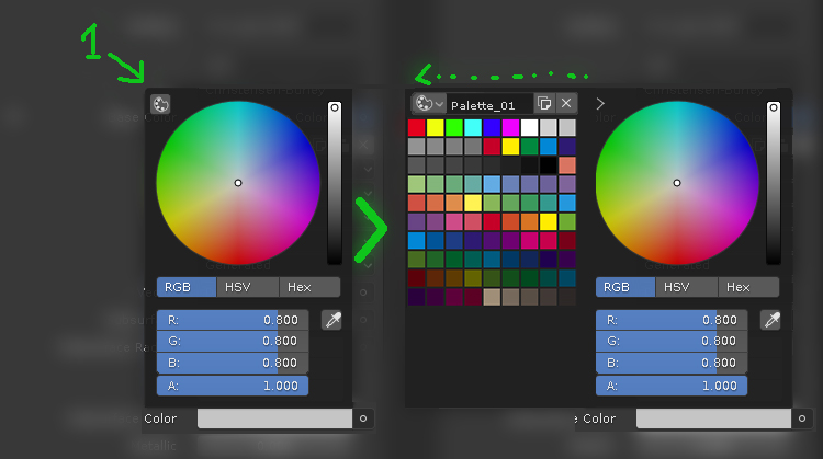
I’d rather have grouped the popup color selector, e.g.:
-Double click on the color circle adds a color to the palette and opens the extended panel if collapsed
-Double click on the color sample deletes it.
-One click selects the color and allows to modify it.
You’re right, that’s actually something, I’m not really happy with myself. You might be able to fix that by making the colors scroll so the left one is always the active…
And despite me linking your idea I think it lacks a good visualization for globally changing a color: because it’d be pretty useful to change a color in multiple locations at once if you ask me.
Also I think it’s a bit too much because I don’t think you’ll usually need more than 7-9 colors in a single palette based on what I’ve seen my non-3D-artists do… And I think we want to optimize the palette to work best with less colors.
Also I just realize there is not really much double clicking in the blender UI, so I’m not sure about that we might want to find a more blendery solution
You are right, it’s not a very blendery solution, but none of our suggestions really are. If you want to follow Blenders UI convention, then we should leave it as it is (maybe just improving the discoverability leaving a single color sample and the plus icon like in .79).
When it comes to color, it’s difficul to make something quick and comfortable to use, being constrained to that convention.
As for the palettes, there is really a wide range of situations.: a designer might use just <10 colors while a pixel artist might have a 16, 32… or even 128 color palette for creating a full world.
Anyway, there is always the addon posibility, you can improve usability as you see fit regardless of the UI convention (to a certain degree of course) if you have the time to learn python or the money to hire someone…
That been said, here is a more “blendery” option, same usability as current palette options, quick access anywhere with a color selector, the color samples could be vertically dragable if the palette is bigger.
But I’d really’d like the changing of a palette color to be just a single click. Hmm I need to think about the solution a bit more and probably also read the UI Design Guidelines.