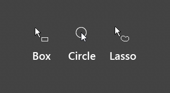
I’ll share screenshots of other software using a crosshair to denote box selection (which is the default selection tool in Blender). I think an arrow is perfectly fine for tweak and lasso tools, but box selection needs a crosshair, and circle selection needs just a circle (the arrow obstructs the view).
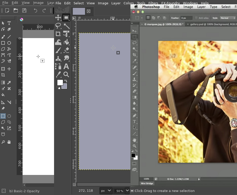
Their corresponding “tweak tool” uses an arrow, but their “box/marquee/rectangle tool” uses a crosshair (I’m sorry for the deficient Photoshop image, since I don’t have it installed I had to use a YouTube screencapture)
A crosshair in box selection objectively allows for greater precision, since our eyes are able to “follow” the cross arms in either direction and extrapolate what is going to be inside the selected area
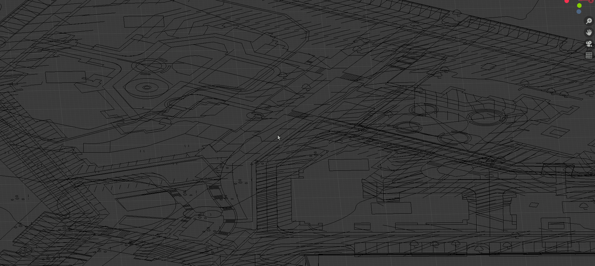
It turns into even a bigger problem during work with highly fragmented large scale objects, like general plans.
It is hard to define what will happen on pressing numeric keys - will it switch edit mesh mode or will hide collection, because it depends on current mode.
So it forces to constantly check current state (is it edit mode, or just tab missclicked), making it hard to concentrate on actual modeling process.
Did you bother to read the rest of the sentence you quoted? It’s much, much easier to follow the cross arms’ direction to know precisely where our selection will begin than guessing where does the arrow point begins.
I’m not saying ‘no’ to companion icons. As everyone can see in the image I uploaded, the crosshair in Krita and Gimp comes with a companion icon showing which tool it is, and I think companion icons would be a great addition.
But some tools need a different cursos alltogether, not just a companion icon. An arrow when using the brush tool would get in the way, for example (as does the arrow in the Circle Select Tool). An I-beam cursor is mandatory for text input.
And for box selection, a crosshair is the right choice for an icon. An arrow works for the tweak and lasso tools (like I said earlier), and just a circle for the circle select tool.
How is it not for everyone? In which ways does an arrow cursor for box selection actually improves the user experience instead of a crosshair cursor?
I have yet to see a reason other than “consistency” (which is false, because the cursor changes when using other tools, so there’s still inconsistency).
If a change doesn’t actively improves the user experience, it’s preferable to hold back that change until something can be figured out, because said change might not affect most users, but it will worsen the experience of the rest.
Now, the only time we could see a crosshair cursor in a box selection tool, is when you are actually performing a box selection (e.g. when you start clicking and dragging)… Some apps do that, and that’s acceptable…
But as the default cursor for the tools, nothing beats the companion icons, both in precision and depiction of what the tool does…
I don’t disagree with this either. But removing the crosshair entirely is a step backwards. Box selecting with crosshair is a need, not an opinion.
Edit: on second thought… at first glance, that gif looks like an alright compromise, but you lose the precision of knowing beforehand what’s going to be enclosed by the selection. I mean, thats where the actual box selection starts, defeating the purpose of having a crosshair cursor ultimately.
crosshair is necessary in all tools because the reasons told before. Nobody have been able to give other reason to change it except “my favorite program do other thing” ignoring that main modeling suites use a crosshair.
I just skimmed through most of the thread and maybe I’m missing something, but why does it seem to be either crosshair or companion icons? I don’t think they are mutually exclusive.
I like the companion icons to indicate the tool, but I would really welcome keeping the crosshair as an option, as well.
It is simply nice for people that are used to CAD as it can make selecting or aligning objects more convenient.
That being said, I would definitely like the crosshair to get an update like making the size customizable or maybe even indicate the axis direction when in one of the standard orthographic views (top, side, front, etc.).
I understand this isn’t really the direction the current design is headed. Is there A way to code this kind of cursor appearance using the Python API? Or do you have to go into the source code?
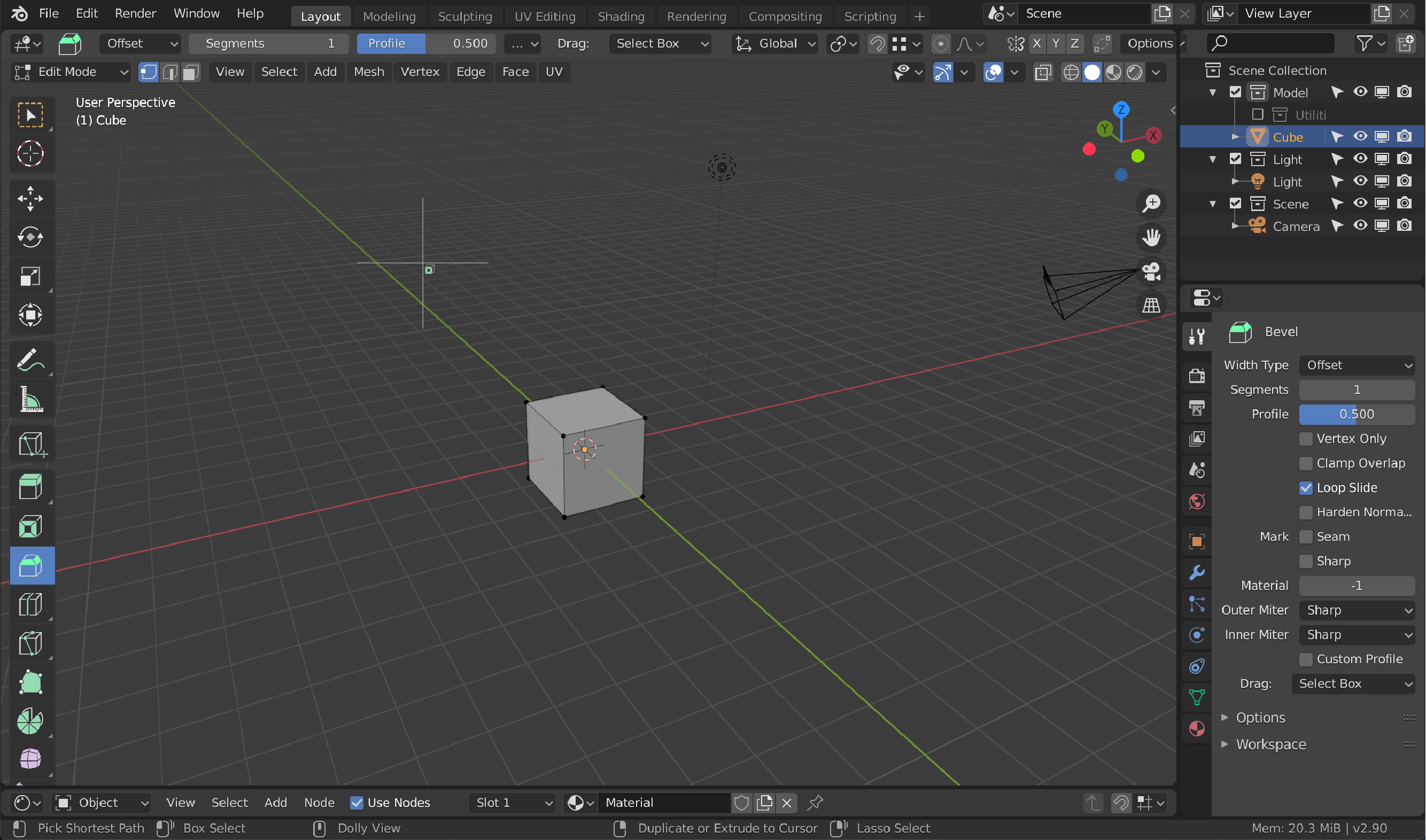
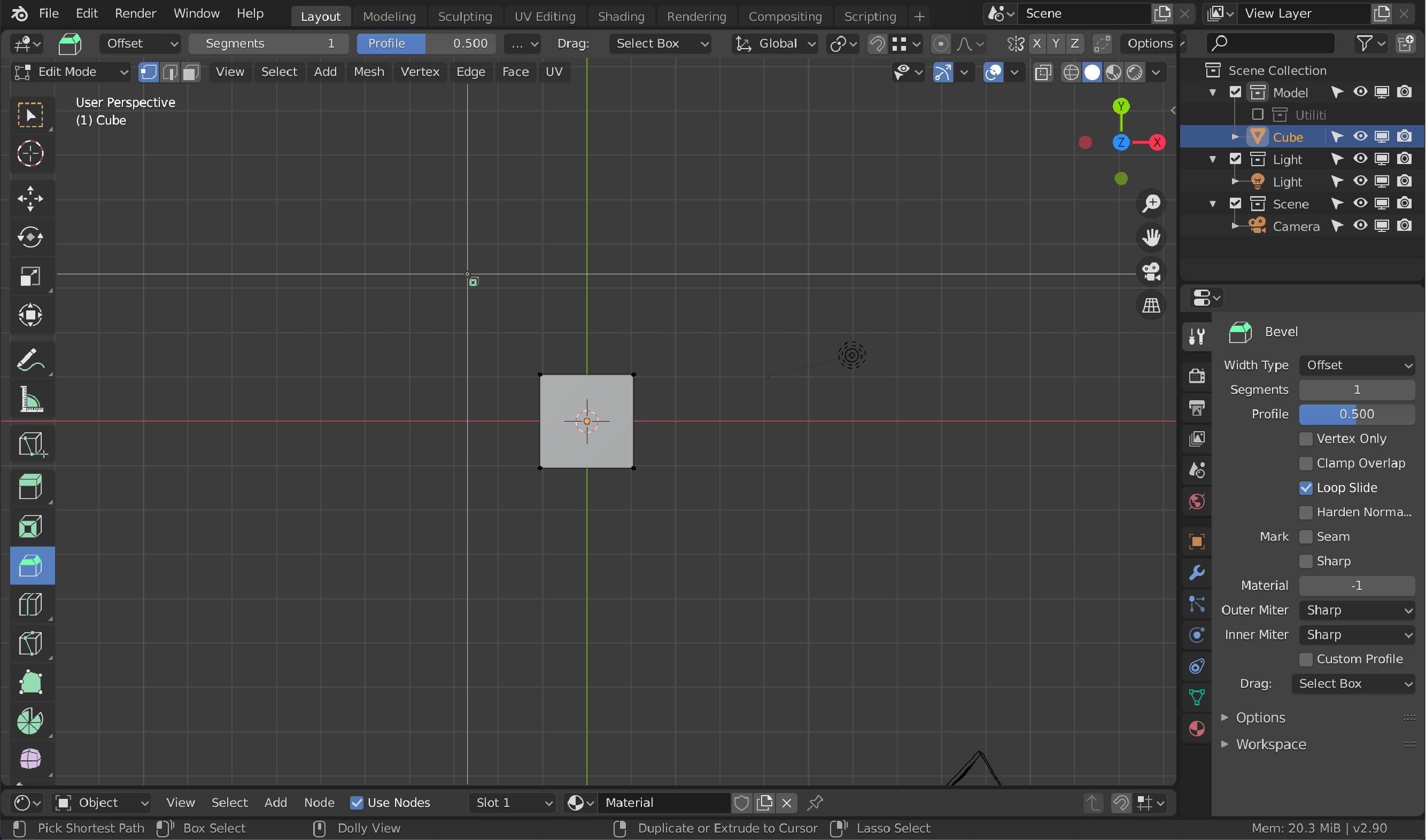
Here are some mock ups to illustrate what I would like to have:
Standard with companion icon:
For selection it should remain an arrow because transformation does also have a 4 direction icon which i always get confused with the crosshair, i don’t mind small esthetic changes to indicate which tool you’re using especially if you’re in fullscreen mode with only hotkeys to invoke the tools but as long as they don’t ruin or obscure the view then it’s okay to make those changes…aslo fine if people want small companion icons with a big emphasis on the word ‘small’.
I mean, it’s clear that the cursor is a great visual help in many situations, specially in precission modeling, and sometimes we may want to have a crosshair no matter if we are in select mode or in extrude mode, others think the arrow is the best tool, all that does not have to go in conflict with the little companion.
Ok, the default could be the arrow if it’s so important, I think it’s not the best option for edit mode, but I won’t argue that, but why not allow the user to enable/disable the crosshair in settings, as a general setting for the user profile, and the same with companion icons, why not allow the user to decide if they want the companion icon.
To be honest the current state of active tools is kind of uncomfortable, and at least in our case, we barely use them, the inly one we used a lot is the cursor one, because is the only way to make the cursor to be aligned to the geometry, it seems there is no way to align the “normal” cursor to geometry, no actual way of configure it.
It’s a powerful concept, but it still needs a long way, anyways, that’s for another thread, the thing is that the cursor ius very useful in general, we prefer to have it, no problem with having the arrow as the “standard” option, although I think it’s an error, but could be great to have the option in settings for those of us that think the arrow is more a problem and a lack of precission that something useful.
I’m quite new in Blender starting with 2.8X, so never notice/gave that importance to the cursor change (not talking about from 2.82 to 2.83 but from object to edit).
After trying one and another (2.82/2.83) I have to say - even if arrow cursors are “mean” for pointing out things - I like more the crosshair one for selecting vertices. It’s different, feels more precise (and way cooler as a shooter game lol (out of context)).
I bet that:
If we can add gradients to the workspace tabs (used by 1/10.000.000 people?).
If we can change the outline of the tabs of the python console (no one who I asked knows where that tabs are XDDD)
Then, (solution for both parts)
Allow to choose the cursor per mode. (arrow by default)
Sorry but I didn’t see the point of changing to default cursor or the new with companion icon in edit mode, but cool for new users, I assume this can be disabled on preferences for all the professionals that dont use the left tool menu, clicking on each tool to use it, right?
If the Devs allow all kind of options for every small feature like this then Blender will become a big mess, the Default should work out of the box with as little tinkering as possible, at least that’s how i see it.
I beg to disagree, the main cursor, the one you use to work and you see every day at every hour is not a small feature.
Put it inside the theme if you want, but this is not one of those small features that don’t have any reason to be modificable, for us the crosshair is rather important.
Well you’re asking for a crosshair, others asking for an arrow , others asking for companion icons and since now it’s per tool not per mode then it’s not a single cursor it’ll be done for every single tool so yeah it’ll be a big mess looking at how many modes & tools Blender has.