Did I understand correctly that the problem is not in the crosshairs, but in the tips that are supposed next to the cursor?
Too “lazy” to draw and implement such tips for the cursor and for the crosshairs at the same time.
Why not make hints separate from the cursor. (margin: 5px 0 0 5px )
Well then everything is clear. Please leave as before, at least in the form of the “legacy mode” option.
This is very sad.
It is difficult to remain silent when, without warning, they took one of the most convenient and logical things
Max is an outdated software (UI wise), but still, that’s not just a sketchup thing… Most modern apps are going this direction, because it’s better and clear.
See the companion icons in c4d for example.
I didn’t say remain silent, i said give your feedback but refrain1 from pointless debates.
AFAIK the Cursor changed a while ago in the 2.83 branch, i didn’t see the discussion afterwards so there must be a good reason for it to be pushed to the master branch.
Well my complains are not emotionally directed to anyone like you guys are doing.
I do understand that some changes might be frustrating since not everyone likes the same thing…so to make your points valid then it has to be productive otherwise no one will pay attention to, 2 months or even 2 years .
Aww, so C4D. I felt something like that)
Yes, some programs goes Sketchup way because it has got the lowest entry level.
Sketchup was built around the simplicity paradigm.
But the problem is, that level have a growth limitations - every professional ends with hotkeys and clear screen to work faster than competitors. Even Sketchup users in our company created Blender-compartible keymap because using GUI is pretty much expensive.
So I understand your desire to provide low entry level to a program, for sure it is important, but we should not limit the space to grow as well.
So, I am out. Does really make no sense to discuss like that. Having companion icons is entry level, people not using crosshairs need no undo, and the benefit of the an arrow cursor is that it’s like that in internet browsers.
There is actually, important who are those “no one”.
It depends on the type and complexity of the work performed.
For instance, entire community passed through broken vertices selection for a year, while we faced a threefold slowdown just immediately. There are things, that cannot be afforded in deadlines.
We have too different stakes.
Actually, no - having entire toolset organized in GUI is an entry level. We are growing specialists for decades, so we are interested in their progress, and performed a lot of tests and workflow comparisons in our company. That’s just statistics.
GUI is nice for getting familiar with the program, but right after that it only gets in the way.
I am talking about the feedback you give here, it should be a valid one for anyone to take it seriously including the Devs…people like Crosshair & Arrow then the solution is to have both, nothing much to add to be honest.
I just wanted to say that there is no “one cursor” in web browsers. But there are many - each for its own purposes. and there is also a crosshair.
We (I and Alberto ) can understand the approach to cursors in web browsers a little differently.
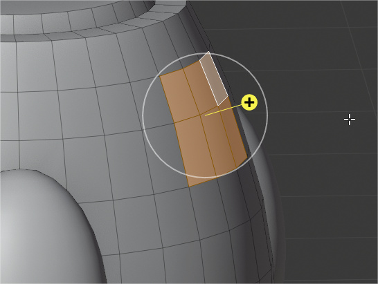
the arrow is not centered. That would be enough.
Tips on the side of the pointer are a completely different conversation.
when you write message now you use {cursor: text}.
How is the editing mode different from this special case? if you need accuracy, you have to use the {cursor: crosshair}
Come on. That is visual feedback. It’s not correlating to the topic of if somehting is exclusively organized in the GUI. It’s how to inform a user about the state the tool is in and that without having to change the main cursor.
Even in professional tablet applications they don’t do that (procreate, affinity)… Affinity doesn’t even do it in its desktop version for most tools, which uses a crosshair. It’s more of an interface design tailgate from the past. Even in photoshop it always got weird. Even more so when we already have a toolbar indicating the tool and a gizmo indicating it.
But, well, we can accept that for very juniors it’s something useful the first week, but okay.
But let’s see, we are professionals in a professional software that have been using the program for ten years, 8-10 hours each day. At least don’t destroy the flow an do it a new splash option.
@Alberto: You are a funny guy. You don’t need any visual feedback, yeah, but if the cursor position is now top left instead of centered you are raging or if the sculpt icons get drawn differently you say you are confusing them. After 500 times you wouln’t even need them at all.
One is to popup constantly showing information in the center that I don’t need and broke what I’m thinking. A thing that pros call “flow” and that only blender allow that in the 3D Suites.
The other is to hide information to the user, give a fake indication where you are selecting.
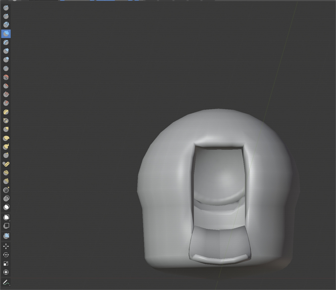
About the sculpt thumbnails… If you work fast you need to be able to select the tools easily without move the eyes more than necessary. Actually is not easy because you don’t have a clear indication of what tool are you selecting, you must to search the shape of the icon.
Somebody is able to see what yellow tool are you selecting without see directly the icon? No, nobody can do it. And a lot of tools are similar in the shape, so you need to see directly and search. Same happens with the properties editor tabs.
That things are not important for juniors. But when you know to use it we talk about don’t break mental state that allow you work better and in less time. So yes, for some people it makes no difference, for others it means breaking our concentration and losing minutes of work every few minutes which at the end of the day can easily be half an hour or more.