As far as I know, the only software that makes a distinction for the active object within the outliner is Blender. Other softwares do have “active objects” per-say, they just only show it in the viewport, and they do it in the same manner as blender (with different selection colors). This means that when it comes to highlighting they only use 2 colors, one for selected objects, and another for showing that something is within a hierarchy.
I think this approach is appropriate, it’s just that would make blender have 3 selection colors. Active, Selected and “within hierarchy”. I think this may work, but we need to be careful about it. This may also come up later in discussion about parent child relationships, if they need yet another type of color which would make it 4, which truly may be too much.
Regardless here is some food for thought:
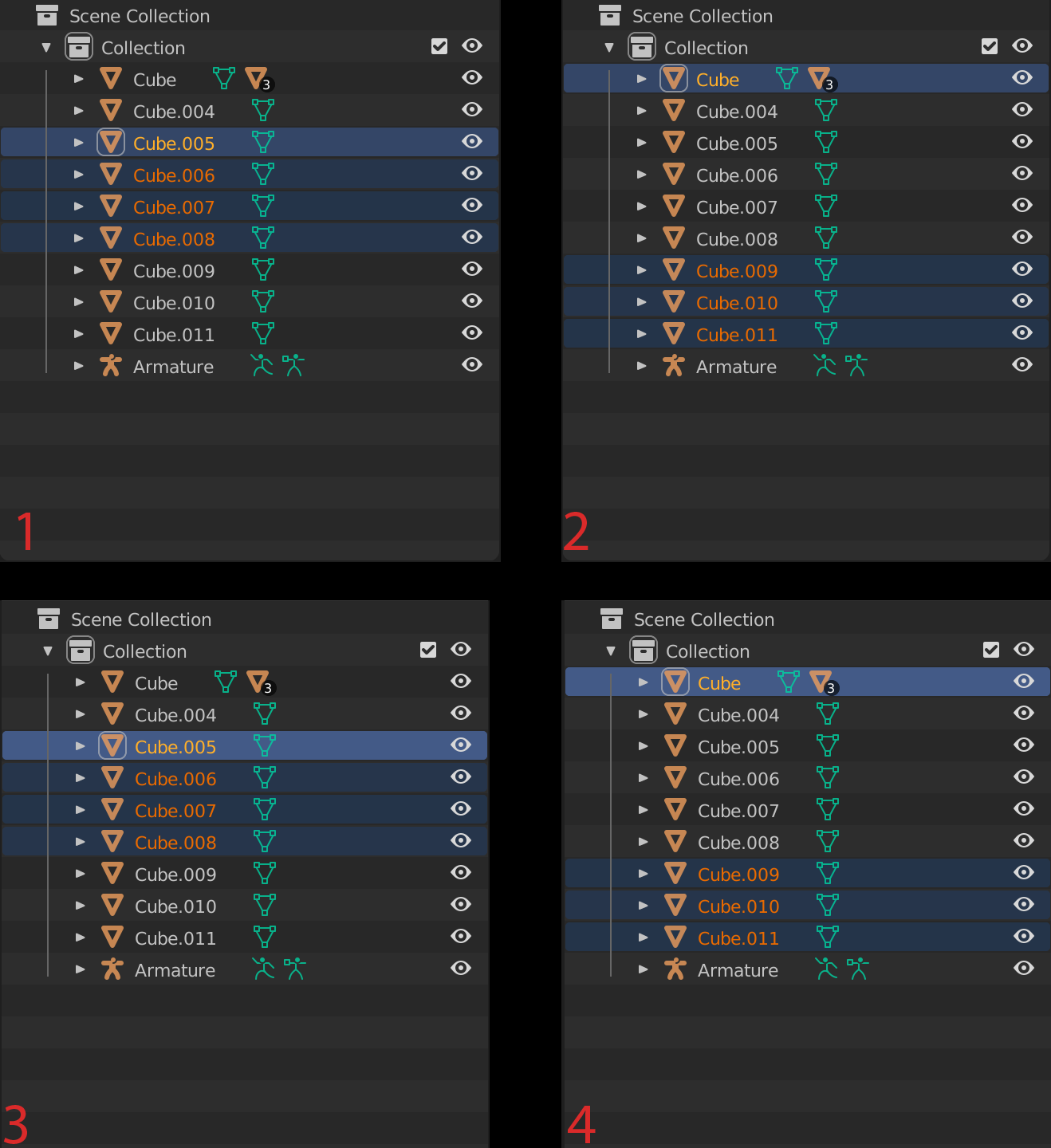
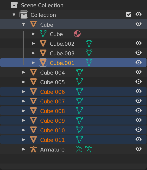
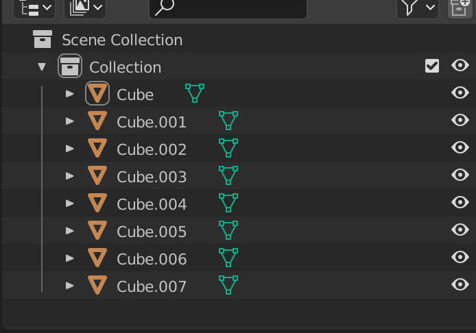
I think the current active and selected objects color doesn’t have enough contrast. If we are adding a 3rd color we need to be careful with our choices. (please zoom into this image)
In this picture each outliner on the left compares with the outliner on the right.
1 to
2,
3 to
4.
in
1 we can see that the distinction is clear enough, the active object is visible as it is right beside the selected objects, making the contrast more visible. In
2 however, in all honesty it becomes significantly less clear. Personally, sometimes I see the active object more clearly, other times I almost feel like it is an optical illusion, and I don’t see any difference at all. Let’s also keep in mind this outliner example is a very short list, where actual scenes would be much more complex making it even less apparent.
In 3 and 4 I have simply taken the value from the existing active object color and bumped it up. I think this makes it much clearer at a glance, which is why I made these all in the same picture, I hope it reads well.
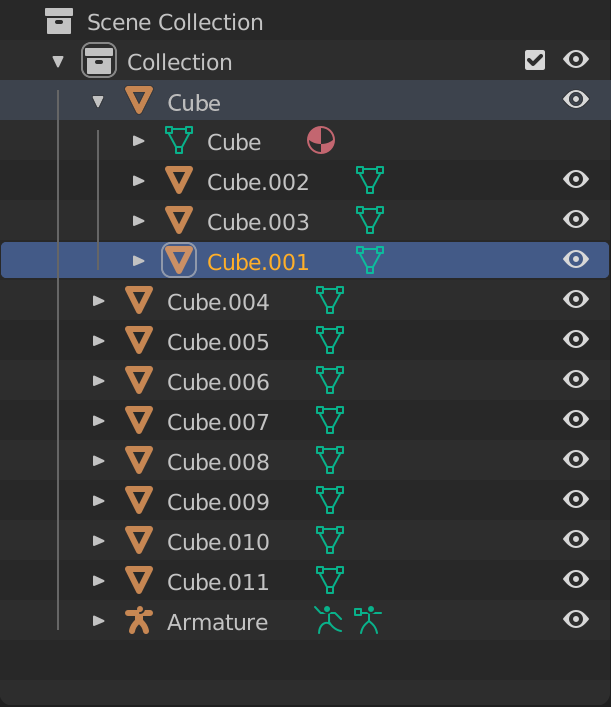
I think doing something like this is absolutely needed if a 3rd color is to be introduced for “within hierarchy”. For me, taking the selected object color, then bringing the saturation down and reducing the value to darken it a bit works well:
When its darker and de-saturated I think it denotes the idea well, like the light of the bright active object is shining through the hierarchy to the top. Keep in mind this mockup is using the new value for the active object, making it brighter.
Here is all 3 colors in the same picture:
As you can see, having all the different colors stand out is really important, without the extra value on the active object there would not be enough contrast at all to support all the selection colors.
3 colors might be a lot, but I think it works well enough. And I LOVE the new white box around the active object and active collection.