I lost track of the thread already ![]()
I messed a little bit with the code (python for now) on how I think that the operator should be:
5 Likes
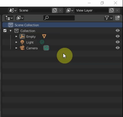
Paste is done inside active collection.
In your screencapture, active collection is Scene collection. So, that logic is respected.
You have to activate collection you want to paste objects in buffer before performing paste.
Which may be useful if you want to paste it in another collection.
But if most frequent use is to duplicate inside same collection, that could be useful to have a duplicate item in right click menu or a shift D shortcut.
A camera is an object. You can add multiple cameras to your scene and choose to use them for different view layers.
View layers are layers for compositing.
You may want to see some collections rendered or absent in those different layers.
But all those collections of objects are content of same scene.
Sorry if I was not clear enough,
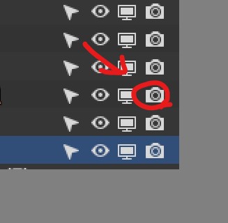
By “turn off the camera icon” I meant this
i will update the post.
Yes but if there was a “duplicate” option would make more sense if the object gets duplicated underneath the selected object.
well probably we need a “duplicate” button in the menu.
1 Like
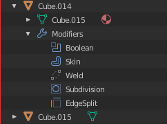
It’s amazing to see modifiers drag and drop suppport. And now when this happened, it’s nice way to organize modifiers using outliner. But with that opportunity comes wish to be able to remove selected object modifiers in outliner and this works from menu but only when more than one modifier is selected. For now it’s impossible to remove only one selected modifier instead it deletes whole object. It would be so nice to have ability to delete selected object modifiers from outliner.
5 Likes
As an experiment I changed all the outliner highlights to draw as rounded rectangles like the file browser and UI lists for greater consistency. I like it a lot and I"m curious what others think. It’s a slight thing, but it makes the outliner look a bit more polished.
left - 2.83; right - outliner branch
its subtle change and i like it, it fits roudness of current UI
and if someone dont like it it could be option to turn it off in theme like other elements does
![]()
is it me or weld icon is not colored?
I really like design and functionality of collection colors, thanks!
also addon creators would love aligned icon buttons in menu rows, thanks again!
Have you considered/planned dimming checkboxes when they are not visible like visibility rows are?
8 Likes
This is a subtle but frustrating detail of the current context menu. If any objects or collections are selected, the menu entries are only shown for objects or collections. My goal for this week is to show the menu items that relate to the target of the right click. So if you right click on a modifier (with any other items selected) the modifier options would show allowing delete, duplicate, etc.
A few icons are wrong. The coloring of icons is a bit messy imo and requires the icons to be defined as a a certain type. These are small details though and will be fixed sometime soon.
Dimming the checkboxes is probably an oversight, and it would be nice to do that.
8 Likes
Hi, astonishing work, I have a paper cut. I think the “select similar - collection” operator should work the same as the “select hierarchy” in the outliner (and maybe have the same name), currently “select collection” doesn’t select nested collection.
I know it’s not an entirely outline related suggestion but its kind of collection thing and relevant for consistency, so maybe you can do it.
Even if it’s not relevant, syncing the operator (adding shift -g to the outliner) would be nice.
Still, I am not sure if it’s exactly relevant to you / this SOC.
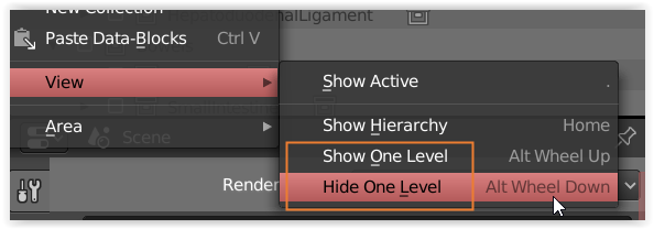
i was working with some big scenes with a lot of collections and subcollections and noticed it would be very useful if the view> Show/Hide One level would be only for enabled or selected collections instead of the whole outliner.
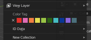
Nice common solution for color tagging from the patch.
Are color swatches predefined or user-defined with some defaults?
If predefined, I would like to propose to place them in Hue order, avoid Value/Saturation variations and reserve some defined color for cumulative collections which shares the same objects
(like purple, which is used, for example, for cases when texture is missing).
This will be helpful for possible further viewport shading Collections coloring mode, since cumulative objects may belong to multiple color tagged collections, so they can be detected this way using viewport shading, avoiding color uncertainity.
So regular objects will take collection’s color, and cumulative objects will take that prefefined color in such viewport shading mode.
This reserved color should be out of the palette and predefinder palette should not contain color that are close to that color.
If swatches are user-defined, well, there will be such kind of a problem with cumulative objects and collections, so cumulative collections color should be user-defined as well, separately from the main palette swatches, but as part of the entire palette.
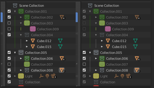
I fixed an annoying issue today with synced selection.
Before and after
An issue with synced selection’s first implementation was that it deselected parent objects. This caused issues with drivers and bones, so the parents were selected in the outliner to ensure the objects were selected in the 3D view.
But this caused many issues with the context menu and drag and drop.
Now the parent objects are still selected, but not in the outliner. This makes the context menu behave more predictably, and fixes a few other small issues.
Bones now can be sorted by name.
One sad thing though - for now I’ve decided to put manual bone sorting aside. The way bones are stored in Blender’s main database doesn’t allow this easily with the current sorting code. I may write an abstraction to translate between the outliner tree to the flat list of bones, but for now I’m focused on other things.
21 Likes
Thank you so much. I’d say manual bone sorting is less important. Name sorting is already effing great. I’ve been suffering from that for years. A mild suffering.
5 Likes
Could be an addon ? (or improuve the multiple windows click on windows when you need to have active windows to do something)
I don’t think floating windows whas the original blender ui paradigme (The 3 Rules : Non Overlapping, Non Blocking, Non Modal)
Now we have already lot of popovers, and menu inside menu. I found cool the way blender try to be industry standard but if it is to have same thing as 3DS max or fl studio. I don’t think this should be in vanilla (or as an option).
@natecraddock When the new outliner is going to be part of the master branch ?
1 Like
You can do floating windows, hold shift while dragging from the corner of an editor in Blender (as if you were splitting) and it will duplicate into a floating window.
I believe each OS has a solution for keeping floating windows on top.
The summer of code ends at the end of August. Around that time I will be merging my changes, probably one at a time. I would guess that most features will be in 2.91 and some in 2.92 if there are delays.
14 Likes
Yes, you can already do floating windows, but for example immagine you want to have a windows just for front view on left screen, and one for top view on right screen. If you want to pan, you would normally press alt+drag mmb
but the windows have to be active
so you need to click once somewhere in the windows to be active so the shortcut is understand by windows.
(btw it won’t understand the alt+mmb but it understand to move the cursor (with the lmb in my configuration)
Anyways, maby this is only on windows 10 and it work fine on linux. Maby i should open a bug report, but it’s more about a feature request that a bug as it is dependant on how os work.
1 Like
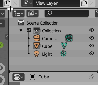
@natecraddock: I had just trouble with the blender outliner and I thought maybe you can solve it. ![]()
It ist just a limitation that could be dessolved.
The select hierarchy operator only works on one selected group/empty not on multiple selections!
If I select more empties/groups and click on select hierarchy, only the first selected group/empty hierarchy is selected.
I have lots of hierarchies and want to assign materials to them, but I have to select them one by one!
I hope you understand what I mean?! Would be great if you can solve the limitation!
Thanks Marcus
8 Likes
Okay, you are meaning floating windows within Blender, not part of the OS. I don’t see this happening as it’s against the UI paradigms.
Yep! This should be simple to solve. I’m currently in the middle of rewriting most of the context menu, and fixing many of the operators. This is one of them, I’ll let you know when I fix it so you can test it in the build.
11 Likes
@natecraddock Thank you very much! Furthermore all the best for your GSOC project!
I don’t think dimming the collection checkboxes is a good idea. To me, it looks like it is locked, not just disabled.
It’s similar as to when the visibility icons of its contents are greyed out after you turn off the visibility of the parent collection. The objects’ icons are greyed out because even if you toggle them on/off, there’s no apparent change in the viewport up until you unhhide the collection itself.
Now, the one thing I do like is that they don’t stand out as much, and create less visual clutter. But I don’t think greying out is the way to go. Maybe the icon should be less prominent, like a single horizontal line
1 Like