GSoC 2020: Outliner Discussion and Suggestions

Hi @natecraddock,

With the colors like that, now -all- Collections, even Instanced ones start to look the same, but the color.
I hope we can have at least the link icon on the root icon of a Instance to make that difference.

Also, is there any plans for object differentiation with font types before the summer project is done?

cheers!

rob

2 Likes

outlinerCollectionColorTest01

Thanks for all the good work on the outliner. I think filling with a small colored horizontal line inside the top of the colored collection box could give the amount of weight needed to be spotable and also vertical lines a little bit thickier.

6 Likes

Those could then be the colored checkmarks, why introduce a new un-clickable element?

This looks pretty good, but 1px colored lines are gonna be barely perceptible at native resolution, maybe make them 3px wide? Love the rest of changes.

изображение

2 Likes

this is a better compromise. The only thing Im wondered is if this checkbox design is consistent with other checkbox icons

UI test

This is my proposal, no lines, no mess.
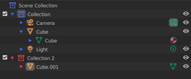
By the way love the new checkbox and collection icon designs New icons for Blender 2.8x

4 Likes

Auto Scrolling is a god send! Boy, scrolling with the mouse click down was awkward haha. I think that when you go vastly outside of the outliner area the scrolling should probably stop though, otherwise when dragging and dropping objects into other areas you lose your spot in the outliner every time:

12 Likes

I think that if they refused to color checkmarks : it is to be able to color code them for animation in future.
That could make sense for efficiency to animate activation/deactivation of Collections with Library Overrides instead of just their display.

And checkboxes on the right is not a good idea. Because when outliner is expanded they can be pushed far away from collection icon and name.
Keeping them at the left, allows to move, rename, activate/deactivate collections in same area of outliner with minimal mouse movements.

We could also imagine that to be clickable : open color tag menu or a color picker.

1 Like

Yup. I’d probably fade off the 2 vertical pixel lines on each side a bit so it’s less in your face. There’s a lot of aliasing going on in the outliner, a 3 pixel wide fully filled line can be a bit of an eyesore.

Patch to fix that here: https://developer.blender.org/D8193

6 Likes

I was pushing for the colored toggle icons, but this proposal by Ronan is not nearly as in-your-face as mine would have been, but it still largely gets the job done of having some element of color on the right-side toggle area for the eye to latch onto when it moves from the center area to the right area to change a toggle. Hey @natecraddock, is there a possibility of getting something on that right side that acts as a landmark for the eye when it moves from center to right side? I pushed for colored toggles. Ronan’s option is admittedly better and less intrusive, but whether mine, his, or something else, I would love to see some element of color on that right side to help the eye land on the wanted toggle line quickly.

And I, too, think that thickening up the vertical colored line would help.

1 Like

Thanks for the feedback everyone! I’ll be reviewing everything with my mentor, for now I’m sticking with the same design.

Today I made the vertical line twice as thick (not sure this is needed depending on the color), and I made the colors available in the user preferences. Also, the icons now draw in the context menu too!

The collection colors might just be drawn in the outliner panel, but they have their own section for now.

Nothing yet. I really do want to address this though.

That is the plan! I’m going to take a break from collection colors now to work on sorting and parenting now so this should be working sometime next week.

This could be easily done, but don’t we already have the alternating line colors to help with that.

22 Likes

This looks great!

How many colors are you planing to expose in the settings? I think in Maya it’s 31 plus a non colored option, but it’d be easily more than 6 for most people. (I know it’s work in progress, but figured I’d ask)

2 Likes

I have some food for thought here. I was looking at the the location of the arrows to open up the hierarchies:
Stagger
Right now, the arrows for collection inside collections are center justified with the collection above it. This is a nice way of doing things, Houdini does this for instance. Just for reference, however, I was looking at Maya and C4D on how they dealt with things. I found they both stagger the “arrows” or whatever equivalent a tad. In the suggestion picture you can see it if you look close. The arrows are closer to the collections left corner rather than being in the middle. I think there a two reasons for this.

  1. It saves space in the long run.
  2. It makes it less likely for people to confuse the arrow below a collection for pertaining to that collection, like this:
    Mistake
    As if it comes out of the collection. I know most of us are super used to hierarchies but, nonetheless.
  3. This is super duper small, but all the spaces between items this way are equal, expect for the top of the hierarchy. The gap between there is smaller by a bit because of the staggering starting from there. This give a hyper small cue for where the whole hierarchy starts from.

I thought I would just post this for reference. Personally I don’t mind either way, but I was curious how people felt about it.

2 Likes

I personally like it centered. They can be pushed together more closely for all I care, it’s just that arrow being off to the side throwing me off. I don’t know about C4D, but I like the Houdini and Katana graph views.

Not a fan of the Maya outliner, it’s just ancient and not visually pleasing.

I think if someone is using the outliner extensively they would probably expand it anyway, and I can only guess how a more node based system (which is the way we’re heading) is going to complicate things in outliner land - the space we save is probably not worth it.

Again, it may be just me. Interested in hearing what others are saying.

2 Likes

Hi @natecraddock,

Love the work you’ve done again, things like autoscrolling are very welcome additions, as are all other tweaks. :slight_smile:
It looks and behaves better and better, but I do have some reservations with the way Colllections look now.

Like I mentioned before, the visual difference between ‘regular’ Collections and Instances is now completely gone. I would prefer a partially filled icon like the suggestion of @thecavelap (post 300) to make that more distinct.

And a more visual distinction (icon, font) between different datatypes (instances, linked data etc.) will help tremendously. I’m still hoping something like that will arrive before this project comes at an end this summer. :sweat_smile:

rob

3 Likes

Alternating line colors are useful.
But, the more, hierarchies are expanded ; the more toggles are far away from item names : the less, they become efficient to distinguish first, second or third level of hierarchies, corresponding to collections or first object.
A dot to mark collections rows helps to scan toggles vertically and realize that you are passing to another collection without having to read anything on the left of outliner.

2 Likes

I commented once before about using color tags to filter collections, but I didn’t get attention, so I did a quick mockup.

Color tags are very useful for visually organizing your scene. By adding an option to use them as filters they become even more powerful functional tool (sort of isolate view based on the custom colors)


In short here is my idea images from left to right.

  1. collections with custom color tags (not the final design, but close enough)
  2. Popover menu with added “sort by color” and an entry for the color tags in the filter menu
  3. Some of the color tags are disabled, and the outliner tree reflects the change
  4. filtered collections and their respective content.

elements added to the interface:

  1. added toggle for the filter button. This way you have a visual feedback that there is a filter active that restricts the elements the outliner is showing. Added benefit you can quickly toggle filters on and off
  2. added an option in the filter popover menu for selecting which color tag is shown in the outlines. The color squares are toggles and can easily be toggled in bulk by holding shift and dragging (standard Blender behavior) or the checkbox above them.
  3. added an option in the filter popover menu for sorting by color tag. This is more of a invitation for discussion. Is it important for users and how will it work.

One thing I want to point out. There is a corner case when a collection is shown in the outlines, but its parent collection is filtered out. (eg. image 4, collection 4). My reasoning in here is that we should show the nesting levels somehow. To do this I added a second checkbox to indicate the “ghost collection”. This has an added benefit of being able to toggle the parent collection off if needed.

5 Likes

Filtering by color sounds like a neat idea. I’m also interested in the ghost collection proposal. Indicating if there is a nested collection and maybe it’s color tag seems tempting, can’t properly visualize it though.

I don’t see how the sort by color could/should work. I’d just use custom sorting, it’s not like colors would have an objective meaning, they’d vary from user to user. For example, I always put all the junk I don’t need in a red collection and put it right on top.