GSoC 2020: Outliner Discussion and Suggestions

I’ve pushed the changes for the first step of improving the collection colors. It is far from finished, and there are still a few bugs I have to solve. I believe it is a good compromise between all of the suggestions over the last week. It is very clear in marking colored collections, but it also indicates the hierarchy without drawing colors everywhere.

image

For this to work, we have also moved the collection exclude check (finally) which also has the benefit of making the hierarchy more clear. The collection icon is now drawn to the left of the contents! :slight_smile: (@eobet) Again, this is unfinished and it’s not clear if the left column is the final location for the checkbox. We are trying to make things more clear though! If you have any feedback on the current design, lets try to keep it focused on improvements rather than radically different ideas. (we already have many unique ideas).

Yes, I think a viewport collection color overlay would be a great long-term goal once collection color tagging is in master. It could even extend to selection operators (select by color tag…) and other parts of Blender.

Finally, I’m also working on all things drag+drop. That means parenting, collections, modifiers, custom object sorting, etc. It’s a big task where many things are related, so I’m doing that in a separate branch for now (i.e. no changes in the daily builds here).

One last thing: This is now part of 2.90! (autoscroll)
scroll

38 Likes

Nice, works for me. :slight_smile: One thing I’d probably do is make those hierarchy lines just a tad thicker, they look a bit flimsy. Just a smidge.

Auto scrolling looks great as well! Really looking forward to custom object sorting as well.

Any news on the object highlighting for collapsed hierarchies?

10 Likes

Great work on the collection coloring! It looks useful without becoming a visual eyesore. The drag and drop scrolling is also very welcome and long overdue.

Am really excited about the drag and drop changes that are coming to the outliner, as this will really make Blender feel like a much more modern app.

Is there any chance that that having to hold shift to parent objects will be done away with? It feels very unnecessary to me as you can nest/parent collections without shift, but not objects themselves. Especially since objects will soon be able to be manually sorted, the shift modifier will feel even more clumsy imo.

2 Likes

I don’t have Photoshop at hand right now, and I can’t make a mock-up to judge myself. But indeed the doubt is “wouldn’t it be better if the exclude checkmark goes on right side along with the other restriction toggles?”

2 Likes

Autoscroll is much welcome, thank you so much. It’ll make a difference in managing long lists of objects. Can you consider changing the collection arrows to a plus sign as in @wevon’s mockup, given they represent a different relationship than the arrows on objects ?

1 Like

I think I finally figured out one big thing why I dislike the checkboxes so much:

They’re LOUD!

This re-focuses the attention back to the collection icons:

image

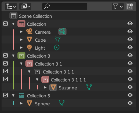
Also, I agree with @dan2 that the bars should be thicker, plus the white in the icons themselves looked weird with the colored background, but removing it again diminished a bit of their focus… so I think @Hadriscus colored icons looks the most fitting (which I tried at the bottom).

16 Likes

This definitely helps. Might me just me but I never use those checkboxes, I just disabled them.

The whole view layer system is a bit strange to me, I’d rather have some sort of visual editor/tab for them. They feel somehow disconnected from the UI, crammed into the upper right corner, almost like they have forgotten about them and had to come up with a place after the UI was already established.

Only my personal opinion though, not bashing anyone’s work. They just don’t feel visually accessible to me.

So ye, those checkboxes are definitely in the way and are messing with readability.

1 Like

I just remembered that checkboxes are on the left to be closed to collections icons.
You are activating/deactivating collections by using checkboxes and reordering collections by drag and rop.
So, that is more practical to avoid to have them far from collection icon.

@natecraddock , this is good. But can you also introduce a reminder of collection row on the right, next to toggles ?
reminder

1 Like

Hi @natecraddock,

With the colors like that, now -all- Collections, even Instanced ones start to look the same, but the color.
I hope we can have at least the link icon on the root icon of a Instance to make that difference.

Also, is there any plans for object differentiation with font types before the summer project is done?

cheers!

rob

2 Likes

outlinerCollectionColorTest01

Thanks for all the good work on the outliner. I think filling with a small colored horizontal line inside the top of the colored collection box could give the amount of weight needed to be spotable and also vertical lines a little bit thickier.

6 Likes

Those could then be the colored checkmarks, why introduce a new un-clickable element?

This looks pretty good, but 1px colored lines are gonna be barely perceptible at native resolution, maybe make them 3px wide? Love the rest of changes.

изображение

2 Likes

this is a better compromise. The only thing Im wondered is if this checkbox design is consistent with other checkbox icons

UI test

This is my proposal, no lines, no mess.
By the way love the new checkbox and collection icon designs New icons for Blender 2.8x

4 Likes

Auto Scrolling is a god send! Boy, scrolling with the mouse click down was awkward haha. I think that when you go vastly outside of the outliner area the scrolling should probably stop though, otherwise when dragging and dropping objects into other areas you lose your spot in the outliner every time:

12 Likes

I think that if they refused to color checkmarks : it is to be able to color code them for animation in future.
That could make sense for efficiency to animate activation/deactivation of Collections with Library Overrides instead of just their display.

And checkboxes on the right is not a good idea. Because when outliner is expanded they can be pushed far away from collection icon and name.
Keeping them at the left, allows to move, rename, activate/deactivate collections in same area of outliner with minimal mouse movements.

We could also imagine that to be clickable : open color tag menu or a color picker.

1 Like

Yup. I’d probably fade off the 2 vertical pixel lines on each side a bit so it’s less in your face. There’s a lot of aliasing going on in the outliner, a 3 pixel wide fully filled line can be a bit of an eyesore.

Patch to fix that here: https://developer.blender.org/D8193

6 Likes

I was pushing for the colored toggle icons, but this proposal by Ronan is not nearly as in-your-face as mine would have been, but it still largely gets the job done of having some element of color on the right-side toggle area for the eye to latch onto when it moves from the center area to the right area to change a toggle. Hey @natecraddock, is there a possibility of getting something on that right side that acts as a landmark for the eye when it moves from center to right side? I pushed for colored toggles. Ronan’s option is admittedly better and less intrusive, but whether mine, his, or something else, I would love to see some element of color on that right side to help the eye land on the wanted toggle line quickly.

And I, too, think that thickening up the vertical colored line would help.

1 Like