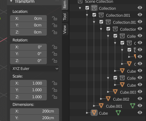
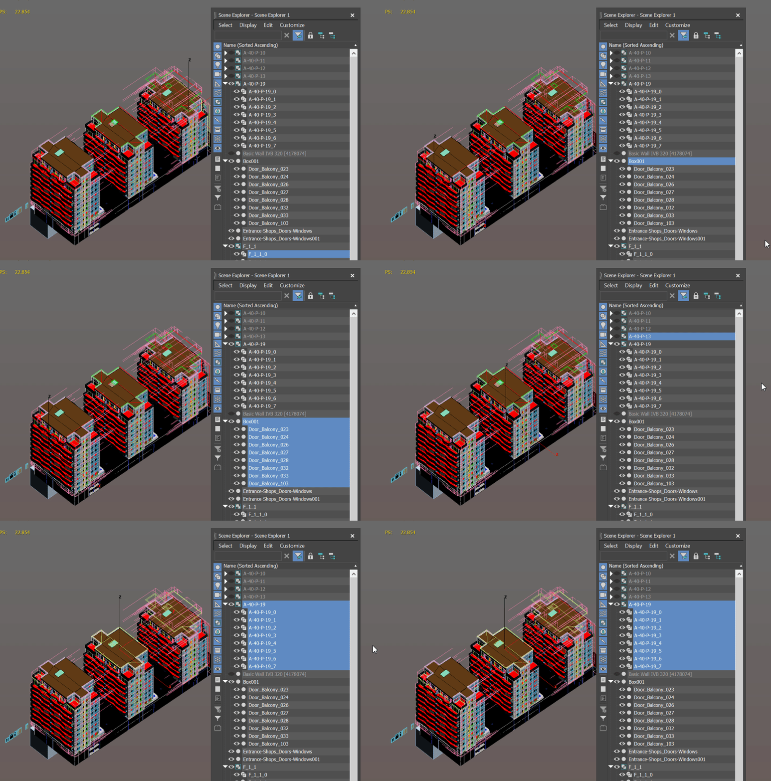
That doesn’t look like the same thing. I think he’s wanting the outliner to automatically scroll when dragging an object to parent it or drop it in a new collection. If you have a really long scene graph, you have to use the scroll wheel while still holding the left mouse button. The proposal you’re linking to, is a request to have the outliner automatically frame selected in the outliner when you select in the 3D view (or #D view as he called it).
I’m currently working on implementing this.
You are my unsung hero!
I got the constraint icons to work. It turns out that each constraint tse stored the constraint in te->directdata so I was able to find a solution that worked the same for both bones and objects. Thanks for writing the switch 
https://developer.blender.org/rBf5ccf5f0354c6581558525fd9d7b91aea8fd6350
Before spending too much time on this, you might want to get the design for it approved. We currently already have 3 different ways to highlight something in the outliner with a specific meaning (active, selected in outliner, selected in viewport).
Highlighting the collection selected objects are in can make things more confusing if it’s not clearly distinct from e.g. the active collection. Or if you are proposing to automatically make the collection that the active object is in active as well, then it’s also unclear if that will work well.
 Good to hear! Sorry for the action icon, I didn’t think about it… Maybe it could simply be marked as “modifier” in UI_icons.h, without duplicating it; I think @brecht made it so that icons so marked are used in their coloured version only in the outliner.
So this might be a stupid question, but is there a way of using the Outliner to show only the objects you’ve hidden? I am constantly hiding objects in large scenes, and then having them show up in my render, and then I spend ages trying to find that object. Or the reverse happens, where I’ve disabled render visibility.
Is there really no way of filtering by visibility/invisibility?
And if there is already a way to do this, is there a way to make it more discoverable?
Ya know, I’m actually coding an enhanced Outliner filter and sorting system right now. I plan to allow for the filtering and sorting of tree elements using almost any criteria. Don’t know how useful it’ll be for artists, but I’m coding it anyways.
I asked Brecht, he said that making a new icon would be the simplest way to use the correct color.
@Frozen_Death_Knight Yes, a better way to manage constraints and modifiers from the outliner would be nice. Thanks for the suggestion
@dfelinto no worries, and I hope the existing code helps in making this work too 
@AlanNoble This won’t be hard to add, and I’m planning on doing it soon!
@J_B just curious, how much are you planning on doing with sorting? I was planning on allowing custom sorting order as time allows toward the end of the summer of code.
I am planning on creating two different ways to sort. One way is through allowing for unlimited reoccurrences of the filtered tree within the Outliner. Tree reoccurrences(i.e. groups) and filter criteria will be stored as collections. The second way is to simply allow for the rearrangement of tree elements.
My design allows for almost any criteria to be used for filtering and sorting. Some of the criteria I have in mind, right now, are:
object selection, active, visibility state;
property type;
object type;
id type;
struct name;
property name;
tree element name(which I think, for objects, is also just the object name);
property value;
etc…
I also plan on allowing for the filter criteria to be specified as a range, and evaluated using a number of methods, where applicable.
I should probably admit that I haven’t yet figured out how sorting(i.e. rearranging tree elements) using so many criteria should work. So that’s something I still need to do.
I should also probably admit that I’m not a good programmer so I don’t even know if my code will get the green light. So, feel free to code your own sorting design. Maybe I could use your code as a guide?
EDIT: After realizing that by “custom sorting order” you probably meant that users would be able to click and drag elements anywhere they want. Well, I wasn’t planning on adding that functionality - so you’re good to go.
172 posts … too much mushrooms… it looks like I missed all the party.
I just post here my old concept on RCS.
Its not only about Shift for multiple as standard but also about Ctrl, Ctrl + Shift, maybe Alt + Shift, etc.
Name too long/Outliner too short - and this " short idea " does not work.
So you want to " eat " part of space for holding emptiness for just cases when you need sometimes to do some specific action - very questionable solution.
Also - how should it look in such cases?

I’m currently getting my self familiar with the outliner code and creating a rough implementation.
I am only using the current highlighting method as a placeholder for the future design.It currently highlights on the outliner being used and doesn’t highlight on another outliner that is open.
why not just use the left empty space?
Yes, you are right. It can be done in this way.
Or why not just Double Click on icon ( not only for collection but for any object with something linked ) to select hierarchy.
Right now Double Click for rename work in both icon / name spaces of item. So why not make it work - Double Click on icon space to select hierarchy / on name space to rename?
Short Max example GIF . Double Clickon item name area ( same on icon expand/collapse childrens list ) select all grouped/linked. From other side in Max there are no rename with Double Click.
Maybe it have no sense if there already some plans to add something much necessary to Double Click on item icon - I have read part of comments but doesn’t found.
Cursor in GIF capture not adjust because of 4k ad Windows scaling. For unknown reasons it gives such capture

