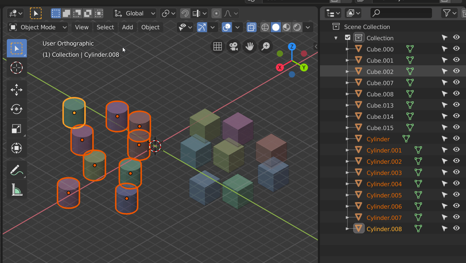
I want to ask make filter Visible for objects, work with Local View.
1 Like
@a.monti guess I should have asked sooner, will you be creating that new constraint icon?
@AlanNoble I added the invisible filter. It should be in tomorrow’s outliner build d2493bdd776a
@J_B Thanks for explaining. I’ll go ahead with my plans  Good luck!
@IIIFGIII Having a more standardized interaction is absolutely planned. Keymap changes are trivial to make, so it’s not a huge priority for me at the moment. Thanks for the suggestions. Additionally, I think showing visible objects in local view nullifies the point of local view. If you want more objects to be seen in local view, just add them to the selection.
All constraints do have their icons now, so what particular constraint icon do You mean?
Emmmm … so this mean - you make it to work with filter Objects → Visible in Local View same as if all other objects are hidden?
Currently the Action constraint uses the same icon as the action editor. So in the outliner, it is drawn white rather than blue.
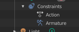
Brecht said that duplicating the icon would be the simplest route to keep the colors consistent.
I get it. I’ll duplicate the icon and update the icon sheet then. The custom Action Constraint icon will come later.
3 Likes
Hi Nathan,
Is it Possible to apply selection improvements for other editors,
Like Material slots,Vertex Groups,Shape Keys and others?
another question: if Possible ,i think it will be nice to
search by typing letters without the need of search box like in windows explorer
last question: sometimes i find myself searching for the same thing multiple times i think A bookmarks for favorites search words will speed up work.
here is a link for mock-up i did
p.s. you are doing very important work
thank you
When objects are deeply nested, it increasingly gets difficult to show them in a narrow outliner.
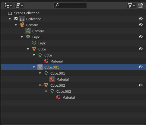
This a quick idea that might help improve this.
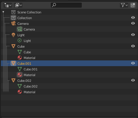
As you can see, indentation will not show the grouping. Instead the lines show it.
While this decreases the visibility, I believe it is a convenient option.
11 Likes
super cool and…original ? never seen that in any software
Interesting idea. But from what I can see it doesn’t move the icons at all, meaning there is a finite space for those lines. Basically if you add a couple more nested things to that menu you will run our of space for the lines. It should probably move them a bit horizontally? I’d say each icon should be moved exactly 1 lines worth + that small gap in-between the lines (or more). That way you never run out of space, but you still don’t move as much as what currently happens. Anyways, having horizontal space in between the icons, even if it’s small, probably increases readability. Honestly, even though this saves a lot of space it’s a bit difficult to tell what’s coming from what at a glance.
1 Like
@IIIFGIII Oh, is that an edited GIF you posted? I can’t replicate that behavior with local view so I’m going to assume it is. I guess it may be nice to include that in the outliner filter for visible objects; however, I am not sure how simple that would be because the functions that control outliner filtering aren’t associated with local view functionality.
@alonabrany It may be possible to add multiple selection to the UI lists for materials and other datablocks, though that would be outside the scope of this project. Searching by typing would be cool, but it would conflict with the keymap for operators like box select B, scroll to selected . and other operators. Remembering previous searches is an interesting concept though, thanks!
@TakahiroKomatsu I agree the problem you raise with the horizontal spacing is valid, but I don’t think that compressing the hierarchy lines would be a good way to solve it. Though there could be a way to calculate how much space it takes as an offset, it removes the more intuitive tree structure that the levels of indentation bring.
3 Likes
@Kranos
Original, I believe. I haven’t seen one before too.
@Bobo_The_Imp
Running out of space is clearly an issue. Maybe either the icons or the lines can adaptively move horizontally but I’m not sure if that would make a good UI.
I also agree that they aren’t readable.

(I changed the hierarchy to show more complex trees)
How about this?
@natecraddock
I understand that this design is full of drawbacks and was meant to raise interest in the nesting problem. I actually believe that decreasing the indentation a bit would be a good solution. (or an User Pref to change the pixels)
I hope you would look in to it.
5 Likes
My take on this is that running out of horizontal space isn’t really an issue.
As the content gets wider and/or the area gets narrower there are already two solutions in place: horizontally scroll the area or just drag the area wider.
Since this type of content cannot wrap or reflow, but always remain horizontal rows, I think it would be a mistake to draw it differently depending on the window area width. Just let it overflow and allow scroll.
The best way to think about it is to turn the problem 90 degrees. The Outliner list also overflows vertically, but we would not consider changing the vertical spacing depending on how many items are visible. You wouldn’t want a short list to have taller rows but then get cramped by smaller line-height as you add more items. Instead we just let the items overflow and scroll…
5 Likes
I see it the same way as @Harleya.
In your mockup it is very hard to tell which objects are on the same hierarchy level. For example, at a glance Cube and Cube.002 seem to be on the same level, although they aren’t.
Maybe we could win a few pixels horiztontally, but not so much as to remove the clear visual structure that we have now.
2 Likes
Apologies if this has been suggested (I’m struggling to search the thread on mobile), but what about some kind of mouseover preview, that would highlight an object in the viewport if you hover your cursor over it in the outliner?
This would make it super easy to quickly see which object is which, without having to actually select that object.
Anyway, thank you for adding the invisibility filter! I haven’t had a chance to test it yet, but I’m super pleased to know it’s there.
7 Likes
@natecraddock: Thank you for taking my idea with the invisibility filter in the outliner serious! Coming from Maya, for years I was struggeling with the Blender outliner limitations. Now you are improving it, I see a bright light on the horizon!
3 Likes
to narrow hard to read… the current solution is really good maybe it should be just adaptive i mean the “tab distance” let’s call it should be adaptive based on % of width of window.
It could also scroll by itself, based on the active/selected item, so this is always centered.
1 Like
I noticed something that is missing from the walk navigation…hold Shift and walk navigate should extend the selection like in Windows file explorer.
Mainly in the Properties Editor right? Those are Python based, so there is a lot less that could be done. It would probably require a new widget written in native code to expose drag’n’drop functionality etc. to the Python UI scripts.