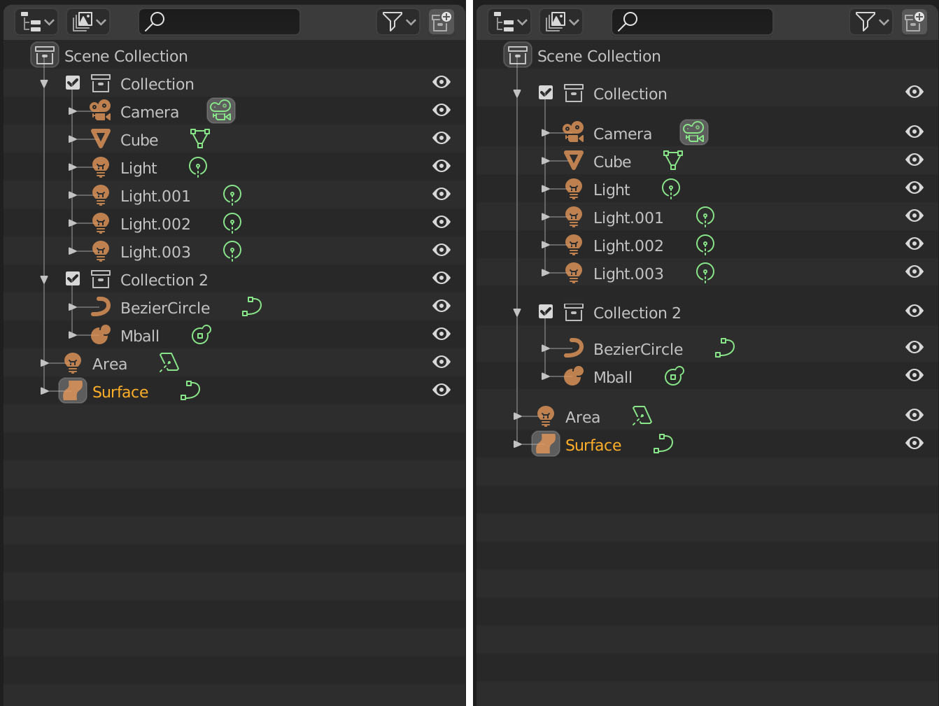
Maybe it was already mentioned, but I think that Collections filter should have same States as Object filter.
Currently, user is adding collections to scene and enabling/disabling collections inside View Layers.
So, contrary to early state of 2.8, View Layer view of outliner is not restricted to collections enabled for a view layer.
All collections present in scene are shown although one View Layer may only contain one Collection enabled among dozens of disabled ones.
I think that simply, adding a filter state like All, Enabled, Disabled, Active for collections could help to adapt View Layer view to what user is working on.
User would feel more comfortable to use View Layers as an organized and permanent alternative to informal temporary local view.
I am so sorry, due to lake of time, i am not reading all the prev posts…
So, a guy a suggesting something about renaming of collection, i am just mentioning here.
I see your point. I am pretty sure a lot of discussion went around the icons in the outliner. Maybe the collection icon itself could contain the checkbox. I’ll look into this.
@ZoolooS I chatted with @billrey about the collection indentation. The open/close triangles do show the correct indentation, and that should be enough. I agree and won’t be changing this. Thanks for the suggestion
Could there be a “Hash Tag” kind of thing for filtering objects?
I know that the collection system is the intended for that, but its somewhat cumbersome.
What I had in mind was a tooltip for every entry, showing the parents on hover after a short delay. Not sure if this works well in practice however.
There might be better solutions, e.g. an entry in the context menu so on right-click. Maybe a Change Parent operator which initially shows a list of parents? Or would a shortcut to collapse the entire outlined hierarchy even suffice?
I finally got around to addressing the shift+click on disclosure triangles. Thanks again for pointing it out, I probably wouldn’t have noticed otherwise
Another suggestion is to add Shift+D shortcut to duplicate. I found it inconsistent that you can duplicate with Shift+D almost everywhere (Object mode, Edit mode, Nodes, etc) , but not in the outliner. You can only duplicate with Ctrl+C then Ctrl+V
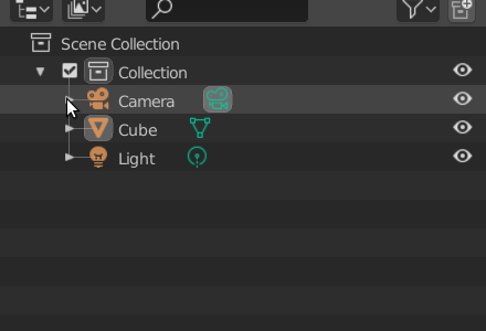
I’m sorry to be late to the party here, but what use could that checkbox by the collection possibly have that can’t be fulfilled by the half a dozen visibility options already present in the right edge of the outliner!?
Not only that, but if that checkbox is so important, why not add it as a new category along that right edge, and those who want it can reveal it via the already available filtering options.
Further, since I simply don’t understand its function at first glance, it’s not very intuitive, is it?
I may sound harsh, but my god, I do believe that’s possibly the single ugliest UI element I’ve seen in 2.8…
I like this, but like the visibility filtering options, I do think that adding so many different things to the Outliner would probably require its own entire set of visibility filtering options, separate from what’s already there.
Thanks for the info!
Which build does parenting multiple objects have it fixed? In RC2 it still works the same.
Selecting multiple objects in outliner also needs fixing. Using B (rectangular selection) feels outdated and not user friendly. Selecting objects like in Windows file explorer or MacOS finder is more convenient and intuitive. Please fix this too.
I hadn’t been following this very closely lately, but I now tried one of the test builds, and it is progressing really well. Congrats.
One small improvement that came to mind is when using walk navigation with arrow keys, try to keep the currently “active” selected item in view. In other words, auto-scroll the Outliner to keep the active item always visible if possible.
I second this, opening the Material tab in the Properties Window when clicking a material icon in the Outliner would be very welcome.
I love how things are much smoother than in master regarding the outliner.
I just have two points which would be, in my opinion, two small but nice improvement to the workflow for renaming elements in the outliner.
when you are editing the name of an element and when you navigate with the arrow keys up and down while in name editing mode, it is very handy when you are directly in the name editing mode of the next element. therefore you are very fast for i.E. when renaming Indices for many objects.
Also, when pressing F2 in the outliner It would be smoother if the renaming would not be in a popup window but also directly in the name like when double clicking on the name.
@eobet the checkbox is the per-viewlayer toggle for collection exclusion. It is quite useful actually. if you don’t like it, you can disable it in the outliner filter popover.
I like that idea, and I was already considering it for drag and drop. Thanks!
I think this would be a more difficult feature to implement because the text edit mode captures the arrow keys already, and with the batch rename addons that exist, I’m not going to consider this high-priority.
I was thinking of adding support to rename outliner elements to the popup, but this is a smarter solution. I have commited the changes, thanks!
Great, I will absolutely get rid of it the first thing I do.
Why isn’t it disabled by default (since all but one filtering options are disabled by default)? I honestly still don’t understand what it does from your description, so it sounds like something only expert users would have any use for, so why expose new users to the unnecessary clutter and complexity?