I’ll keep this renaming issue in mind, but its not super high priority. Might even be better to post about this in the papercuts. (or maybe that is how Blender does it and its going to stay like that…)
For now I do think that collections suffice. It would be nice to have a selection set feature though. Noted. 
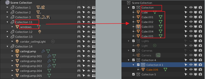
@Xeluaxeman I like your idea for selecting child objects! I’ll think on this
2 Likes
I think that’s exactly what collections are for
Sometimes i guest need to pick objects without making things more complicated, and because i don’t want to link one object to to more than one selection layer .
Why would adding objects to a collection be more complicated than adding them to a selection set ? This is not clear to me. Your second point could use some clarification as well - why don’t you want to link one object to more than one selection layer (collection?) ? What are the adverse effects of that ? (I’m trying to understand the use case here, which at first glance collections seem to fit well)
VS Code indents by half the icon width and just got indent guides in v1.36. Maybe that would be a compromise to save horizontal space in deeply nested hierarchies?
10 Likes
After using this new VSCode tree for a few weeks now, I find it difficult to navigate with the half width icons. At least for me, its too narrow to easily see the nesting.
1 Like
I have to agree, it’s quite difficult to see at a glance. Moreover, it wouldn’t really work with the checkbox on collections, which is about as wide as an icon.
What you could look into are micro adjustments to save a few pixels perhaps. But more useful would be some kind of tooltip that shows you all the parents so that you don’t have to scroll.
@Xeluaxeman Started working on that icon select menu. Still has a few issues but shouldn’t be too difficult to resolve
36 Likes
Great Nathan
People will realize how important this feature is for large scenes.
Please make them announce this feature well when implemented so people can use the extra power.
Thanks my friend
3 Likes
great! you are improving the outliner a lot!
A tooltip on what exactly? Or to be more specific, what causes the tooltip to appear?
I have fixed it finally
I can’t make anyone announce this feature, but I will do my best to make the knowledge available when I do documentation as part of my project this summer.
4 Likes
Hello there.
Using 2.80 not from start so I guess that variant of indent of objects in collection was changed
and my qustion is WHY?
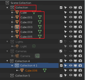
I know that now we have checkbox so it moves collection name on one icon right. But now collection container itself and its content visual equal. And that confusing. So why not move this checkbox to the filters on the right and move collection name on one icon left for better indent.
3 Likes
I get what you mean, but having more indentation would be an overkill, wouldn’t it? Would it perhaps be a viable option to replace collection icon with a checkbox (if enabled) altogether (“Scene Collection” would have to be excluded though)? So for normal collections it would either be a collection icon or a checkbox but not both together…
1 Like
Why more? I said that identation will be like earlier i.e. minus checkbox icon on collection name row. But there will be new column around filters.
Something like that
2 Likes
Oh, I’m sorry, I must’ve misinterpreted your previous message, I thought you mean we should add more indentation.
Tried to search this topic and didn’t find this:
Could vertex groups, shape keys, uv maps, vertex colors be actually moved to outliner? The property ‘lists’ are tiny absurd outliners inside another window… they never made sense and were always hard to use…
This would also involve list of materials (by now the only reason to go to properties - materials instead of node view), and probably other things.
4 Likes
Hmm, I agree that the small areas in the properties panel hard to access and work with in terms of shape keys, vertex groups etc, but how would they be displayed in the outliner? Wouldn’t that be just as small? Not that I’m against the idea, I’m intrigued. Could you elaborate a bit on how that information would be displayed in the outliner?
I would like to suggest adding the ability to zoom/scale the outliner with “ctrl-mmb” like we can do with the majority of all windows/panels in Blender.
Is this something you would consider?
Ok, to write more about moving list views to Outliner
pros for this suggestion are in my opinion:
- by default the Outliner itself is already bigger and easier to make big or to scroll.
- Outliner has many more features and these could be shared
- Outliner supports drag-drop which could be used for copying this data between objects or reordering.
- The code-base would be shared and possibly reused for different types of data
- This would be all much more logical to newcommers

- I can’t repeat it enough. List views are tiny outliners inside another window. It’s like a tower inside a tower inside… you know.
Regarding how it would look, these would be simply tree branches in Outliner. I think accessing them might become easy with shortcuts.Similar to e.g. AfterEffects where shortcuts unfold different things like masks, opacity, e.t.c. (Don’t kill me for mentioning AE here, I don’t like their UI, just those shortcuts for unfolding certain types of data)
Of course, there are things that wouldn’t be possible, like the + - buttons, select vertex group. But these functions would easily go into right-click menu…
3 Likes
Hmm, interesting. I am fond of how cinema4D displays a lot of information in their outliner, but they also have other areas that you can view things like shape keys in a more robust manner. What I’m saying is only having it in the outliner might not be optimal. I’m worried that if that were the case you would run into a couple of issues:
1 - Indentation making it super annoying to find that one nested object just to get to it’s vertex color or shape keys.
2 - Adapting to resizing of the outliner might make creating a clean UI difficult (like if it’s very thin in the top right corner, would that work with say the sliders of shape keys)
3 - Having several tree drop down menus for objects will create annoyingly large spaces that you then have to re-collapse to clean it up. In a shape key intensive work period between a couple objects that might be awkward, ie having to scroll a lot between objects to get to their properties.
I think there is some good to having these options in the outliner, but I think redundancy is good in this case. Having access to objects mesh data in the outliner and the properties panel would be good I think!
I also think that some of the mesh data sections, like shape keys, for instance, should maybe have their own editors. A shape key editor would be nice wouldn’t it?
1 Like