Search for Modo and tell me what you see.
You’re welcome. 
Search for Modo and tell me what you see.
You’re welcome.
I still have a feeling we could just put the tool settings with the tools. They would take a lot less space than the topbar, especially when you make the icons closer to the size of the rest of them. Here I am also showing any sibling alternatives if any are selected.
I like that!
A rather compact solution.
So you like blender being like modo?
Obviously not. It’s just so you don’t think there’s c4d copycat/influence happening in 2.8. If there was, we wouldn’t see those complaints. I have yet to find a c4d user who dislike c4d’s UI.
@anon18120698 And by the way, what if the T and N panels had this ability?
I guess it would end the war that is happening here for good. Basically you would have access to everything even when working in fullscreen. Right?
Yeah this would pretty much solve multiple issues, but is that ok to you?
I mean, it literally means putting a whole editor inside another editor.
I dont know if thats simple to implement, developers arent magicians.
I really don’t need it. This is more for those that like to have settings in the viewport and fullscreen fans.I don’t like to work fullscreen, I always have the outliner and the properties visible on the side most of the time.
I believe the blender devs have the skills to do it.
To be honest for a long time now, essentially ever since the editor sidebars were added, I’ve been wondering why the properties editor wasn’t simply done away with and everything be moved from it to the respective editors properties side panels.
Spreading settings like that makes the software non-intuitive and hard to use. The discoverability is also very poor when things are all over the place. Even though blender has many editors, it’s still just one app. Unification is important.
Not if the “spreading” follow a meaningful logic.
Local settings in the N tab, Global settings in the properties editor.
I understand the T and N shelf without any problem. It’s not the problem of blender. Nobody of my partners have any problem with the sidebar, the problem was the controls and some strange controls layouts like lists. Thing that have not been solved.
Other day I tried blender2.8 with new user, to see the response to the changes. All have exactly the same problems that always.
nobody see a problem in the T-shelf, you learn to use it in 2 seconds.
You can find essentially everything you want in the RNA editor. If you want something where everything is in one place there you have it, in the outliner.
As for that, blender is a content creation workstation. Every editor is it’s own specialized thing to an extent. That certainly doesn’t mean though that certain things couldn’t be generalized though. The top bar would be a perfect place for things such as the playback buttons. They are useful for the video editors, the 2D as well as the 3D animators, etc. But every editors properties should be in the appropriate editors sidebar.
Just as the properties editor has the tabs now on it’s side the editor specific properties side panels could have them instead/just as well. And on that note: the properties panel is always to the right of the editor. With the strange exception of the file browser where there are non-properties in it and it’s to the left.
The topbar should always be inside the same panel from where the tools are selected and show only the properties of the active tool for each panel.
The t-panel was a good way to know where the addons were going to be and have everything in one ordered place.
The UI might be more cool-ish right now but its really disorganized.
in 2.79 everything had its place and used to make sense, now those places were just removed to create space for a UI that no one quite understands but just accepts as being good somehow.
IMHO, blender should have been developed gradually just like anything that actually evolve, so it has time to recover from errors, “Stacking one mutation on top of another only is gonna kill the spcecies” if you change too fast you can’t predict the results. just like the topbar were added in the clould of the brainstorm and now there’s not a clear usage for it.
This makes me think some will never be satisfied with the UI, no matter how hard the devs work. Frankly, the topbar is one of the best decisions they’ve ever made and the myriad of opinions regarding how to ‘fix’ it tells the tale: any other approach will just divide the community even more. Let’s wait and see how they hone it over the next few versions before jumping all up in their faces and telling them they’re doing it wrong.
I were satisfied before some changes. personally, I find the topbar incompatible with blender.
but.
Tell-me more about how you would use the topbar.
Do you like the topbar with its current usage?
Why you like this new UI?
How could somebody tell that the topbar is the best decision when also developers doesnt know what do with the topbar? And put random controls in it and quit in the all the workspaces because don’t have readon to exists?
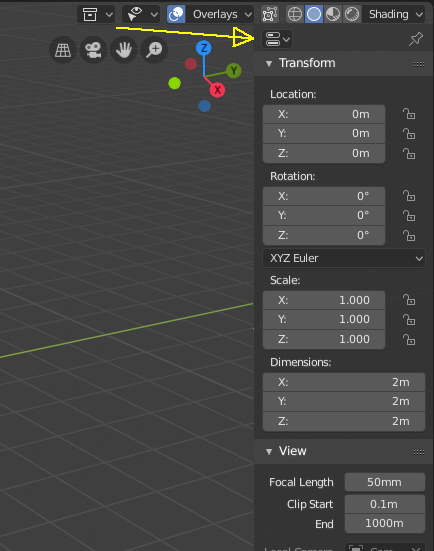
I was thinking of a similar solution where the individual tabs of the properties editor (Active Tool Settings, Render, Output, View Layer, etc.) could be accessed from a dropdown at the top of the N-Panel. So if you clicked the dropdown and chose Active Tool Settings, that’s what you would see in the N-panel.
I think this would solve so many issues. The N-panel is always tied to a single view, so your Active Tool Settings would be tied to the active tool in that view and that view only. You also have the convenience of being able to access the Modifiers panel and Render settings from a full screen view. et voilà - it’s done. There’s no more need to fight with the top bar or maintain code for it.