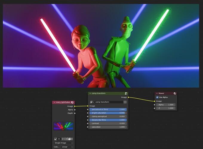
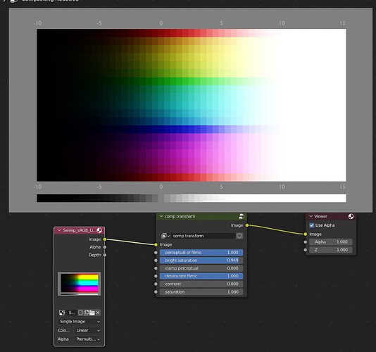
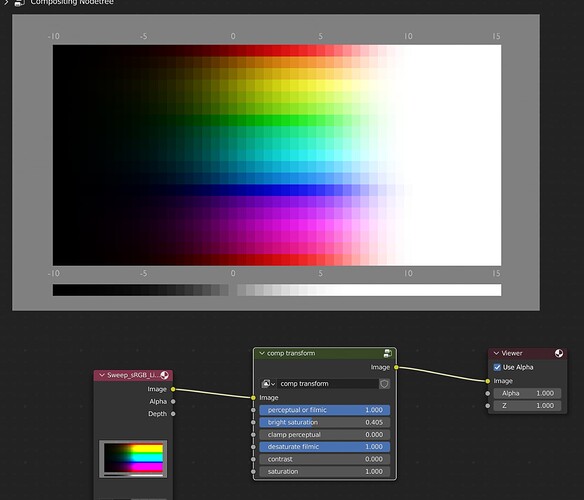
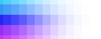
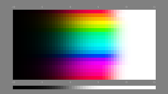
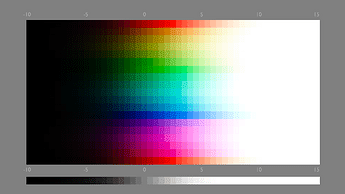
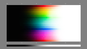
If you disable the normalize inside the group, these settings appear to get very nice results on the colour chart. My eyes are getting tired, but I think I’ve avoided the troublesome 6:
oh no, I haven’t actually looking more closely at the greens.
There you go, mission complete 
Here’s the link for the new version with the troublesome 6 fix: Dropbox - comp transform better saturation troublesom 6.blend - Simplify your life
Brilliant, you have done a chromaticity linear attenuation!
Note this isn’t the end. We still need to check the skin tone, and make sure the blue doesn’t look purple becuse of abney effect.
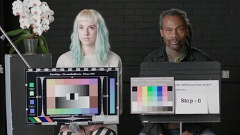
A quick load up in your .blend file, skin tone test is not passing:
Too pale
Abney effect still there:
Well that’ll do me for an hours worth of trying. I might delve deeper at some point, but bed now. Cheers 
I am going to bed soon as well, but for your next attempt, these are some goals:
-
Skin tone, and make sure the same setting works for both skin tone and sweep
-
Abney effect compensation
-
“Wider Gamut rendering”. Try to achieve acceptable result without breaking the above tests. Here is what your current approach yields with BT.2020 sweep:
My current version as a reference:
BT.2020 sweep:
ARRI Alexa 35 as a reference:
EXR:
Sweep_BT.2020_Linear_Encoded_in_BT.709.exr.txt (99.1 KB)
Remove the.txt at the end, added it because this forum doesn’t support uploading EXR.
Yes, u r right about it, u really have great understanding and sum up the tread instead of judging people like ''photograph cant have whites, photograph cant be like that ‘’ etc
So I just keep saying I wanted to add some LOOKS on filmic that can give us that clipping and gamma or some brightness explosions , so we can do everything from filmic and add little bit of those standard artifacts to filmic by additional LOOKS, so people can see filmic can also do that too by secondary transforms etc in the form of LOOKS. People keep saying its wrong when we want to have that control on filmic to have little bit not too much like srgb , of that artifacts or imperfections because it add realism like flaws etc.
The latest version looked like this
although there are some messy leftovers in this one
Since the recent introduction of the Convert Colorspace node, this is actually possible, although there were tons of pitfalls in learning how to do it correctly.
I’d love if it Blender had OCIO nodes for this reason. Just load the individual functions various OCIO transforms and looks use into nodes you can plug in and mix and match and adjust on the fly. You wouldn’t necessarily even need the various Filmic Looks but instead could just use a single look that does it all.
You can already replicate all that in the compositor with lots of work, but it’s much slower than a 3DLut approximation would be. The above node setup was completely unusable before the full frame compositor. Now it’s at least reasonably performant. But adding all too many things after still breaks it. Also, it takes a whole lot more knowhow than just dropping in premade functions.
To me that’s not an issue with any given view transform though. It’s an issue with the current state of Blender’s feature set for the purpose of color management.
Quite a bit of issues seem to at least theoretically be on the agenda in this bug ⚓ T68926 Color Management Improvements but even once this is completed I think more could be done.
It’d also be neat to get some matrix manipulation functionality. That way you could easily work in completely custom color spaces as needed. - the Color Conversion nodes only work with presets. I’d like to specify my own custom color spaces and then have blender come up with the matrices.
But anyways, all of that is very in the weeds. If you want to build your own color formation chain, you absolutely can. But most people just want something that “works”, and Filmic, for most situations, works better than Display Native. And AgX, for pretty much all situations, works better than Filmic, especially in the most recent iterations.
thank you it looks nice, I will try it outttttt
I actually dont mind having abney effect from blue if it will give more variation and detail. Is it physically accurate to reduce abney effect on blue? isnt it normal to have it? also , is it the same thing as what flourish version as I read in BA.
Abney is a perceptual effect. This isn’t about physical accuracy per se. The “physically accurate” thing to do would be to render spectrally, and then have a monitor that is able to accurately reproduce those spectra in each pixel, at any intensity.
Color Management is about getting something that makes sense in lieu of that “real” thing, given hardware limitations: We only get to use three colors rather than fine spectral control, and at a limited maximum intensity.
It turns out that linearly changing such a three light system’s intensities does not translate into constant hues. I.e. we have, among others, the Abney effect.
His result really look like ARRI, even kind of more closer to it than AGX?
Maybe only needs that dark tones spreading or leaking from left to right on blue red and green so it will be more contrasty and deptful and be more like ARRI. I liked it
Dont mind the terms about physically accuracy, I just try to mean perceptual accuracy and just asking that if its was a real world and we input a blue filter on light and would we see it purple or blue if its too bright like in example or would it have little bit of purpleness? or what I try to ask is are we trying to make lights more expectable by reducing abney effect so people can have expectable renders while using blue for a light?
In the real world, things act with spectra. These artifacts of perceptions are not apparent, as you don’t need to reduce intensities.
In the real world, blue does not usually turn purple if you shine a stronger light of the same spectrum upon it.
Ahh okay I understand, then its fine to reduce abney on that , so its more like real life
This is really less about how it’s “in real life” as that is inherently an ill-posed problem given hardware limitations. It’s more about predictability and expectations.
That said, it’s a subtle effect and you gotta be careful to not over-correct. FWIW, while mostly an improvement, I don’t think the current iteration of AgX necessarily gets it quite right.
It’s tricky to evaluate though.
Yes I understand now, so yes its better for predictability of results.
Take a closer look at his BT.2020 result:
It has a lot lot of clipping.
His result looks like chromaticity linear, but note it’s difficult for chromaticity linear approach to stay smooth and natural, there will be issues he needs to fix like skin tone etc.
And his approach currently doesn’t work at all with “wider gamut” BT.2020, looking towards the future it is important to be able to work with Spctral Cycles etc. So this side is important.
Your color tranformation chain is so flexible and it has a great look, it has nice all the control I was always wanting to have,
its better than LOOKS, u almost made a parametric AGX by exposing values,
THAT brightness saturation feels like changing between filmics over saturation into a agx saturation logic
Also that perceptual allows u to have filmic quality while feeling like having SRGB
and that contrast slider really looks like like great control
also if I add RGB curves to that node to do my own ENHANCED WHITES thing, on top It will be my perfect thing to use for my workflow forever,
, THANK YOUUUUUU, its a big inspiration,
Yes maybe it has many clipping as I noticed now , probably I took a wrong look at wrong picture while opening on new tab but I just felt like the control of those sliders give so much flexibility to get the look I can tweak. so it sounds nice still
Would it be first better compare with ur BT709 to make it a better comparison?
