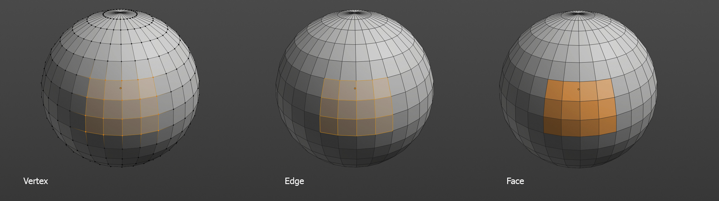
Ever since face dots were removed there have been some users who don’t seem satisfied with current behavior (no face dots and thick edges when in edge mode).
I’m interested to know if this is most users? a vocal minority?
Disable face dots by default (current state).
Enable face dots by default (no need for wide edges).
I don’t particularly care what the default is so long as everything is configurable. If I want no face dots, but no thick lines or any other identifier for the edge select mode to visually differentiate it from face select mode I ought to be able to configure it as such.
I always found the dots helpful (specially finding holes or stray internal faces, or as something to click). But not the (new?) extra thickness for edges (it seems to change with view… I guess AA side effect), their mere length is enough hint they are there.
BTW, the AA should be configurable (and work as set, including “off”).
I simply enabled the face dots and then saved my startup file, because without thinking too much, I find it better to recognize the faces in both wireframe mode and in solid mode.
I had not given too much weight to the secondary problems, in fact I had not noticed it at all
A separate toggle for thick edges is what we really need.
I want to be able to disable face dots and thick edges at same time. That would be my default.
The solution of a thicker edge seems to me very bad because it dirties the wireframe just when you want to see all the edges perfectly. In addition to the continuous visual popping that is created.
I think that the facedots should be kept by default simply because of the coherence between the different versions of blender and obviously because of their great usefulness.
I have never agreed to remove them as a visual reference for aesthetic reasons. Many changes have been tried in the 2.8 wireframe and all have failed, now blender almost has the 2.79 wireframe and there are no complaints.
The current solution is poor but the solution to revert to face dots is even worse.
I am quite confused as to why there is a debate about it as if the solution wasn’t obvious. It is - to differ how the selection looks in each mesh element mode:
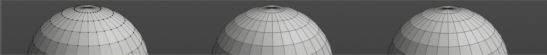
1, Remove the ugly thickening of edges in edge mode. It looks bad and it makes edge selection on edge meshes exercise of frustration.
2, In vertex and edge mode, make the hinting of the faces that edge and vertex selections make up more subtle. Just slight tint.
3, In face mode, make fill the face areas with strong orange color, same one vertices and edges are filled with, but do not highlight edges.
4, Introduce face dots only in Xray mode (already current behavior)
This will make distinction between edge and face mode super simple, and good looking. There will be no more jarring changing of edge thickness when switching between edge and other modes.
It doesnt solve the problem that people want to solve. In reality, it don’t change nothing. We all now what component we are using after select something.
Hell no, this looks horrible imo. This is not how component selection should display
They just need to give the options to the users, and everybody can configure it the way they want.
No, no no no, this solution you propose its similar as the first time dots were remove and have the same problem, there is no way to know if the select mode its face or edge.
The main issue is that you sometimes launch a mesh edit tool without realizing which mode you are currently in. That’s the first thing I thought of. Sure it’s also a problem when you have nothing selected, but a smaller one.
In this case, I think that most helpful would be something like pre-selection highlight like Modo or Maya have.
But it was just a suggestion. I don’t mind if it’s done any other way. I’d just like to see those ugly thick lines in edge mode gone.
The difference between edge and face select could also be that in face select, edges are dimmed. As such, the element type that corresponds to the selection mode would be the most prominent.
This solution doesn’t require edges to be thick to differentiate edge select from face select modes.
As for face dots in general, they are a useful mesh debugging tool, just like normal display or face orientation, which you can enable when needed. But they do create a lot of clutter, which is especially problematic with dense meshes, where the face dots can actually make topology unreadable.
What we should do, is keep face dots off by default, but obviously keep them as an overlay option. Secondarily, we should explore other ways to differentiate edge select and face select modes, without resorting to the thick edges.
Not wanting both face dots and thick edges is fine, but it probably shouldn’t be default, since new users probably would complain that edge and face mode are too similar.
If face dots were to become the default, they need to be properly AA’ed like in pre-2.8 versions and have their color decoupled from vertices (also like pre-2.8).
I do not support the idea of changing the surface color based on selection mode. That’s equally distracting.
Wrong.
That weird distinction you guys love here, almost doesn’t exist in other apps. I don’t even know why this is a thing. None of this should be enabled by default.